Corresponded image pops out on hovering text, tab questions and arrows

Hi there,
A few questions here:
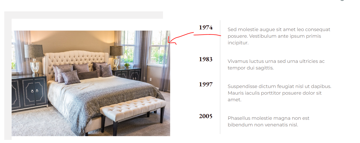
1. Is there a way when you hover on text ie 1974 there will be corresponded image pops out and same as 1983 text and the rest.
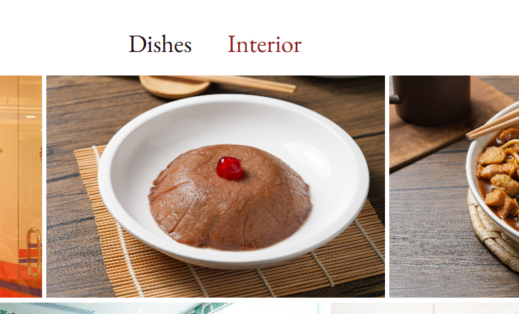
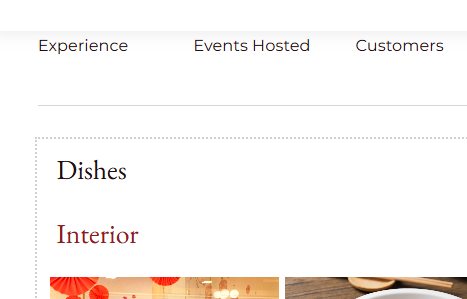
2. We are using accordian to show the gallery. Right now on desktop version, the accordian text is placed on the top on image (and in middle), on mobile/tablet version, it places on top left with top and down ( but not the right and left)
3. Is that possible to remove one arrow on the slider?
-

Hi Janet,
Thank you for contacting us.
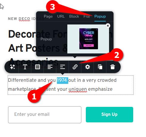
1. Unfortunately, there’s no built-in option in Brizy to make an image appear when hovering over specific text. However, it’s possible to link the text to a popup, which will display the image when clicked.
This can also be achieved with custom CSS, and we can provide you with a sample CSS snippet to try.
2. Regarding the accordion gallery layout, the difference in positioning between desktop and mobile views is expected due to responsive design behavior. You can adjust this by modifying the element’s alignment or padding settings in the mobile and tablet views to match your desired layout.
3. About the slider arrows, it’s possible to hide one of them with a small piece of custom CSS. Please let me know if you’d like me to provide the code for it. Let me know which arrow (left or right) you’d like to hide.
Best regards,
Ariel H.0 -
Thanks Ariel,
1. Im still more into the option by having the corresponded image appears when click on specific tex. For exmaple: https://www.splunk.com/#four
2. At least from what i have tried, i dont see the option to adjust the text into middle ( if you can try it on your end too pls
3. yes i would like to hide the arrow on the right lpls
4. Quick question we would like to install biligual plugins that is compatible with brizy and wordpress, any suggestion on this?
0 -
Hi Janet,
1. You can create a similar layout using the Tab element, as shown in this screencast: https://youtu.be/8j73gCphVcw
Within the Tab element, you can add both text and images. The images in the example are not optimized, so they may load slowly. Please use optimized images for faster loading.2. Could you please provide a screenshot of this so we can better understand your layout?
3. Please try this CSS:.brz-slick-slider__arrow.brz-slick-slider__arrow-next.slick-arrow {
display: none;
}You can add this under Customize → Additional CSS. If this doesn’t work, please provide a screenshot of the block.
4. Please try using Polylang - https://www.youtube.com/watch?v=FfAQyzu92EE
Best regards,
Ariel H.0 -
Thanks,
1 &2 are now having the same issues on the displays on the tablet and mobile mode.
4. Polyland - the video link you shared talk basic on the setup, but doesnt dive deep into full details how to change the body text. Any video link for this?
ps: below is the tablet display as same as the mobile view, where the second text is placed below 1st text instead of next to ech other ( i have attached the screenshot in the first thread)
 0
0 -
Hi Janet,
The behavior you’re seeing is actually by design, the Tabs element automatically converts to an accordion layout on tablet and mobile views to ensure better usability on smaller screens.
We did look into a possible CSS workaround to keep the tab layout, but unfortunately, it didn’t achieve the desired result. I’m sorry for the inconvenience this may cause.
I can't find detailed tutorial for Polylang, but you might also consider checking out the following:
TranslatePress - https://www.youtube.com/watch?v=Jl7NQ_UHYrU&t=1239s
Best regards,
Ariel H.0 -
Hi Ariel,
Translatepress is not friendly plugin for translation, do people use these three plugins often?
So there really is no way we can change the layout, its really not ideal if we display on mobile
more questions below:
1. what would be your recommended way to install cookie consent that is compatible with Brizy
2. how to show the logo on waiting/loading page like this example: https://corkandfork.ie/
0 -
Hi Janet,
Thank you for the update.
TranslatePress and Polylang are among the most commonly used translation plugins with Brizy. Each has its own advantages.
About the Tabs element, unfortunately, there isn’t a built-in way to keep the same horizontal layout on mobile. The tabs automatically switch to an accordion view, currently, we don’t have a workaround for that. I’ve also looked into third-party plugins, but most available options don’t support vertical or fully responsive tab layouts either.
For cookie consent, you can try using Cookie Yes GDPR Cookie Consent, as it works well with Brizy and is easy to set up.
As for displaying a logo on the loading or waiting screen, that functionality usually comes from the theme or a preloader plugin. You may try searching for WordPress themes or plugins that include a preloader feature.
Best regards,
Ariel H.0 -
Can you recommend a wordpress themes?
Am currently using twenty twenty and didnt find the preloader options thanks
0 -
or pluign that is again compatible wiht Brizy thanks
0 -
Hi Janet, please try using this plugin: https://wordpress.org/plugins/loftloader/
If I come across any other suitable options, I’ll send you the links as well.
0 -
thanks
0 -
I am adding counter in and set the value to 10000, but every time it loads, it will appear as 10001.
Is there any way we can put + ie 1000+ ?
Also i added a background image on the page, and when i view it over the mobile, it disappeared. Can you pls take a look as well: https://www.new*****ap****s.com/contact/
0 -
Hi Janet,
The issue with the counter displaying 10001 instead of 10000 appears to be a glitch with the counter element. Our team is aware of this, and a fix should be rolled out soon in one of the upcoming updates.
About the background image, it’s loading properly on my end as shown in the screenshot below. Please try clearing your browser cache or viewing using another browser.
Best regardcs,
Ariel H.0 -
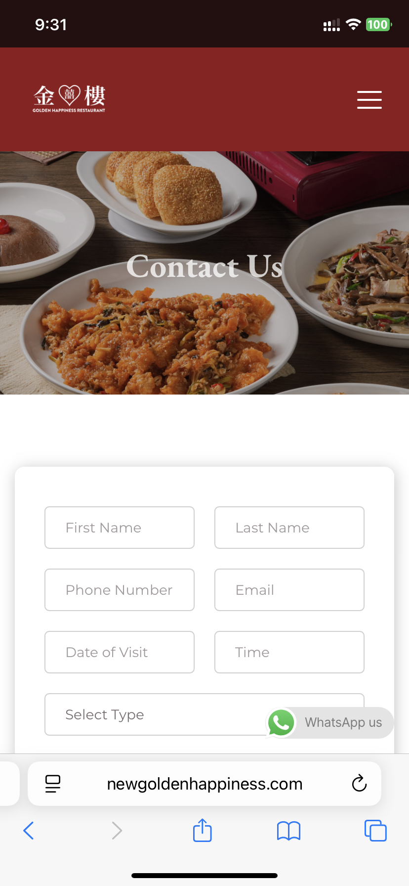
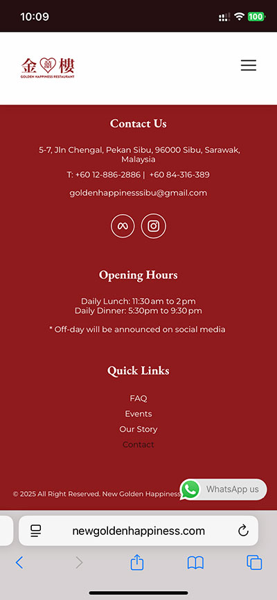
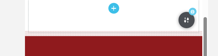
Hi Ariel, not this background image but the background image on the footer. Red pattern
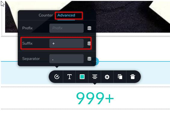
Also is there a way to put + ie 1000+ for counter
0 -
Hi Janet,
Here’s a screenshot showing the footer background:
If you’d like to display a "+", you can add it as a suffix under the Advanced tab of the counter element settings.
 0
0 -
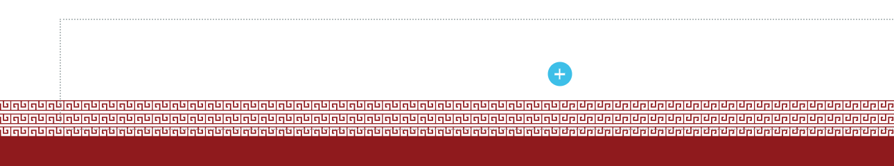
I am not sureif you can see it but there is a very fine red pattern light placing on the top of the footer. Please advise if you have a better to showcase, both from Desktop and mobile view attached
 0
0 -
Hi Janet, please try adding a spacer element to that block or section, and set its height to 60px (or adjust it as needed) for mobile.
0 -
is that possible to make the artwork bigger mobile version?
0 -
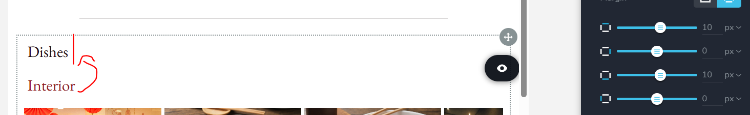
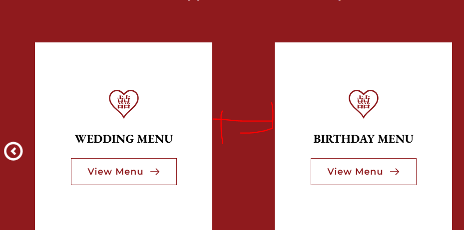
hi can you advise to make teh gap between these cards smaller?
 0
0 -
Hi Janet,
About the artwork, could you please share a screenshot so we can better understand the issue?
To reduce the gaps between the cards, you can decrease the padding as demonstrated in this screencast - https://youtu.be/wNRoV7czmq0
0 -
the display size looks good on the desktop and tablet but not on the mobile. I have put the spacing on the column, but the spacing is not adjustable on the mobile
0 -
Video link is set to private: https://youtu.be/wNRoV7czmq0
0 -
Hi Janet, could you please share the URL so we can take a closer look? If you prefer to keep it private, we won’t display it here in the thread. The video is now set to unlisted so you can view it. Sorry about that.
0 -
Sorry another question - on the mobile menu, there seems to be missing menu items which i have added via the dashboard
I re added the faq and contact us on the mobile menu, but they are not populated. Canou please take a look
0 -
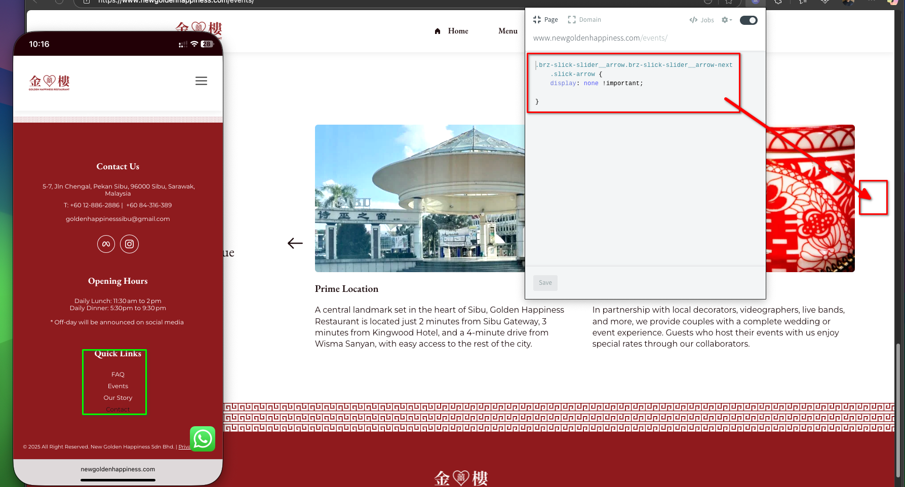
Can you also double check onn this moble page page new********pin**s.com/events
with the arrow code you gave me earlier. I can still see the right arrow appears on teh mobile version.
Thanks
0 -
Hi Janet, please use this script instead:
/* Hide the next arrow on desktop */
.brz-slick-slider__arrow.brz-slick-slider__arrow-next.slick-arrow {
    display: none !important;
}

/* Hide on tablet */
@media (max-width: 1024px) {
    .brz-slick-slider__arrow.brz-slick-slider__arrow-next.slick-arrow {
        display: none !important;
    }
}

/* Hide on mobile */
@media (max-width: 767px) {
    .brz-slick-slider__arrow.brz-slick-slider__arrow-next.slick-arrow {
        display: none !important;
    }
}
Also, about the menu — I noticed that the FAQ and Contact links are already visible in the footer menu.
 0
0 -
if you hover to menu dashboard in the wordpress backend, I have added the faq and contact on mobile menu. ( im not looking at footer meu), but the mobile menu, there is missing menu item on the list
0 -
In response to the below link: you can access https://www.newgoldenhappiness.com/events
to check the artwork (red pattern line) above footer here. Awaiting for the fix
Hi Janet, could you please share the URL so we can take a closer look? If you prefer to keep it private, we won’t display it here in the thread
0 -
Hi Janet,
Please provide us with temporary access to your WP Admin page so we can take a look. Kindly add us as an Admin user to your WordPress Dashboard and send the following details to communitysupport@brizy.io. Also include the reference number 30239589414674 in the subject line of your email.
Looking forward to your reply.
Best regards,
Ariel H.0 -
done
0
Please sign in to leave a comment.
Comments
82 comments