desktop site layout different on different screens
Dear Brizy team,
I am currently building a site using Brizy. Checking your tutorials I am aware that I can design the site to look nice on different devices using the view port options "desktop", "tablet" and "mobile" but I have the problem that the design I am making for desktop, does look different on my laptop screen (15", resolution 1920x1080) to a regular desktop screen (21" 1920x1080)
Please check the two screenshots below. What could I do to make the site look good on both screens?
Best regards,
Max
-
Look of the website on a laptop screen 15" - looking good:
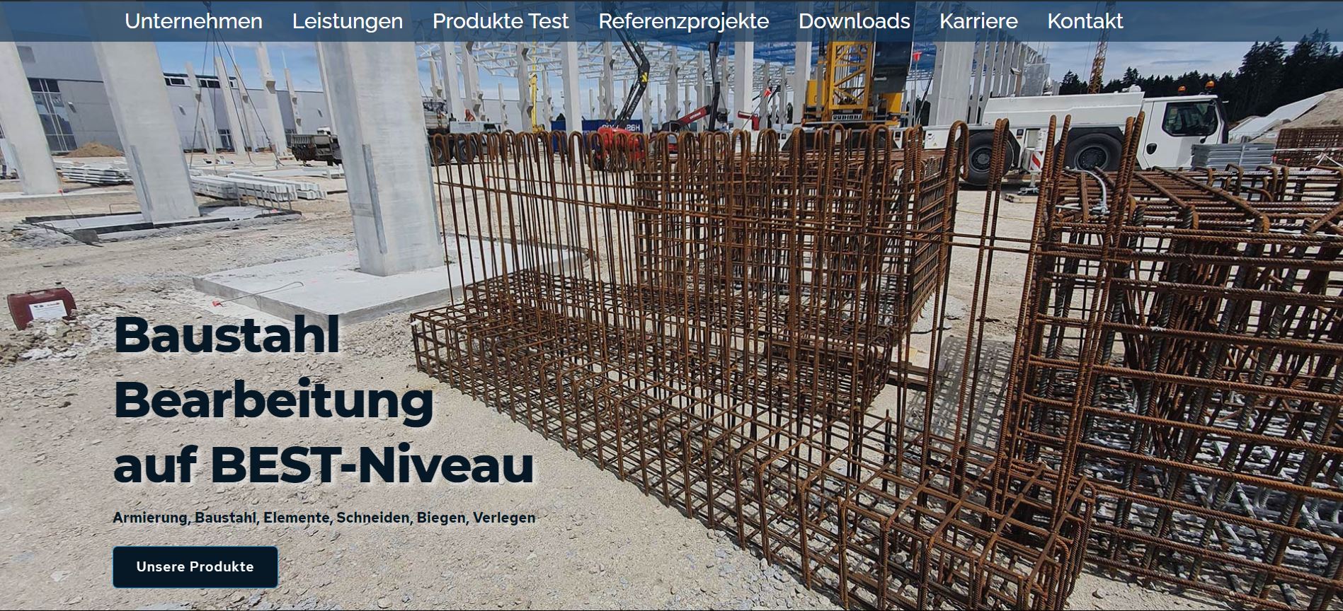 0
0 -
Look of the website on a PC screen 21" - looking distorted: (the menu bar is not at the top)
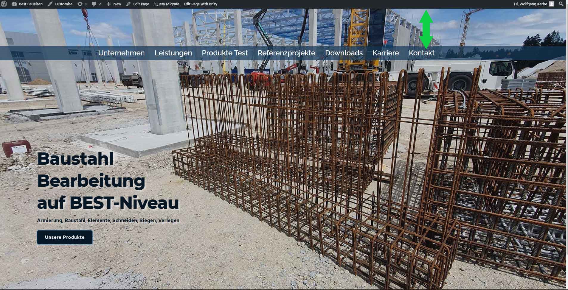 0
0 -

Hi Max,
This inconvenience is related to this inconvenience. When we will discover how is created the section with the menu, we will solve this problem too. As they both are related, could we please keep the discussion in a single place?
Thanks!
Best regards,
Sandra0 -
OK, will respond there!
0
Please sign in to leave a comment.
Comments
4 comments