mobile view is not mobile view

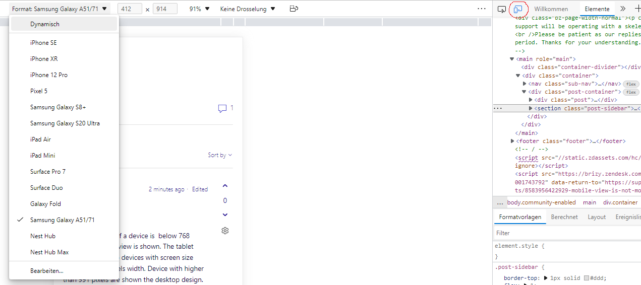
just wanted to check what pixel width the mobile view in Brizy editor is?
finished my page with all mobile views and stuff, checked it on my phone and well it looks broken. Even if I set my browser to emulate e.g. an iPhone SE it looks like this:
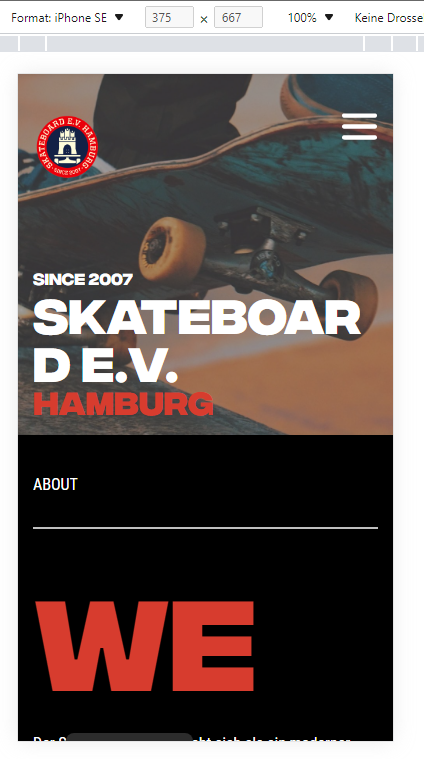
attached the same view in brizy builder:

seems it has a width of mybe 400? is there a way to change the width for mobile views?
most phones dont have that width, maybe iPhone XR of Samsung Galaxy S20 Ultra, but not a "normal" Pixel 5, or an iPhone 12 Pro
Skateboard e.V. Hamburg – Skateboarding in Hamburg (skateboardev.de) here the page
cheers,
Gerry
-

Hi Gerry,
If the screen size of a device is below 768 pixels, the mobile view is shown. The tablet design is shown to devices with screen size from 767 -991 pixels width. Device with higher than 991 pixels are shown the desktop design.
iPhone SE seems to have screen width of 640 pixels. To avoid the text getting wrapped around in smaller screen phones, please reduce the text size in the mobile design view and also remove all margins and paddings around the text
On your website, consider reducing the font size of SKATEBOARD E.V. If you see any margin or padding around this text, consider removing it.
0 -
thanks, maybe as a feature request, it would be possible to have mobile views for different devices (like in the Dev-Tools from MS Edge)?
 0
0
Please sign in to leave a comment.
Comments
2 comments