Button Text not centered

Hi,
I am building a new site using Brizy and the button text appears to be misaligned vertically on different devices. Some show it perfectly, like on my screen, but others show it aligned above the center. See screenshots.


-

Hi,
Please provide the link to your website and we will look into it.
btw: do you have any optimization plugins? Please also make sure you have the latest Brizy versions - Free 2.3.33. and PRO 2.3.26.0 -
https://community-insurance-services.mysites.io/
Username:....
Password: ,,,
No optimization plugins are active and latest versions are installed
0 -

Hi Ben
I looked at your homepage on a Windows 10 laptop using Google Chrome. This is how it appears at my end https://jmp.sh/ibf00fK. I do not see any misalignment of button text.
On what browsers and what devices, do you have the misalignment problem for your button texts?
0 -
Seeing problems on Apple devices - iPhones and MacBooks using Chrome. Text still slightly aligned above center.
0 -
Submit button slightly off on iPhone Chrome browser.
 0
0 -
Hi Ben
I asked one of my colleagues to do a test of your website using Google Chrome on her iPhone. Here is the screen recording she made. https://jmp.sh/JGNN5mW
Like you said the button text seems to have a mild vertical shift towards the upper half. I think it is hardly noticeable.
0 -
I agree it is hardly noticeable - but enough for my client to notice and ask. Anything we can do to fix?
0 -
Hi Ben
Since this is a browser specific issue, we do not have an easy solution. Only possible solution is for our developers to research this and come out with code to correct the alignment issue on google chrome on iPhones and Macs. This route is likely to take several months as our development team has many other priorities at the moment.
Besides, the vast majority of users go with the combination of Android phone with Google Chrome or iPhone with Safari. People who use Google Chrome on an iPhone may be a small minority.
0 -
I don't love the idea of discounting iPhone users who use Chrome. To me, this seems like a very large category of people (myself and client included), who are targeted by this response and need this issue resolved. Would love to stay updated on this topic and hear of ways to fix it when it becomes available.
0 -
Hi Ben
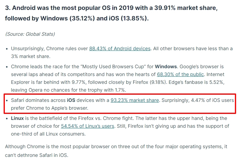
I am sorry; but did not mean discounting iPhone users who use Chrome. Let me restate what I meant. What percentage of the market may benefit from the proposed change is a consideration when deciding the priority for a proposed feature. If you look at this article, it says "Surprisingly, 4.47% of iOS users prefer Chrome to Apple’s browser." https://review42.com/resources/browser-usage-statistics/
Sure; will updated you on this topic when a fix becomes available.
 0
0 -

I had the same problem with Overpass-Font. Changed it in my case to red hat and button text-allignement is fine.
0 -

Hi, I have the same problem, only for me it seems to be misaligned consistently (I use mostly Chrome on my iPhone, but the screenshot below is from Safari). The button text is misaligned (it doesn't show in the Brizy editor as much, but becomes more noticeable when I change the button style to "default" -- usually I am using Overpass-Font as well).

This is in Brizy editor (I'm using WordPress plugin PRO):
Where can we customize text alignment (left/right/center -- center desired for most I assume) for buttons please (or how to fix this otherwise)?
FYI, I am having the same issue with buttons on other pages, so not specific to this page or form only.
Thanks!
0 -
FYI, I just tried to fix it with this CSS code:
.wptb-button {
justify-content: center !important;
}At first it seemed to work, as it aligns on desktop (was only slightly off before), and it also aligned in the Brizy editor "default" view.... however, still it's misaligned on all mobile browsers (tested on chrome, safari, and mozilla/firefox).
0 -
Hi Jenna,
Can you please share a URL where we can test this issue?
0 -
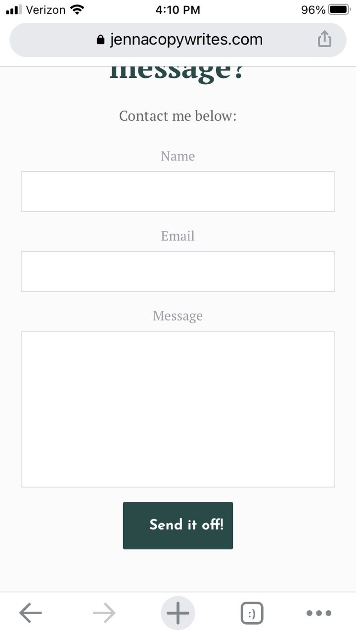
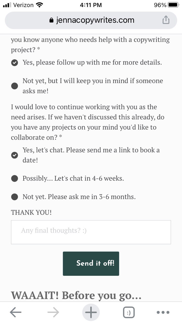
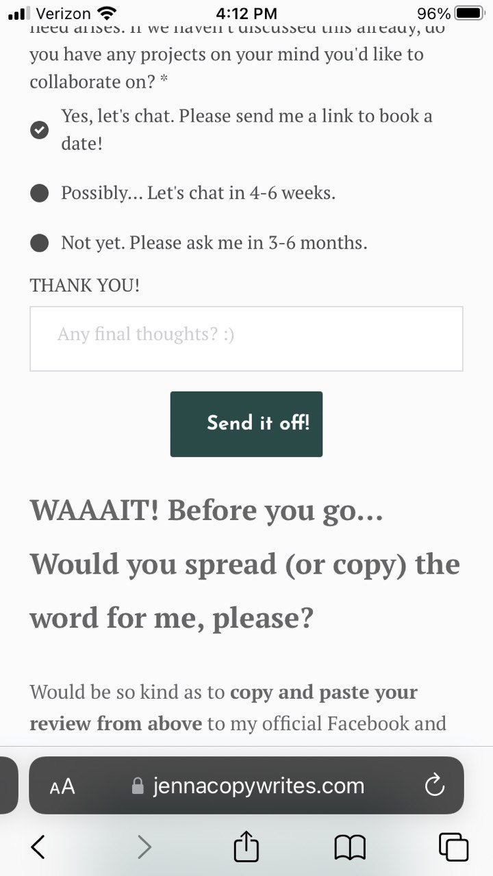
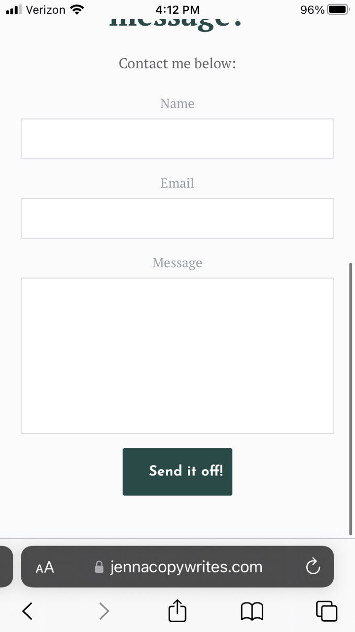
One page: https://jennacopywrites.com/project-feedback/
Other page: https://jennacopywrites.com/ (Here, it is even still off on desktop I'm seeing, I think I didn't add the code there)
I think it's an issue on all my pages/forms/buttons(?), however all others are still in draft.
0 -
Hi Jenna,
Check out the screenshots in this folder, please. These screenshots are from Google Chrome, Firefox, and Safari. https://jmp.sh/f3OElPH
On my end, the buttons appear to be fine.
0 -
Well, I don't know what devices or resolutions you're using, but they are still all off on all devices and browsers I'm checking (see my screenshots below); no change. How can this be addressed/fixed, please?
 0
0 -
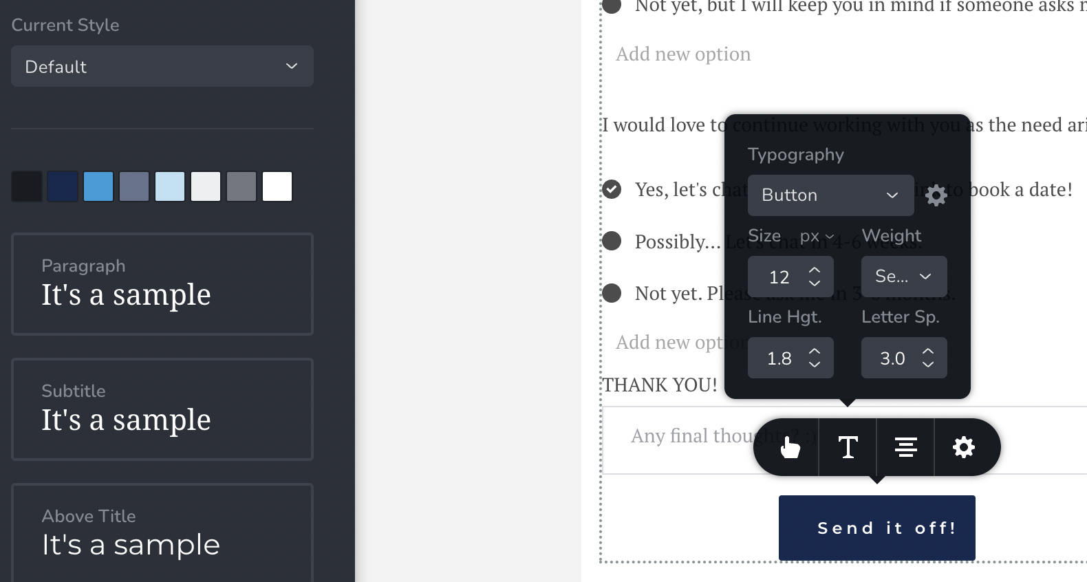
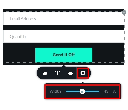
Hi Jenna,
Please try this workaround to fix this issue. Increase the button width in the mobile design view by selecting the gear icon and moving the width slider.
 0
0 -
Just tried that; still didnt fix the misalignment issue. :((
0 -
Hi Jenna,
The button doesn't appear to be wide enough on a mobile device. Please note the empty space on either side of the text "Send it Off" in my example above. Please make the button wider so that there is enough of room on both sides of the wording "Send it off" and check if it resolves the problem.
 0
0 -

contains have css padding: 0 26px;
The text is always centered on the button, so this css code is not helpful.Setting padding: 0 will solve the problem.
I add a css ! important to override the default css, but you should fix them.0 -
That seemed to have fixed it, KC George, thank you! (Although I don't really understand why the button can't be more narrow, but it doesn't matter. :) )
vantrinh duong – thanks for responding. I didn't create the CSS, I had simply searched for it and then tried it... Thanks for your suggestion with "! important" – I didn't know that!
0
Please sign in to leave a comment.
Comments
22 comments