Problems with differences Desktop and Mobile

Hello,
We have the problem that there is a big difference between how our website looks on desk and on mobile.
Can you take a look at it?- moeitelooszien.nl
1. The yellow area behind the eye is there on the desk version, but not on the mobile version (see first box)
2. I have removed the tabs on the mobile version in the text about the meaning of the letters of Motto, because it looked very messy on mobile (the second box). Now it is also without tabs on the desk version and that looks less clear. I have tried to use tabs to get a clean alignment again in desk, but I cannot do it now. The desk version also looks messy now. How can I get this right on both versions?
3. The letters on the yellow background (the third box) look completely different in the Mobile version. Why is that? How do I get this to look the same?
4. The photos have a different size in mobile than in the desk version. The height is at 50%. I see that this is very easy to change, but I am curious why this change is applied automatically.
I did not expect that there would be such a big difference between desk and mobile versions, and that it would require so many adjustments. Should we design our website differently? Or does this require adjustments from Brizzy?
Thanks for thinking along
-

Hi Frowa
Brizy allows you 100% flexibility to design your page for desktops, tablets and mobiles. While you can adjust the margins, paddings, font sizes colors etc for each device, the content is uniform across all three devices. If you delete an image, icon, a button or text in any device it gets deleted from your page on all devices. When you deleted tab in the mobile view, the element was deleted from your page on all devices. If you would like to show certain page elements only in desktops, you can hide those elements in tablets and mobiles (and not delete it)
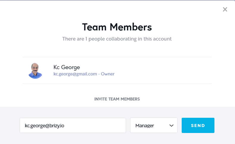
We will need to take a look at your project to help you make your web page more responsive. If you need this help, please add me as a Team Member to your Brizy Cloud project. My email: kc.george@brizy.io. Please assign me the Manager role to help you with this. Once you have sent me the invitation, please let me know here.
 0
0 -
Hi Frowa
I have made few changes to your mobile design. Please take a look and see if your like it.
- In the "Motto van Moeiteloos Zien" section, I have placed the text in rows so that you can organize text better in the mobile design.
- I have added the missing background image for the mobile.
- In the third section with text in front of yellow background image, I have placed the text within columns so that you can adjust the column width in different devices.
Feel free to customize the design further according to your need.
0
Please sign in to leave a comment.
Comments
2 comments