Mobile Header Takes Half the Screen

Hi there,
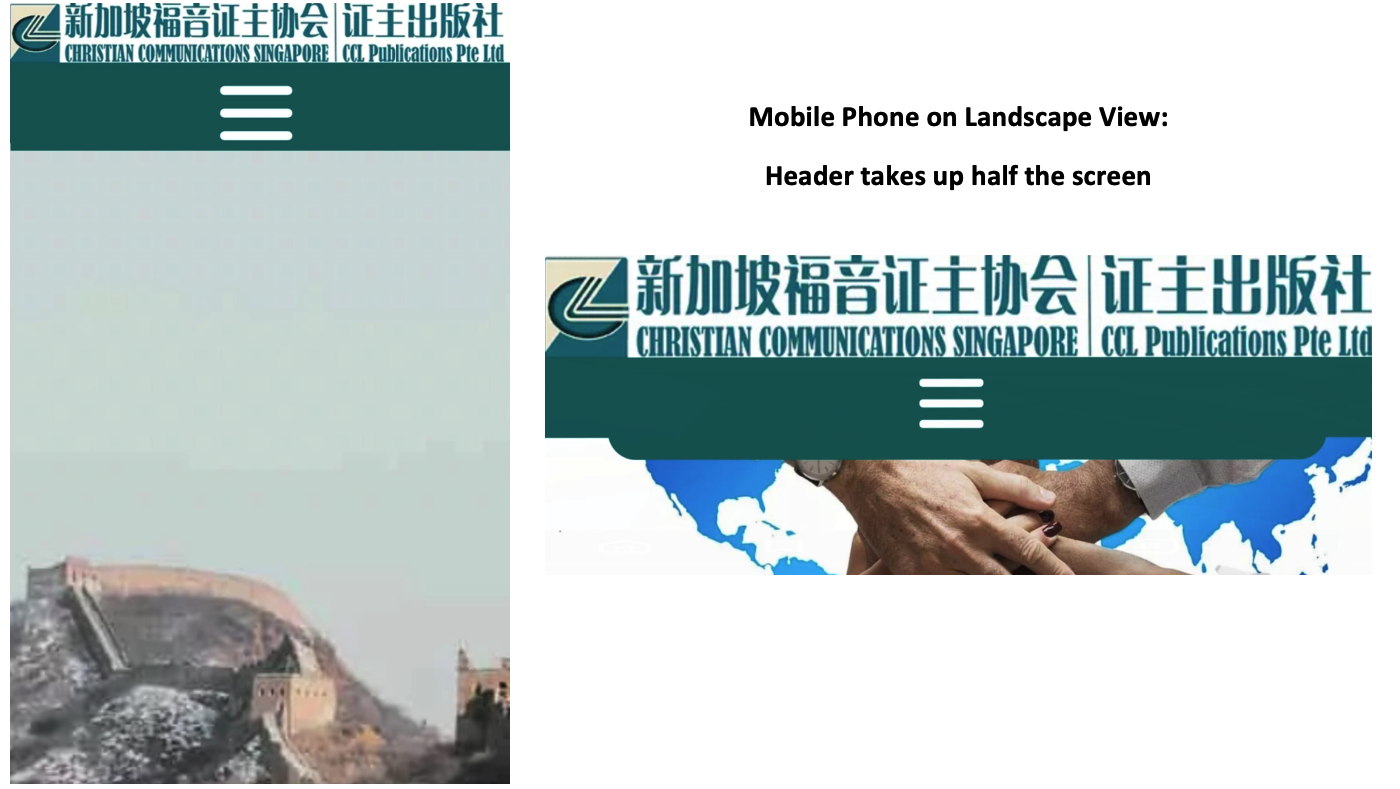
The mobile header looks fine in portrait mode but takes up half the screen in landscape. Please say that there is a way to fix this as the site is not usable on landscape with a sticky menu. Brizy starter template with the latest Pro version.
Thanks
Albert
-

Hello Albert,
Thank you for your message!
I would kindly ask you to sent us the link to your website. At the same time, please make sure you have all the browser and server cache cleared and disable the themes and plugins you do not use. Hope to hear from you soon!
Kind regards,
Doina
0 -
Hello Doina,
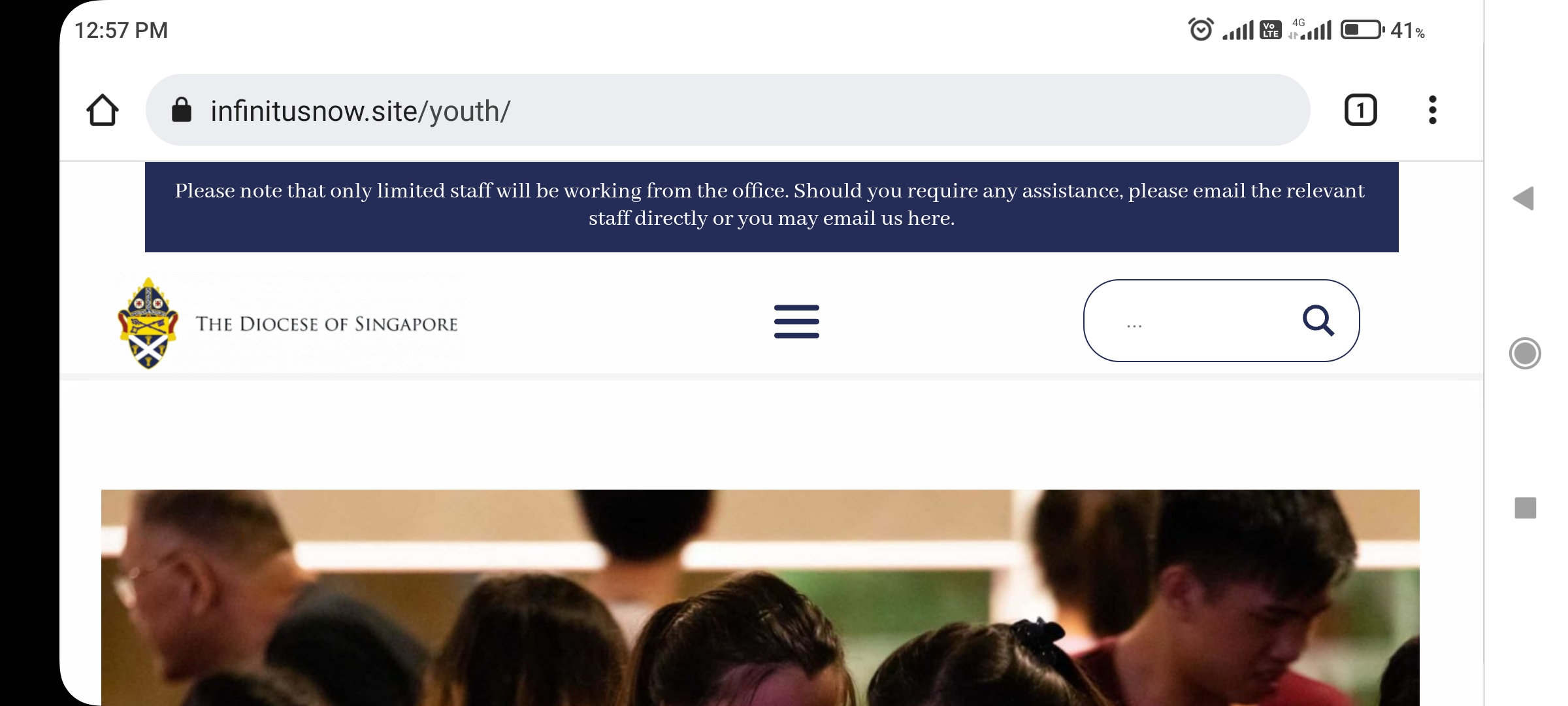
Thanks for your prompt response. Please help me with a puzzling question; this is more urgent as I will be showing the site to the client tomorrow. On this page https://infinitusnow.site/youth/
1. No URL has been added to the images of the slider but every image has a URL to another page: /events. This URL is visible when you hover over the images with another device.
2. When I tried to add another URL to the images (of the present page /youth) to test, /events is still embedded.
3. All sliders on the site has /events embedded into all the images.
4. I looked at the Page & Frame sources and cannot find this /events URL
Thanks! Blessings,
Albert
0 -

Hi Albert
When inspecting your page https://infinitusnow.site/youth/ we can see the events link. https://jmp.sh/isSq5Od May be the link is not added to an image, but to the container around it. This link seems to override other links you may add to the images. Unless you find this link and remove it, adding links to individual images may not work.
The URL https://infinitusnow.site/wp-admin/ is returning a Page Not found error. Hence could not check your WordPress backend.
The blue strip notification at the top of your page take half of the mobile screen when you are viewing it in landscape mode. You need to plan how you want to redesign the page to have more content visible when viewing in mobile landscape mode.
0 -
Hi KC, 1. Thank you for your prompt help! The blue toggle is hidden under the grey toggle and it took a very long time of trial and error to be able to delete the URLs. 2. Landscape Mode: We tested using Blocksy and the menu doesn't cover half the screen. Dimi suggested using the Brizy Starter theme as it is the lightest. a. The landscape view of Brizy Starter is not optimised unlike Blcoksy and other themes. b. Or allow us to view and edit in horizontal mobile mode. Currently, we can only edit in vertical mode. Thanks. Blessings, Albert ᐧ
0 -
Hi Albert
I am glad you could delete the hidden URLs.
If Blocksy theme works better for you, please use it. It is the favorite theme among Brizy users.
Editing in mobile landscape mode is not possible at the moment.
If you want us to take a look at your WordPress backend, please let us know. We can offer better help when we can see your project.
0 -
Hi KC, Many thanks for your help.
1. We're not using Blocksy because the Brizy Starter theme is lighter and allows greater control of the header & footer elements.
2. Blocksy was used as an example to show that the Brizy Starter theme has not been optimised for Landscape view. If it were optimised, the header would be stretched out in the Landscape view, like Blocky and other themes. It will not take up half the screen.
3. Thanks for the reminder to give you backend access which was already set up.
a. I wonder if you can do anything about the Landscape mobile view as I have already tried to minimise the height of the header.
b. Since you are good at searching for hidden elements, could you see why the word "thin" appears in the excerpt of many search results? The word "thin" doesn't appear anywhere on the pages. Even if it does, "thin" shouldn't appear as the first word of the excerpts.
Examples:
Official Statements – The Diocese of Singapore (infinitusnow.site) (https://infinitusnow.site/official-statements/)
Our Anglican Identity – The Diocese of Singapore (infinitusnow.site) (https://infinitusnow.site/anglican-identity/)
Thanks! Blessings, Albert
0 -
Hi Albert
I have made some changes to your page https://infinitusnow.site/youth/. I have attempted to reduce whitespace around the header in mobile and tablet views to make the elements closer to each other. However, the changes are not reflecting in the live site.
Please check if you have server side cache or CDN cache. Purge all Cloudflare cache and any other server side cache and check the page.
0 -
Hi KC, 1. Many thanks for your help! I will clear all cache and update you. 2. Please ignore the "thin" issue. Blessings, Albert
0 -
Hi Albert
After clearing cache, I can see more content in the mobile landscape mode. You can see some whitespace between the header and the photograph in the hero section. If you reduce the top margin of your hero section in Tablet design view you should be able to see a bit more of the photo in mobile landscape view.
 0
0 -
Hi KC Thanks for your efforts! The improvement is not visible on mobile landscape view (below). Are there workarounds eg can I turn off the sticky menu for mobile only? Blessings, Albert ᐧ
0 -
Hi Albert
Turning off sticky menu just for mobile is not an option with Brizy.
Please purge cache and you will see that little more of the content is visible in mobile landscape view; the header will occupy approx. 40% of the viewport and the rest 60% would be page content in mobile landscape mode
0
Please sign in to leave a comment.
Comments
11 comments