Landing page design

I'm struggling to design a landing page. I've spent two hours trying to get rid of this white line in the middle of my page and the white space at the bottom of the page. I want just the block not added white space beneath it. Can you advise please.

-

Hi Nick,
We have modified the layout to improve the alignment and remove the white vertical line. Your original design has been saved in the Saved Layouts area in case you need to restore or review it later.
In the updated layout, we set the image as the background of the first column and added a Spacer element to maintain the correct height and allow the image to fit properly within the column.
For the second column, we centered the text and form and applied the same dark background color. We also set the column’s margin and padding to 0 to remove unnecessary spacing and prevent the white vertical line from appearing.
The new design has also been optimized to remain responsive on mobile devices.
We can also prepare a short screencast demonstrating how the layout was built, so you can recreate it yourself next time. Please let us know if you would like us to make one for you.
Kind regards,
Ariel H.0 -
Thank you, Ariel, that's great. And yes, it would be really good to have a short screencast because I want to make some more landing pages in the future. Thank you very much.
0 -
HI Ariel, the white section at the bottom is still coming up for me: https://www.thebookmarketer.pro/email-course
0 -
Hi Nick,
The white section at the bottom has now been replaced with the same dark background color.

I’ll create a short screencast demonstrating how the layout was built and reply as soon as it is ready.
Best regards,
Ariel H.0 -
HI Ariel, Can you remove the bottom section completely please as it throws out the dimensions of the landing page. thanks
0 -
Hi Nick,
Could you clarify how you would like the page to appear after the bottom section is removed?
Because the main design uses a wide horizontal layout, it cannot fill the entire screen without either being cropped or leaving some empty space. We could:
- Center the block on the screen, with dark borders at the top and bottom and slightly on both sides.
- Keep the image section at the top and move the form underneath it.
- Adjust it based on another layout you have in mind.
Please let us know which option you prefer.
Best regards,
Ariel H.0 -
Hi Nick,
I believe I now understand what you’re referring to based on the attached screenshot—the empty space beneath the image in the left column.
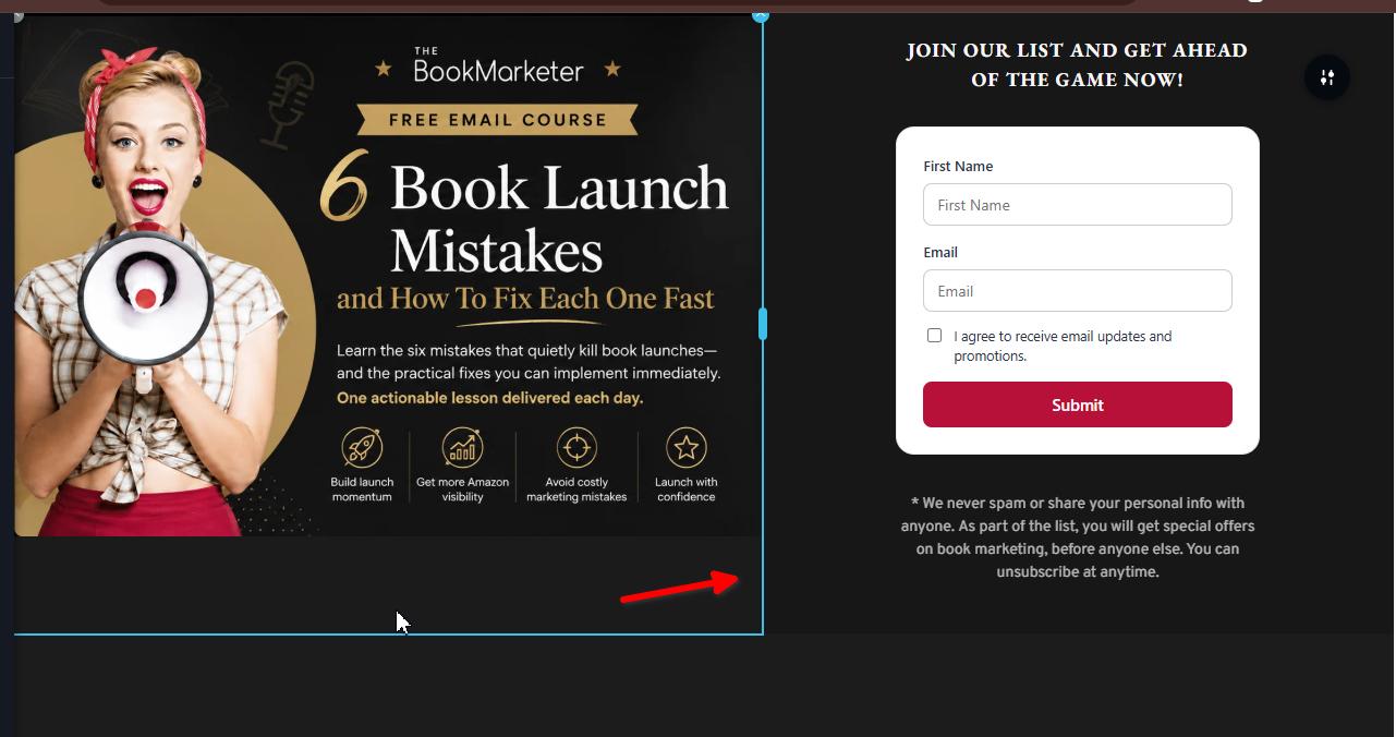
The current layout looks good on larger screens, but the issue becomes visible on smaller screens. We’re currently checking how we can best resolve this and will update you as soon as we have a suitable solution.
Best regards,
Ariel H.0 -
Hi Nick,
We’ve updated the landing page. This is how it should appear on most screen sizes and displays:
Could you please take a look and let us know what you think?
0 -
HI Ariel, I juast want my landing page to look like this without any extra space around it. How do I do that? Please see my example image.
 0
0 -
Hi Nick,
The landing page is already quite similar to the screenshot you provided. However, we cannot completely remove the gap underneath because the main design uses a wide horizontal layout.
Brizy automatically enlarges or crops the image to adapt it to the page dimensions. To fill the entire screen, more of the image would need to be cropped, which may cut off parts of the design. Keeping the full image visible will naturally leave some space underneath on certain screen sizes.
Best regards,
Ariel H.0 -
What dimensions do my images need to be in to make it work? Currently it looks very clumbsy with all the sapce below it.
0 -

Hello Nick,
Have a look at https://restaurant-1.brizy.site/landing. I would recommend the size 1600 x 1500 pixels for the ad image. You can see the image I have used at https://jmp.sh/6JoQHrUO. Kindly set the left column width to 60% and right column to 40%.
Kindly also consider adding 10% blank space at the top and bottom of the adcopy
0
Please sign in to leave a comment.
Comments
12 comments