Mobile Checkout page issues

Hello,
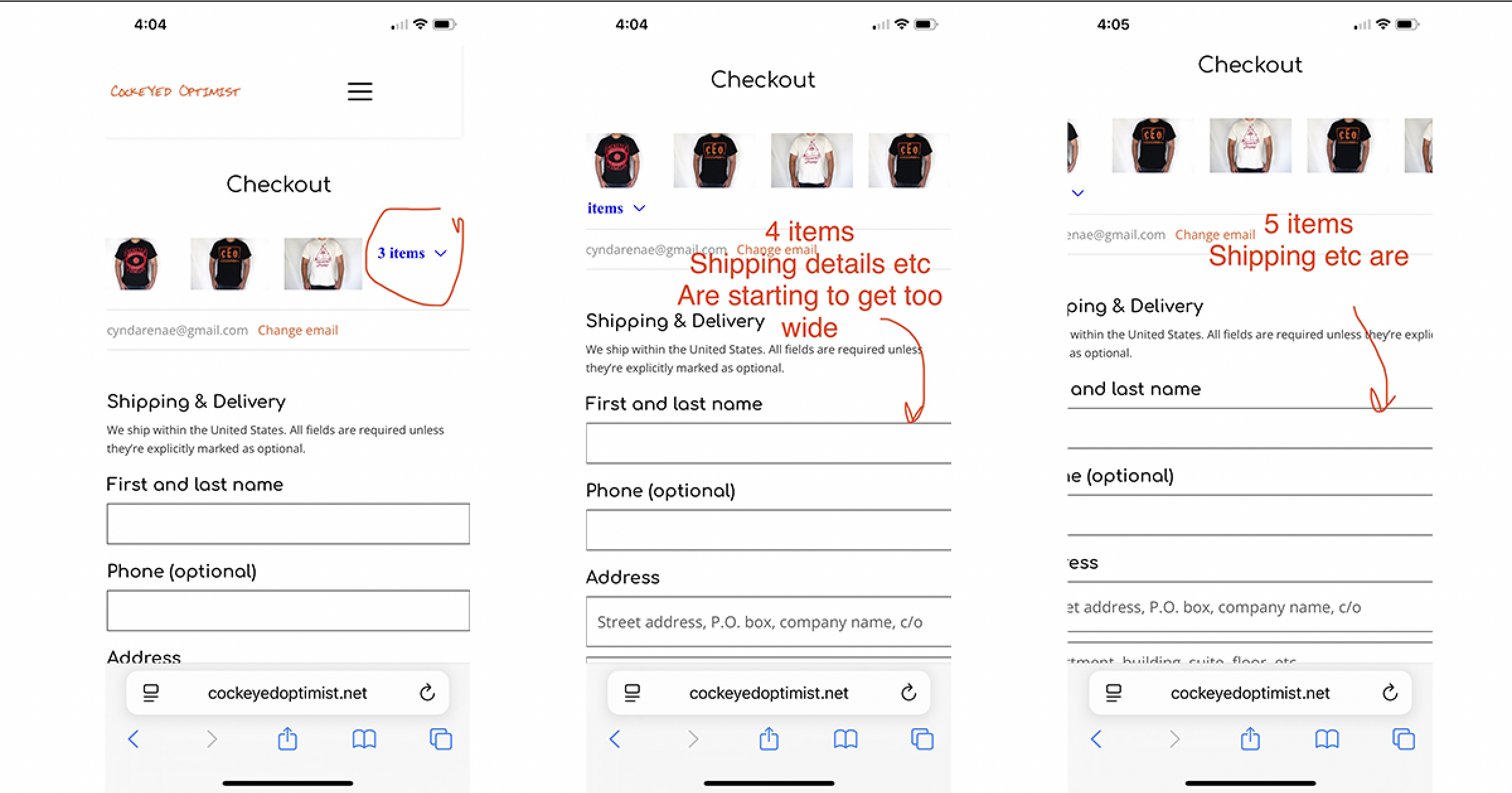
My checkout page looks terrible on mobile if I add more than 5 products. I have included 5 images below to illustrate the problem.
I have tried everything I can think of in the Cart Template of the store section--adding different padding, margins, making the mobile only 80 or 90% of the bounding box. I am only able to customize the "Cart" Step. When I try to customize "Address, Shipping or Payment" Steps under the dropdown, my page is just blank-- there is just an empty few pixels wide bounding box.
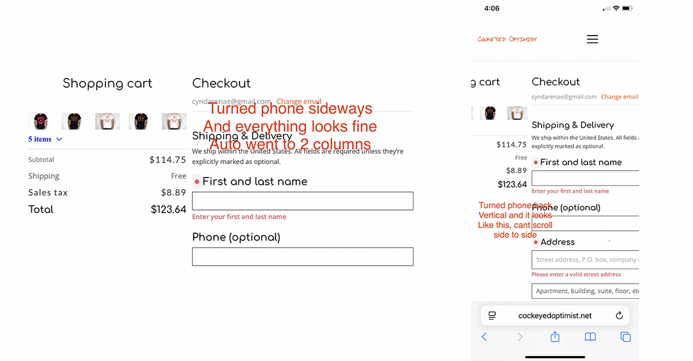
The images included show the difference of how it appears when adding a different number of products: 3, 4 or 5. The mobile Checkout looks fine when turning phone sideways, however when turning it back it looks awful and can't scroll side to side.
What can be done about this?
Is there a way to make the Cart/Checkout experience be 1 column only?
-

Hi Cynda,
Thank you for the detailed explanation and screenshots.
It appears that this is a glitch on our side affecting the Cart and Checkout template, particularly the Address, Shipping, and Payment steps. We have already informed our developers, and they are currently investigating the issue.
Unfortunately, we do not have an immediate workaround or an estimated resolution time at the moment. We will get back to you as soon as we receive an update from the development team.
We apologize for the inconvenience and appreciate your patience.
Kind regards,
Ariel H.0 -

Hello Cynda,
Victor Poalelungi, one of our developers, has requested access to your workspace to investigate the bug in your project. We've granted Victor access to your workspace. Once the troubleshooting is completed, we will revoke his access.
The Brizy Shop feature is developed in collaboration with Ecwid. The above bug is on the Ecwid side. We will contact Ecwid Support to investigate it further.
0 -
Hi Ariel and KC,
Ok thank you for doing this. I know it will help everyone with Brizy Shops! And thank you for contacting Ecwid, because I was unsure if signing up for an account with them would fix it and also how to get the accounts to communicate.
I know you said Victor will be logging in to troubleshoot the bug, this is totally fine with me. If he figures out something coding-wise to fix this in my account, can you also put it in my other Brizy Shop account for ReconciledGreetings.com ? It's actually more of an issue for that account, because of the type of product being low-cost.
Also, 2 other minor bugs when adjusting the Cart Template.
1. If you click "Continue Shopping" it brings up a page "Featured Products". On that page, all the product listings are not formatted with the correct fonts and such. There doesn't appear to be any template that relates to this Featured Products page.
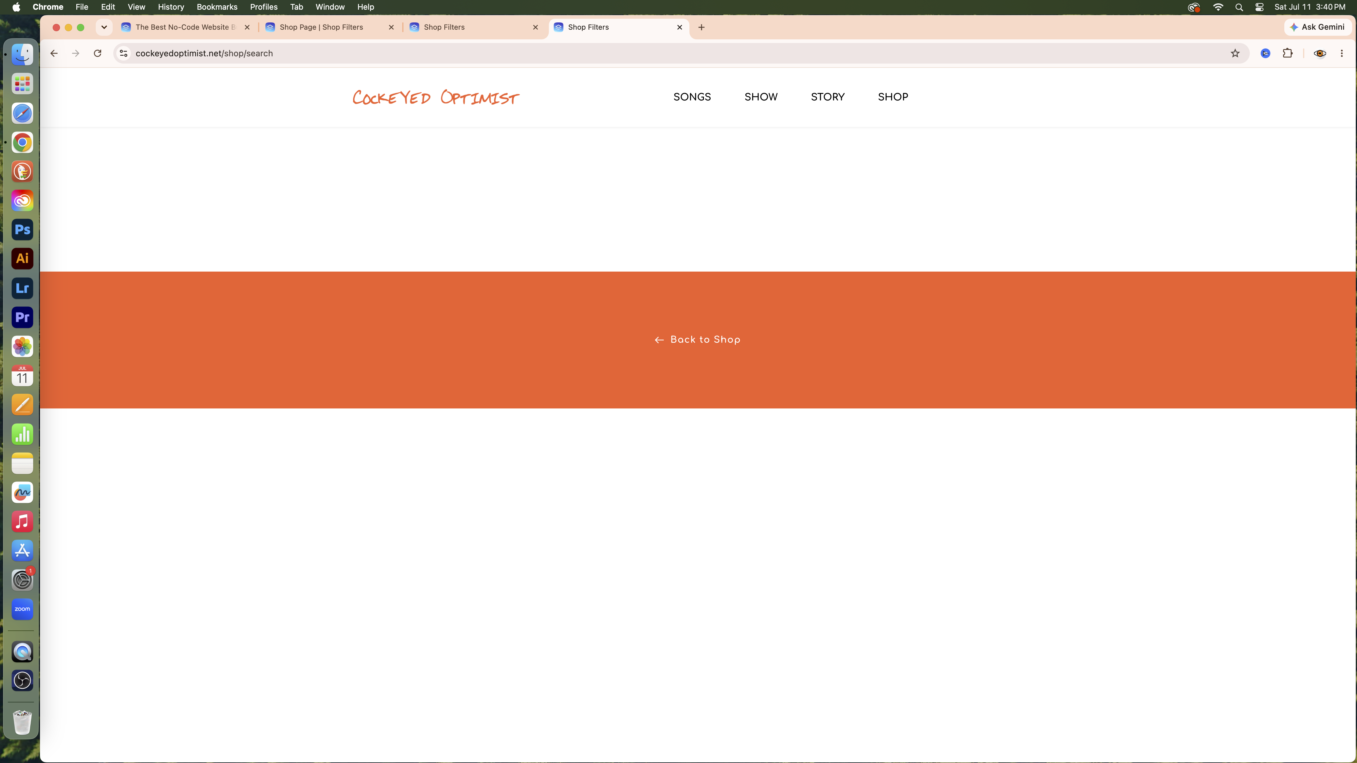
2. If your cart is empty, and you click "Browse Store" the page is just blank, like the image below. I added the Back to Shop so that there's somewhere to click.
Thanks for your help!
 0
0 -
Hi Cynda,
Thank you for the additional details.
We are still looking into the main issue, and it may take some more time to investigate. We have also noted the two minor issues with the Featured Products page and the empty cart page, and we will try to replicate them on our end.
We appreciate your patience and will keep you updated.
Kind regards,
Ariel H.0 -
Hello Cynda,
We apologize for the long delay in resolviing the bug with the Address, Shipping and Payment screens in the Cart and Checkout template. We have finally fixed it.
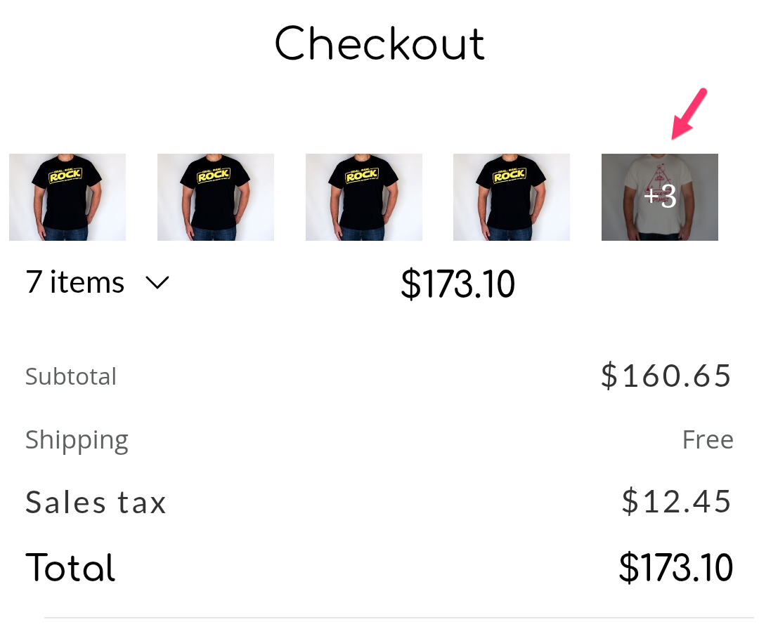
When the cart has more than 4-5 products, initially products are displayed horizontally in the mobile design view. However if the user would click on the last image, the products in the cart will be displayed vertically and the Shipping form fields will be visible within the view port. See the screenshot at https://jmp.sh/share/ykecTAyquivE1VKDTXhg.
We have hidden the "Continue Shopping" link in the template since you have added the "Back To Shop" link in the footer
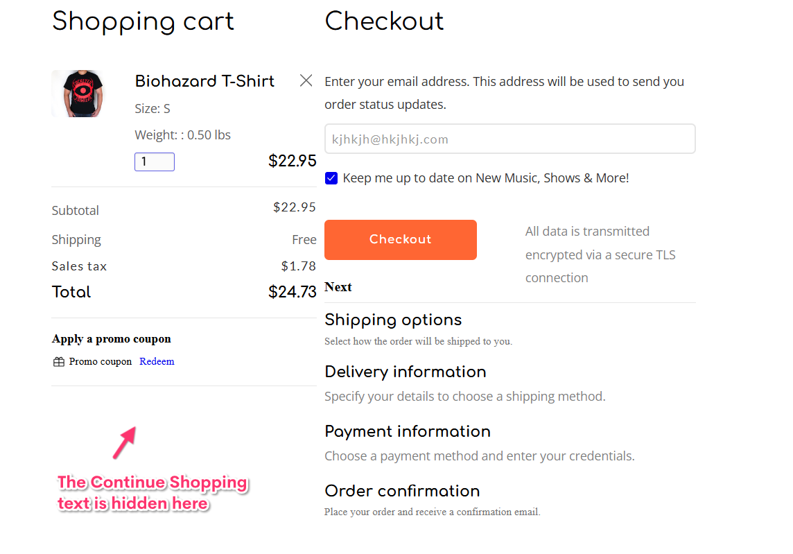
When the cart is empty and when clicking on the "Browse Store" link, it now takes you to the Shop page with the Product Filter. You can customize this template by selecting the "Shop Filters" template.
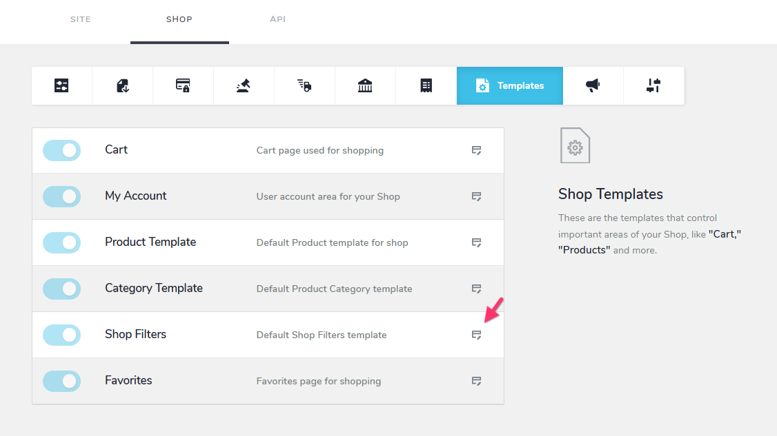 0
0 -
Hi KC & George,
Thanks for adding the Address, Shipping & Payment in the Template.
The issue is remaining though. These look perfectly fine in the Brizy Builder, but when actually trying out the Shop in Chrome mobile (app store says was updated Aug 11), the spacing problem is still there. And I did see how if you click the last product it brings them all up vertically and it looks very nice. But as soon as you then go to add your Address the ends of the boxes are chopped off again.
What appears to be happening is as you add more products to the Cart, the "Envelope" (I'm not sure what else to call it) of the webpage gets larger. So I'll just make up numbers to illustrate my point. If the Mobile Shop page is 500 px wide when there are 3 items in the Cart, it's like the page is now 525 px wide when there are 5 items and the edges get cropped off. I have tried every way of more/less Margin, more/less Padding, 85%,90%,100% on the block and the element.
Also, even with the Shipping and Payment section added, somehow on Mobile, the spacing of the page keeps the 2 Column layout, after putting my Address in and hitting Continue. (Screenshots below) Is there a way to just completely TURN OFF the 2 Column Layout? Because it seems that the mobile gets confused as to which layout to go into and causes the issues.
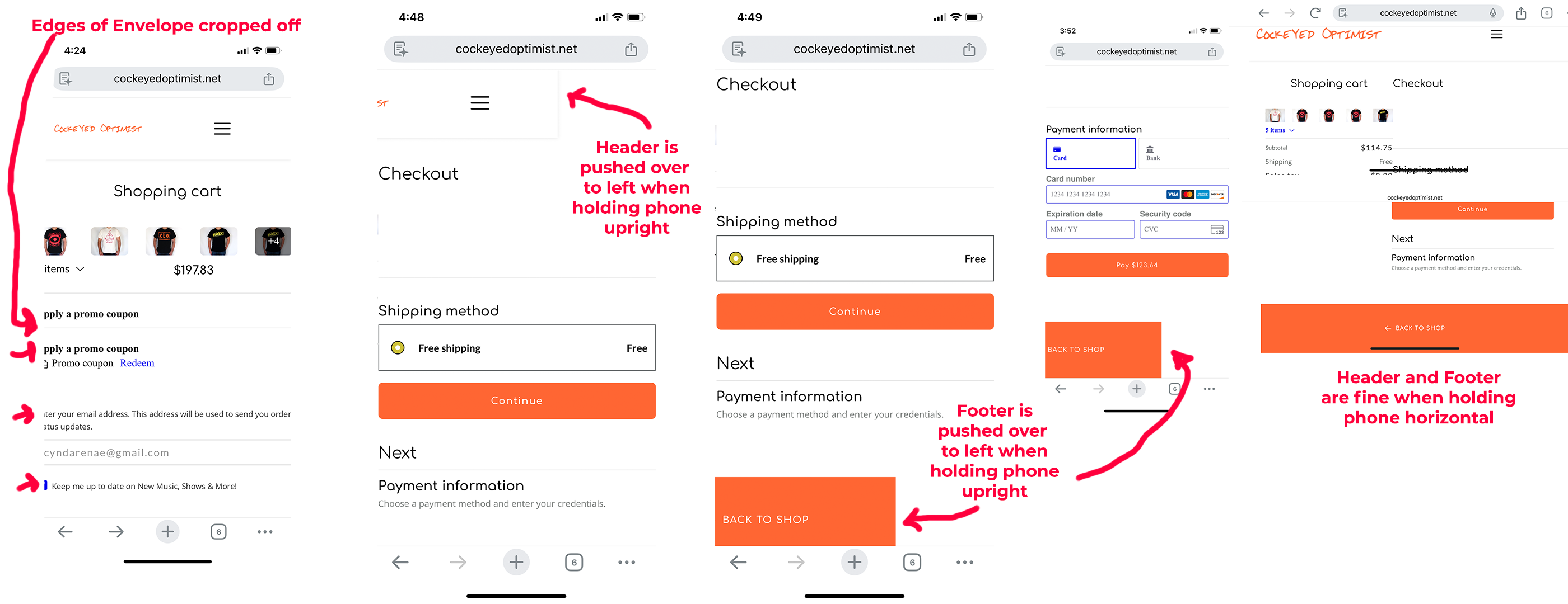 0
0 -
Hello Cynda,
We will work on fixing the above issue.
In the meantime, we've added some JavaScript code at the footer of your website to display the products in the cart vertically on mobile devices. This helps to bring all content of the Cart page within the mobile view port. Please check the mobile cart page again.
0
Please sign in to leave a comment.
Comments
7 comments