Making slider responsive on the mobile view

Hello,
I really would like to know if there is a way to make the slider responsive. I have a block on the top of the homepage and I made it to be a slider. It seems like there is no option to change the size of it on the mobile view, I need it to show the whole picture and not only the middle part of it.
I have the same issue with the top images on the inners pages(just images, no sliders).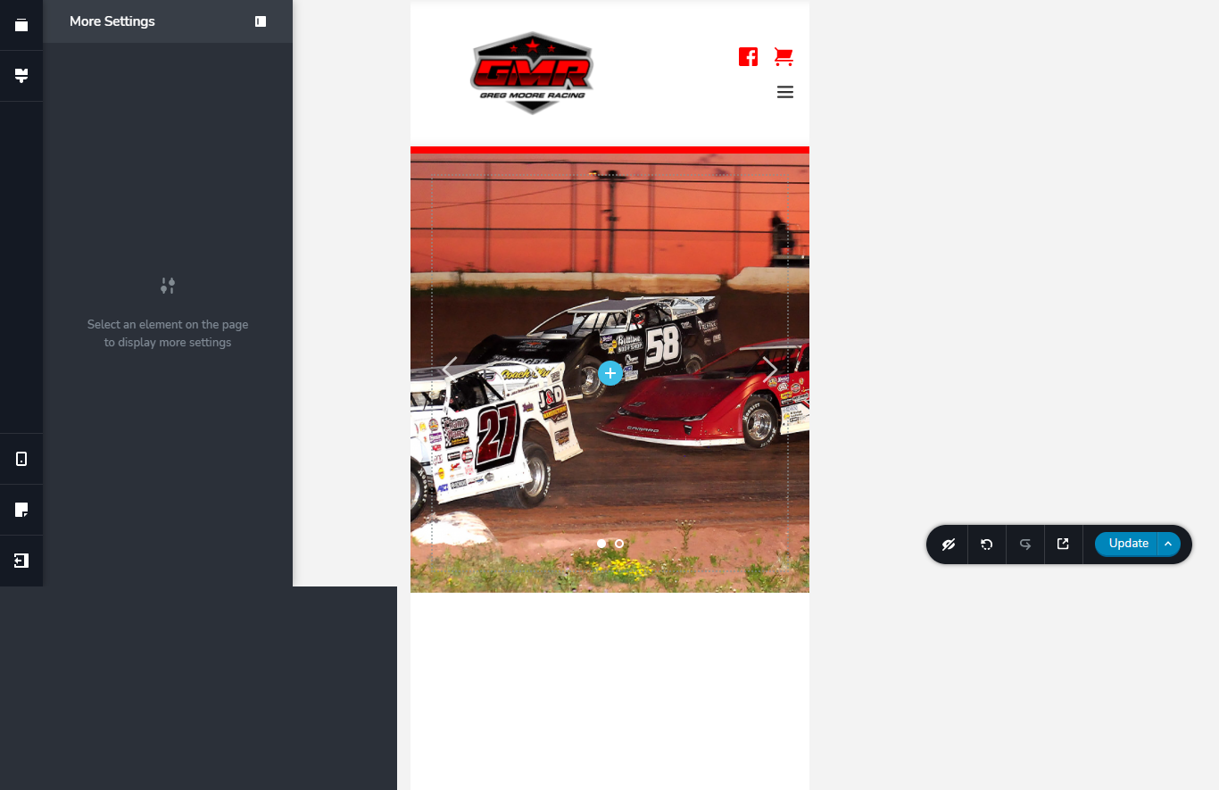

-

Hi,
Yes, on mobile mode isn't possible to set-up the height of the block. Also, I would not recommend this method because it can cause some inconveniences on the live mode, exactly the images will not be displayed on the preview mode in the way you see in the editor mode because inside the block doesn't exist any content and in the preview mode, this space will be removed. I suggest removing the background images and add inside the slide the Image element. After this set it with full width and remove all margins and padding from the slide and Image element. In such a way, on the mobile mode, you will be able to adjust the height and width of the image and display it in the way you want https://jmp.sh/5Z7IZeS.
Best regards,
Sandra0 -
Thank you!
0 -
You're welcome!
Let us know if we can help you with something else.Best regards,
Sandra0 -

Hi,
Do you have a link to a video I can refer to to do the above?
I'm just asking because I don't understand well by looking at the image.Best regards,
0 -

Hello!
I think it can be helpful for you: https://support.brizy.io/hc/en-us/articles/360019680792-Making-your-page-responsive
Kind regards,
Mihail
0
Please sign in to leave a comment.
Comments
5 comments