some weired bugs

Hi there,
I have two big things to discuss:
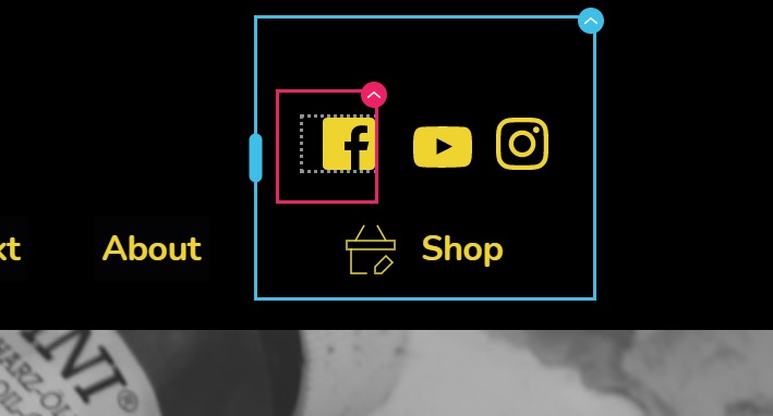
1. The icons will be displayed in the design mode a they should, but in real the are little and blue... see the attachement for that
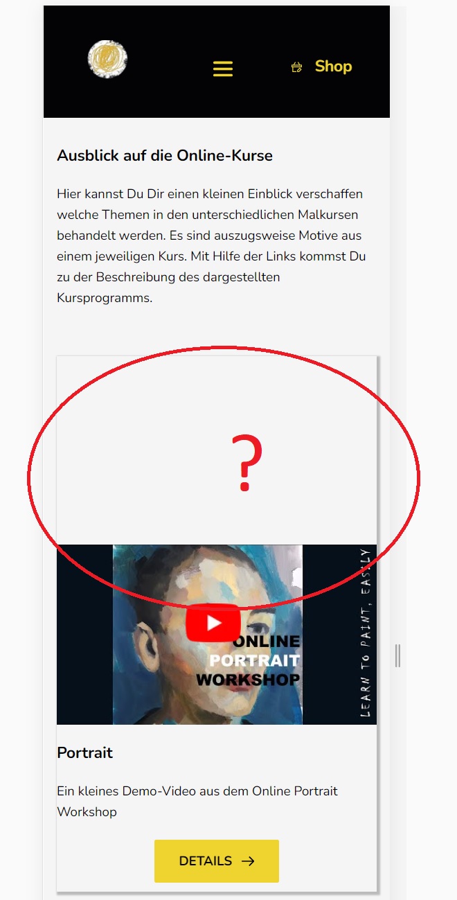
2. I use a row with 2 cols and in the forst col ther is a video 16:9 format. I the secon col there is only text. I the design view everythin look a it should (computer, tabpelt oder mobil) but in real it playes the video in middle of the row (I configuered it on top), see the screenshot for more clearity.
I think from version to version we get more features, but we get more an more bugs too. I const a lot of time to figue out what the problem is.... that's pretty much annoying.
Sincerely
Markus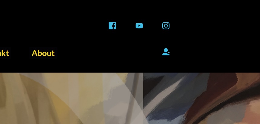
-

Hi,
1 - I checked your site and find that the problem with the icons is already solved. Could you please check it? See here.
2 - Regarding the video, I found that this space is displayed in the desktop mode https://jmp.sh/E0t7QL9. Could you please check if you didn't set the padding or/and to the video element or column where is added the video? Could you please check if you add a Custom CSS?
Do you have the latest updates for Brizy Free 2.2.7 and Brizy Pro 2.2.4?Best regards,
Sandra0 -
Hi Sandra,
the icon issue was triggered by the Autooptimize Plugin. So that's fixed.
But on the desktop video block problem I have no solution. I don't use any custom css and I use the latest version of brizy, 2.2.7 and 2.2.4.
What else it could be?
cheers
Markus
0 -
a remark...
on the same page I use some more videos (2 blocks below) and they look correct.
No idea what forces the problem with thiis.Cheers
0 -
Hi,
Just now, I checked again your site and seems that all is working fine. See here. I suppose that you fixed this inconvenience. Could you please update us regarding this? How did you fix it?
Thanks!Best regards,
Sandra0 -
Hi Sandra,
the problem was indicated by aome plugins that I used for optimization....
Thank you for your help.
I have a queastion about the right solution. I have attached a screenshot of a site. And I like to rebuild that look.
The Menue ist below the site and fixed. How can I solve that with brizy?
the bar should be always on the bottom and the content above should be fit in the rest of the view. I should work on desktop and mobile/tablet.
I there a solution?cheers
Markus 0
0 -
Hi,
Yes, I can suggest a solution for this and recreate this block. For this, you have to create an external pop-up in the Brizy -> Pop-ups and attach it to all pages, archive and everywhere you want to display it. We have some predefined pop-ups that are similar (see the Cookie pop-ups) and you can use one of them as a reference and only make some modification you need. See here. Also, you can disable the "Close" button to not allow users to close the pop-up https://jmp.sh/sm9PO2T.
Hope this will help you!Best regards,
Sandra0 -
thanks Sandra,
this is exactly what I was looking for.
One more Question.What should I do that the content above of the bottom menu area is exact the size that it doesn't show any srollbars. Espacially when I want to show large image in this area.
thx for your help
0 -
Hi,
Great to know that this suggestion works for you.
Regarding the second question - Could you please give us more details? Could you send us a screenshot of this inconvenience? Also, could you please indicate how do you expect to work?
Thanks!
Best regards,
Sandra0 -
Hi Sandra,
in the block above the menu, which is on the bottom, I wanna show an image or something other, that should have automatically the hight that it fits to every device, comuter, tablet oder mobil. I send you alrerady a photo of a sample website where this behaviour works that way.currently the will be a scroll effect in the block above the menu but this I dont want.
As an example on how it shoiuld work see the website https://redrabbit77.com
Maybe there is a solution to solve that with brizy.Best Regards
Markus
0 -
Hi,
Unfortunately, I couldn't open the URL link you send us. See here. But I suppose I understand what you want to create. You want that the scroll doesn't appear the scroll on all devices. It is a bit complicated and you have to make many checks and improvements because aren't some option that has to be set-up and on all devices will be displayed the page as you need.
I can suggest checking and set-up the block height and image height in all 3 device mode, desktop, tablet and mobile. You can set it in the percentage (%) value because it will offer you a more stable control and will depend on the device sizes.
Best regards,
Sandra0
Please sign in to leave a comment.
Comments
10 comments