Lateral fixed menu

Hi! I'm trying to create a fixed lateral menu on the left side of the page by using a fixed header with the logo and description and then a global pop-up on the bottom left corner with the menu, and I'm having two issues.
First, the pop-up is not showing. I created it on the popup builder under brizy/popups. Set it to global, show on all content and after 1sec loading, but I can't see it anywhere.
Second, while editing the page I can set the content to align with the logo using a transparent background on the header, but when looking at the live page the content moves down below the header, leaving the gap of the header height.
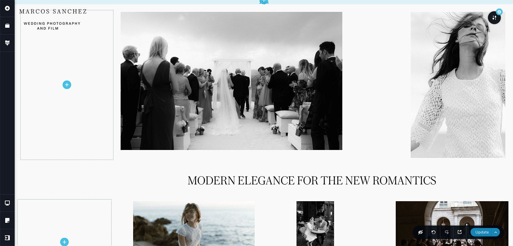
Here's the editor:
Here the live site:
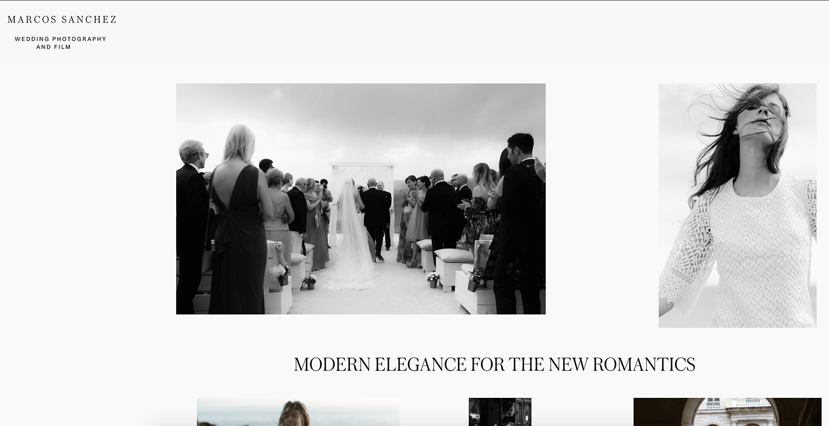
Just starting building the site: https://wordpress-398707-1606372.cloudwaysapps.com/
Thanks!
-

Hi,
Regarding the first problem with the global pop-up created in the Brizy -> Pop-ups - we could identify this problem and our developers are working to solve this issue as soon as possible. I'm sorry for this inconvenience.
Regarding the second problem - If you want to create a fixed vertically menu on the lateral part of the site, I can suggest not using the header block but using the Fixed position of the menu element. See here a useful video about this. Therefore, you can add the menu, set it with a vertical orientation and set it with the Fixed position. The same you can make for the logo too.
Thanks!
Best regards,
Sandra0 -
Hi Sandra, thanks for the reply! The fixed position is helpful, though I'd have to recreate the elements on each page. Probably best solution though. Thanks!
0 -
Hi,
Thank you for your reply and I'm happy to hear that you succeeded to recreate this detail from the page.
Let us know if we can help you with something else.Best regards,
Sandra0 -
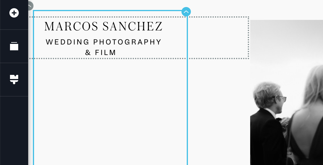
Hi Sandra!
I haven't been working on the page till today, but actually, it's not a viable solution. Now that I changed the position, I cannot edit the item settings as the arrow was on the top left corner and is now out of the screen, so I can't change it's position or even delete it. Is there a way I can select the item again? Also it looks good on desktop but in table or cellphone mode it doesn't work, the position is way off.
If I want to forget about the lateral menu and have a popup menu instead, I still encounter the same issue when using a fixed header, it looks different when editing the page than when it is live, there is a gap. Anyway I can fix it?
Thanks!
 0
0 -
Hi,
You have to edit the mode is displaying the menu element and logo in the tablet and mobile mode but switching to the tablet mode or mobile mode. See here.
If you want to set-up the row element and the logo don't allow you this, you can temporarily move it a bit down, make all the needed modification to the row and then place back the logo element.
If you to de-select the fixed position to the logo and menu, you have to click on the element, go to Settings -> More Settings -> Styling and set the "None" to the Position. See here.
Could you please give us more details about the "pop-up menu"? How did you create it? What problem did you encounter? Could you please send us some screenshots?Best regards,
Sandra0
Please sign in to leave a comment.
Comments
5 comments