Why doesn't text size adjust to screen size/resolution?

I'm using Brizy cloud and creating my site on a 4k monitor. When I view the site on a a smaller 720p screen text boxes overlap and words that start on one line end on another rather than shrinking to fit the smaller screen. This looks awful and unprofessional, is there a way to fix this?
-

Hi Brandon,
How did you build and designed the site? Did you build it to look great for you monitor? Could you send us the URL link of the site? If you said that the "text boxes overlap", I may suppose that you worked with the margin and padding for text boxes, which isn't recommended to do. The site should be built to look great on all monitor types and the negative margins set to the text elements will not help at all. Regarding this "words that start on one line end on another rather than shrinking", do you use the full width for the block? In this case, it is normal behaviour as the width of the block doesn't have a static value but depends on the screen width, on some desktop monitors the text can display on 2 lines but on other on 1 line. The solution can be to use the boxed width.
Best regards,
Sandra1 -
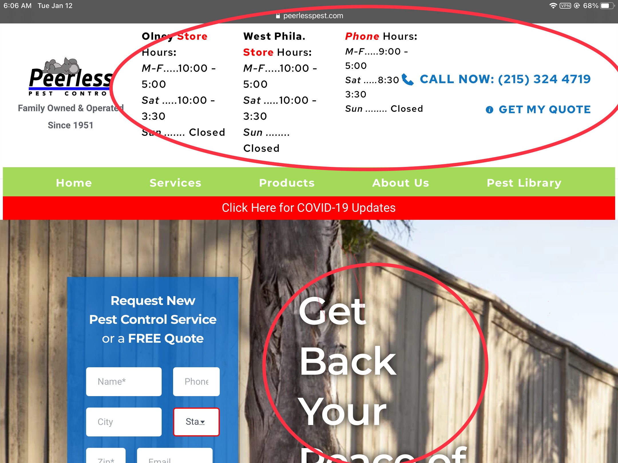
Hi Sandra. I built the site with the intention of looking great on as many devices as possible including mobile which is where the majority of traffic actually comes from by a small margin. Thanks for your suggestions I will be looking into them. It’s is very possible that I changed margins and padding for aesthetic purposes. I will consider what you’ve said for future edits I make. The site is peerlesspest.com and the issue with overlapping is in the header of each page regarding store hours.
0 -
Hi,
Thank you for your reply and feedback. I recently open your site and now all seems to display fine. See here.
Let us know if we can help you with something else!
Have a great day!Best regards,
Sandra0 -
Hi Sandra, I'm attaching screenshots to show what I'm talking about. These are from a standard iPad (landscape mode). You'll be able to see what I'm talking about (despite "Tablet" mode in the Brizy Cloud editor looking very different than on my actual tablet).
I'll add the images from a standard 13" Macbook Pro with 720p resolution later.

 0
0 -
Hi,
I tested your site on the device simulator and this is the way I see it https://jmp.sh/MiCzyt2. All seems to work fine, the only inconvenience seems to appear on the tablet mode (as you said) but this isn't the Brizy inconvenience. This happens because in the text element you have more text and element and the column width is minimized because the tablet width is smaller than a desktop one, therefore, the text that doesn't fit in a row, move to the next row.
To solve this inconvenience, I can suggest placing all these columns in 2 rows for the Tablet mode https://jmp.sh/hyyRf4W. In such a way you will display all details. Also, you can try to minimize the font size, logo size for the tablet mode.
To fix this problem, you can set for the Tablet mode a higher value for row width. See here.
The same for this inconvenience too, you have to maximize the column width for the tablet mode. Also, for this section, I would recommend using the hamburger menu.Best regards,
Sandra0 -
Hi Sandra, I think the problem is that tablet mode for the viewer of the site is NOT triggered when viewed in landscape mode on an iPad. The website thinks it's a desktop user and tries to adjust accordingly. This is why in portrait mode everything resizes and adjusts to how I set it up already in tablet mode. If I adjust all these things to look nice in on the iPad (landscape orientation) it will look bad on a full size desktop monitor because they're both being viewed in Brizy's desktop mode.
For example in this image https://jumpshare.com/v/RUsbzPWi63xWmMECtFm1 the text is like that intentionally because the photo of the man in the blue shirt is right next to it on a larger screen. Because that's actually just desktop mode on a small "desktop" monitor, the iPad in landscape mode. I hope this makes sense. Thanks for getting back to me.
-Brandon
Edit: I've tweaked some text size and the background position and it seems like it now looks better on the iPad but looks the same or similar on a normal desktop too.
0 -
Hi,
Yes, you are right, if your iPad on the landscape mode has more than 991px width, then yes, will be activated the desktop mode of the site. In this case, I only that I can recommend is to move the work schedule in another row or just after this first block, in such a way, the header will look fresh and not laden. See here a suggestion.
Best regards,
Sandra0
Please sign in to leave a comment.
Comments
7 comments