Timeline element - responsive mess

Having issues with getting responsive view working for timeline element
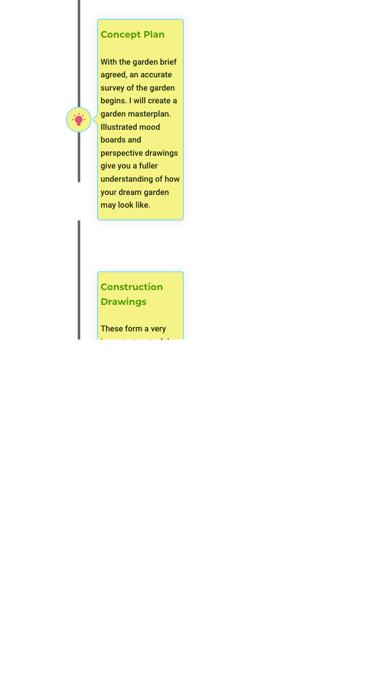
the element is difficult to get working on small iphone 6 screen and not cut off text, had to use negative margins to align so it's not croppped
the line joining the elements is being broken in half multiple times in both phone and tablet responsive, this is a mess and not something I can fix easily using brizy
Image included as reference
also why is the responsive not inheriting the vertical layout from the desktop version?
I think it maybe an issue with margins and paddings on the text element of this timeline as changing this changed the line connecting
Also I think the markup for the label needs to be changed so user has access to change to H2 or H3 for SEO purposes
-

Hi,
I have created an internal issue and we will re-check the responsive styles for the Timeline element. Sorry for the created inconvenience.
The element settings are independent on mobile and desktop so that the desktop seting is not kept on mobile. This is done so that you can adjust the elements to fit a smaller screen. For example, on mobile, such a style might be better suited than just the one aligned to right: https://jmp.sh/FS8nnKJ
0
Please sign in to leave a comment.
Comments
1 comment