The heading in the table does not fit on the phones in the Cyrillic alphabet

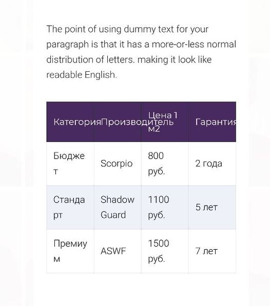
Can someone help me with this? I realized that the table header does not transfer texts written in Cyrillic, perhaps some other languages. You can fix it, or tell me how to fix it, because this tables Brizy can not be used at all...
-
Apparently related to overflow-wrap: break-word;
0 -
You can somehow improve the table so that there is horizontal scrolling, for example, when the table has many columns. As in the TablePress plugin, there are four solutions for displaying large tables on smartphones.
Scroll - vertical
Scroll - vertical, dynamic height
Scroll - horizontal
Scroll - horizontal and vertical0 -
Added to the styles, it helped, but maybe it's not quite right.
.brz .brz-table__th .brz-span {
overflow-wrap: break-word;
}Please correct the FORM so that it works correctly in all languages. And that there is a possibility of scrolling or some other possibility of full adaptation to mobile devices.
0 -

Hi Andrey,
Yes, the Table element is not yet fully responsive and this is on our to-do list. Sorry about that. For now, the solutions can be some custom CSS or creating a table with fewer columns that will appear only for mobile.
0
Please sign in to leave a comment.
Comments
4 comments