Displaying site at a resolution lower than 1920x1080 messes everything up.

As the title says. When I am building pages, every time I look at it through a computer with a lower native resolution, the builds don't adjust to it appropriately and clump together.
-

Hi,
We would like to know more details about your issue. Do you have a link so we can check this? Can you please send some screenshots of the problem?
0 -

 0
0 -
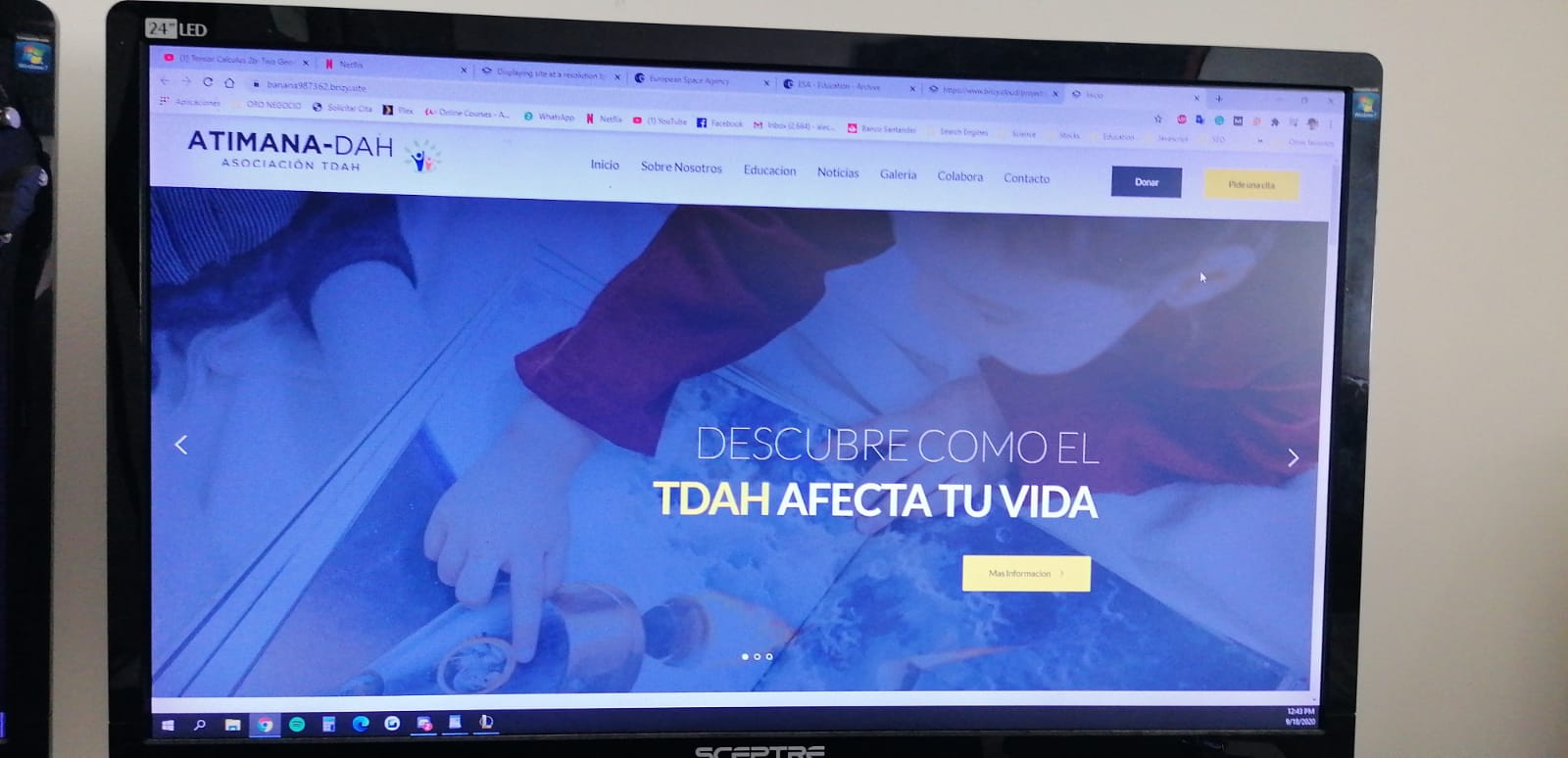
Same website on two different PC. In this case it's even worse because both displays are at 1920x1080. But usually happens when the resolution of the display is lower than 1080
0 -
https://banana987362.brizy.site/ This is the website in question. It currently doesn't look like the pictures due to some modifications I made to it trying to find the balance between the two. I had to reduce the size of the menu due it looking compressed.
0 -
Hi,
from what I understand, the problem is with the header, right? I'm afraid I can't help you much because it's standard behavior. You have many elements in the header and once the screen size decreases, it no longer fits in the container. I would recommend to check your site with the tablet layout and make the possible adjustment: https://jmp.sh/4ueEimA Also, you need to reduce the spaces between the elements in the header. For example, the space between the logo and the menu can be reduced or replaced with a percentage padding.
0 -
I'm aware of the tablet layout. I did reduce the menu and make the whole header less cluttered and there is still an issue where the site looks different on different screens (both PC - buttons on the right are more spaced out in one instance than another throwing off the whole design, etc). Also, it is not just the header. It is the whole website as you can tell by how the block just below it clearly doesn't look the same. It just doesn't scale properly. I want my website to look good in every computer... I shouldn't have to do guesswork while designing it on my PC and "hope" it looks good on others. How am I supposed to make a good product like that?
0 -
I have played around with spacing, menu size, etc... The fidelity is just not there. Is there any way to fix this?
0 -
On what device could we reproduce this problem?
on a 13inch laptop looks good: https://jmp.sh/A4kM3D3 The same for a 1280x800 screen: https://jumpshare.com/v/2YkKPDLjH7hqoziWaXgI
A screen with a resolution lower than 1080, will be a tablet. Looks good too: https://jmp.sh/kMC8x1J I saw the problem on your above screenshot but I can't replicate it on our part. I noticed that you have a different browser on that laptop. Did you try to check in another browser? Is zoom enabled in that browser?
0
Please sign in to leave a comment.
Comments
8 comments