Menu on Mobile

Hi Brizy,
I tried to copy the same as the tutorials, but I can not get my menu to appear as a hamburger menu on mobile view. Can you please maybe just help me quickly? I have been at it for 3 days off and on now I really am lost :(
Thanks
Wayne
-

Hi,
Yes, of course. It is my pleasure to help you!
If you want to display the menu as a hamburger on the mobile devices, you have to go to the mobile mode here and go to the menu element. From here, select the menu, click on the grey dot (from top right corner) and select the Menu option. From there, activate the "Make it hamburger" option. See here.
If this didn't help you, could you please send us some screenshots that illustrate how did you try to set the menu as hamburger or that illustrate the problem?Thanks!
Best regards,
Sandra0 -

I'm in the same boat...how can something so simple be so complicated with Brizy?
I have removed additional Buttons as per Desktop to see if said grey dot appears but no.
Current site is here: www.twostepdetail.com.au
Can anyone suggest a fix? Thanks
0 -

Hi Jose,
Thanks for contacting us.
To resolve the issue, please try raising the z-index value of the menu container. You can see how to do this in this screencast: https://youtu.be/igDeiYBwcLY
Let me know how it goes!
Best regards,
Ariel H.0 -

I am struggling with the same issue. On the mobile and tablet view I am not seeing my menu that I have set on the desktop view so what should I do?
0 -
Hi Darby,
Thank you for contacting us.
The menu appears to be working on mobile and tablet view. If the hamburger menu is not visible, could you please try opening the site in a different browser to see if the issue persists?
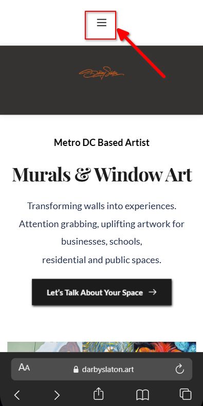
Kind regards,
Ariel H.0
Please sign in to leave a comment.
Comments
5 comments