Mobile View via Desktop VS an Actual Mobile

Hello! I'm having issues with the mobile view via desktop vs display on an actual mobile. Banner formatting is aligned on mobile via desktop, but it does not display the same on an actual mobile.
Solutions I've tried so far:
1. I cleared all browser history and cache, and even asked a couple of colleagues how it looked on their mobile, but the issue is the same.
2. On mobile view via desktop, I removed the image and set a new one but it also did not work.
All tutorials are appreciated, thank you! ❤️
-

Hi,
we would like to know more details about your issue. An image or screenshot will help a lot. Can we see the difference between the editor view and a real mobile view? Can you also send a link so we can reproduce the problem?
0 -
Hi Alex,
Sorry for the delay. Here's the Brizy mobile view:
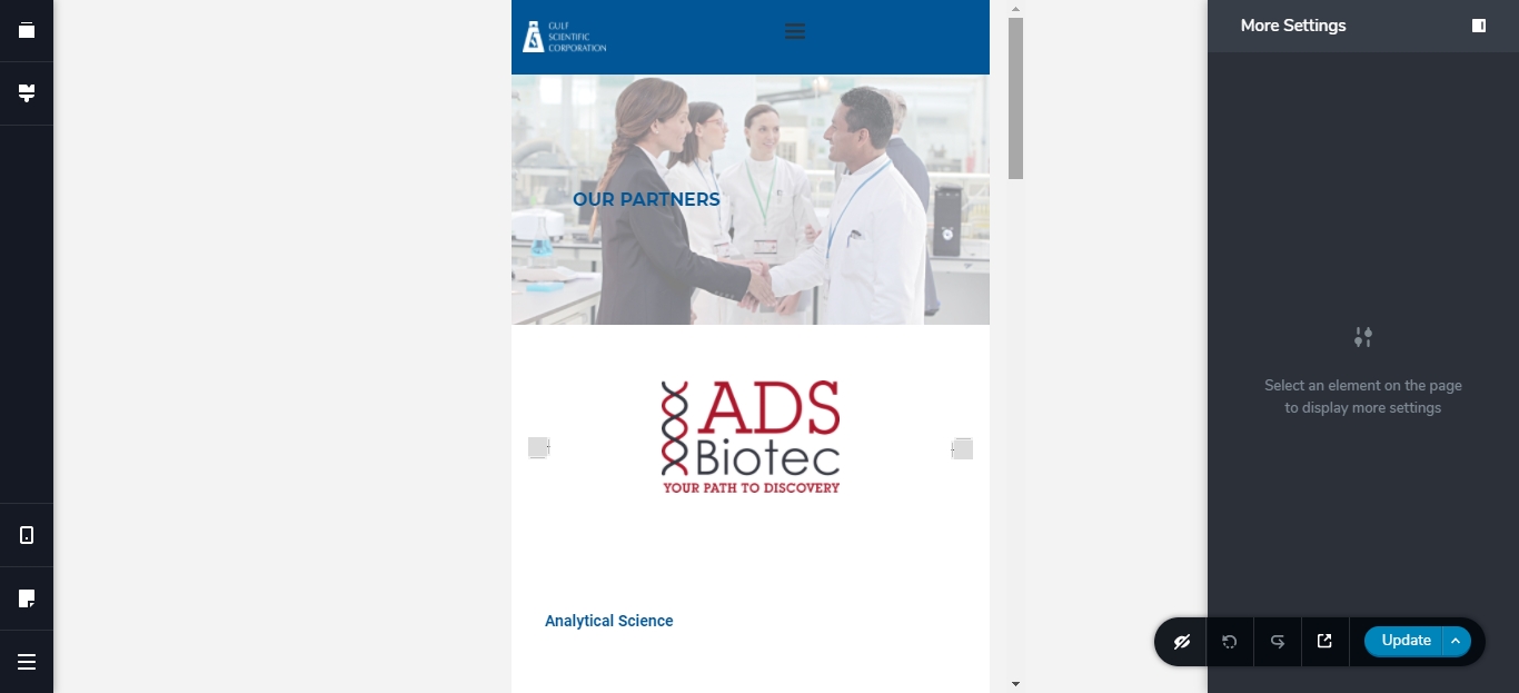
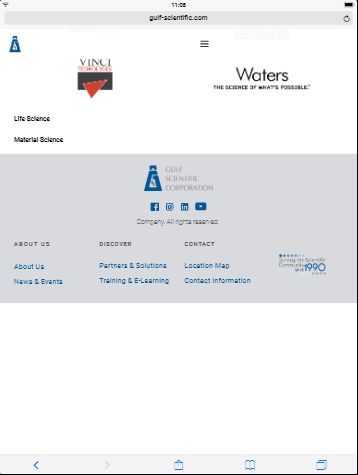
And using Blisk, here the actual mobile view:

As you can see the formatting of the hero image is not actually the same on what is live.
I also have the same issue with the tablet view. Here in the Brizy tablet, it ends with the footer, which is correct.
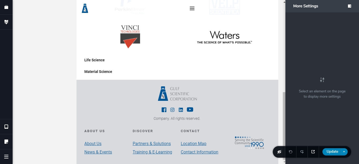
But I wanted to test the tablet view using Blisk, and I get extra amount of 'space' after the footer.
Here's the link to the page. If you could walk me through the proper formatting, that would be great.
Thank you!
0 -
Hi,
sorry for not getting back to you sooner.
This is due to different screen sizes. In Brizy editor it is a general one but on the real device the size can vary and the image background is arranged according to the screen size. Try playing with space above and below the title, and the image will change its size.
As for the tablet, unfortunately, I can't replicate this on a real device. Have you checked this on a real tablet? Do you have the same behavior?
0
Please sign in to leave a comment.
Comments
3 comments