How to resize mobile and ipad version?

Hi Brizy Team,
Currently, I'm editing my website's mobile and tablet versions and found out one problem that I couldn't solve it. The banner (slider) cannot be resized to the correct size. It can only be shown particularly. Could you tell me how to adjust it? Thanks

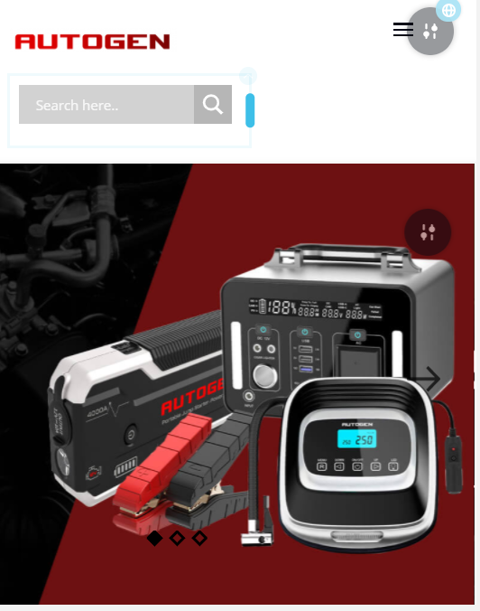
(APPENDIX 1. This is what it looks like on the laptop. )

(APPENDIX 2. This is on tablets - only shows partially.)
(APPENDIX 3. This is what shows on mobile. - I really want all the platforms to look like the laptop version.)
Regards,
Coco
-

Hi,
At the moment, we have some problems with the Search element and I suppose the cause of this problem can be this element. Now, our developers are working to fix it. I'm sorry about this issue.
Thank you!
Best regards,
Sandra0 -

Hi, I made my code via visual and I resized all of it via the dev tool but I can't use what I've coded and and I have no tips on the width/height of brizy tablet or brizy mobile tablet.
And I realized all my media queries were done for nothing . What do you suggest?
Best regards,
Nick
0 -
Hi,
Could you please give us more details about you coded? On what elements does the code have effects? How should the code work? Did you try to change the breakpoints for desktop, tablet and mobile?
Unfortunately, we don't recommend changing the breakpoints. This action can affect the entire site. In this case, we can recommend deleting this code.Best regards,
Sandra0
Please sign in to leave a comment.
Comments
3 comments