Inconsistent display in builder vs live page

I was working in WP. I created a global header block with text, images, and navigation over a background image. I adjusted settings in the 3 device styles. Coming back to desktop, the appearance of the logo image changed.
This got worse when I switched to a slider. An image that was fine in desktop then became tiny after adjusting tablet and mobile. However, when I viewed the page, without leaving the builder, the image was normal. So there was a significant difference between the builder display and the live display.
I went around in circles for quite a while, until I realized that the live display was ok.
Even then, it's a serious issue if the display in the builder does not reflect the live display.
-

Hi Jack,
If you added some large padding and margin to the image or the column it is added, this can be a problem in the image's display. Therefore, we don't recommend adding big padding and margin. Also, could you please send to us the URL of this page?
For mobile and desktop mode, you can adjust the view in the way you need from Mobile and Tablet editor. All modification you made here will be applied only for the device you work.
Best regards,
Sandra
0 -
Hi Sandra,
The URL is https://entryscanir.websitesbykts.com/. Please keep it confidential.
I understand that the settings can be customized for each device size and that in Brizy they are completely independent of each other. I believe that in some page builders the changes cascade to the smaller sizes.
One of the things that I saw happening was:
- I set the display up correctly for desktop
- I worked my way down the sizes, adjusting padding, margins, and sizes.
- When I returned to the desktop display the logo (on the left) was so small as to be invisible.
- I then went around in circles adjusting it and the smaller device displays.
- I discovered that the live page did not look like the builder display.
As to padding and margins, during the process I probably did have some large values although the current version does not have them.
0 -
Further to the above.
Yesterday I was having trouble reading something on the screen, so I tried to zoom in. I used Ctrl-Numpad+, which will zoom a Chrome tab in Windows. I discovered that in Brizy it changes the display from desktop to tablet to mobile and back to desktop.
When I returned to desktop the image of the logo on the top left was about 10% of normal size. I cycled it again, and the same thing happened. I started taking screenshots and could not reproduce the behavior.
---Just to add to the confusion.
0 -
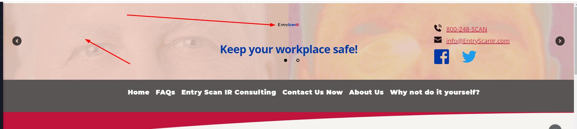
I have encountered the issue again. I have screen shots to share!
I had a fairly well finished page for desktop. I began working in tablet and mobile, making adjustments to sizes, padding, etc. I followed the results in Chrome with Inspector set for a tablet and then a phone. The Inspector display did not quite match. I don't have the screen shots for that. I saved as I worked. I hid the left logo for the smaller devices.
I then returned to the desktop display in the builder. The logo on the left was so small that I did not realize it was there at first. The logo in the center was about 25% of the right size.
Screen shot in builder:
Screenshot in FireFox, before refreshing:

Screenshot in FireFox after refreshing (no change):

This is the About Us page for entryscanir.websitesbykts.com, but since the problem is in the header it applies everywhere.
I then hit Update in the Builder and Refresh in Firefox. No visible changes.
I went back to the dashboard from the Builder. The browser displays, both Chrome and Firefox, of the header are fine.
I reloaded the page into Builder. It displays properly.
This is making work very difficult!
0 -
I saw the above behavior several more times. Using the builder on the FAQs page, I went to Tablet, then to Mobile, then back to desktop. I did not make changes. The logos were shrunken, but not as much. Screen shot below.
 0
0 -
I found that after returning to the desktop version (as in my most recent post), updating to be safe, and reloading the browser tab, the display returns to normal.
PLEASE ADDRESS THIS ISSUE!
Also a clarification: there are currently two versions of the left logo on the site over the different slider images, so the transparent and the white background versions of the screenshots are just from different slides. They don't represent a Brizy issue.
0 -
Hi Jack,
We need to take a look into your dashboard and inspect this problem, therefore I created a private ticket on this request. You have to receive a notification on your email regarding this. Please, send us in that private message your WP credentials.
Thanks!
Best regards,
Sandra
0
Please sign in to leave a comment.
Comments
7 comments