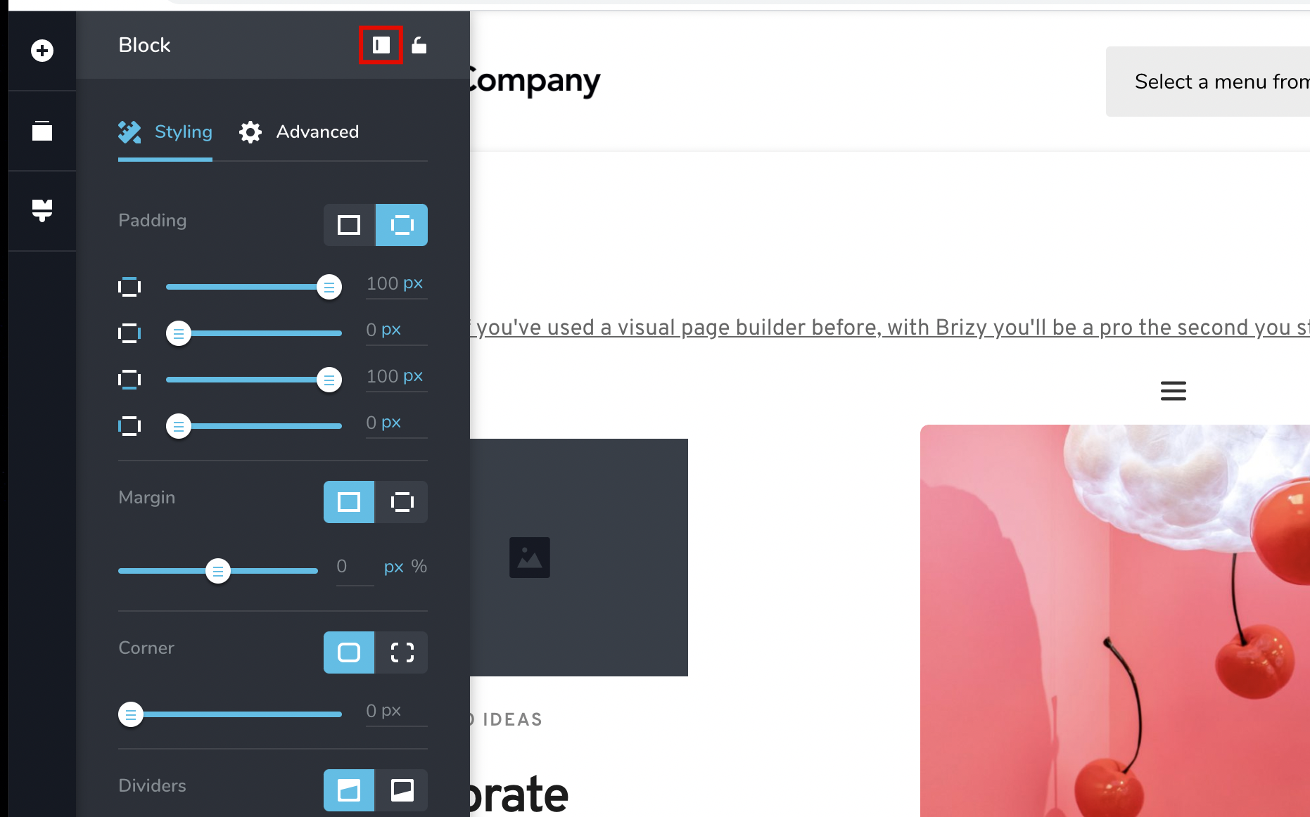
Display the panel inline (not overlapping)

Hey there,
I'm considering using Brizy for a couple of quick landing pages.
I noticed that you can now lock the side panel, which is a huge UX improvement IMO.
However, I find it odd that it simply overlaps the page, and doesn't push the page to the side like Elementor and Oxygen do.
I think it would be super beneficial to have the panel behave like those builders. Since it overlaps content, you need to lock/unlock it fairly often, and having it overlap doesn't give you a great representation of what the page actually looks like.
This simple change would make it a lot more usable.
-

Hey,
Thanks for your post and suggestion.
That change I'm not sure will ever happen because when you do it like in your examples is worst in terms of representation of your page because the sidebar will push your content and the width of your page will not represent the actual width.
That is the reason we've put it on top in the first place and we will not change that.
We've added the lock icon and near that icon there is another one for position, that lets you move that sidebar on the other side if you want.
Hope this helps.
0 -
Hey Dimi,
I just made a quick video for you showcasing why I personally don't think that's a great decision (and frustrating from a user experience standpoint): https://www.loom.com/share/c6fab6a1c8e741fa93cfa73906ed5698
Let me know what you think.
Thanks,
Sunny0 -

I would also prefer it not to overlay but be like the examples in Sunny's video. I'd rather see 100% of my "canvas" than have some of it obscured.
0 -

Hello Sunny, thank you for the detailed video.
When we first thought of this functionality our reasoning was not to mess with the way the page content looks, because if the sidebar pushes the content, especially on a small screen like yours, it will make everything break a bit and look unrealistic for that resolution. All this meant that What You See may not Be What You Get, and this was paramount for us to not happen given that we wanted an editing experience that's close to 100% accuracy to the end result.
Another problem is that the resolution / content viewing may even go down into tablet size dimension, I'm not really sure, because it depends on your laptop resolution. This could pose bigger problems than having to sometimes readjust the position of the sidebar, which in my personal experience happens pretty rarely and only for full width content. Here is a screen recording on my end, and it's not even a very wide resolution, only 1680px wide: https://www.loom.com/share/a2ee1dc70976490db50f93026c8c4cae
Also, another reasoning was that our sidebar was meant to not be always on, unlike Elementor's which is the main area of work, so we believed the constant pushing of content would have been too tiring. The moving content would have made you dizzy and we would've probably had the same discussion, but the other way around...
In any case, we have noted your request and if more users demand this same change, than we'll introduce it in a future update.
All the best,
Bogdan Condurache
Brizy Co-Founder & Design team0 -

I have to agree with Fran and Sunny. And I believe that many customers would.
0 -
Hey Bogdan,
I would actually argue that the overlapping sidebar is going against your intent. It creates a What You Don't See Is What You Get scenario. You are effectively cutting off visibility of design/content that is visible on the front-end.
With the non-overlapping method, your entire page is accessible and within view. Yes I know it cuts into the effective window width, but each builder let's you quickly preview the full width with a click of a button. I would rather click this button a couple times to confirm everything looks good full width, than constantly be switching what side the panel is on and turning it on & off because it is in the way.
And since websites are meant to be fully responsive, there is no "true width" anyways. The content should look good full width, with a sidebar, or on your phone.
I know that you never meant for the sidebar to be always on, but for me that feels forced for Brizy in its current state. Adjusting paddings and margins might be the most frequent styling that's done. Having this be draggable like sections are might alleviate the need for a sidebar, but until we were able to lock the sidebar, I found Brizy a bit of a headache to use primarily for this reason.
Hope that helps. I would love to see this put to a vote in the Brizy community. I could be way off here, but I do feel that people's preference might be more lopsided than you think.
Thanks!0 -
OK Sunny, noted.
May I ask, what resolution are you working on?0 -
I'm using a 2560x1440, 27" monitor. So it's not at all the screen size that's an issue, but rather having a side of the page being cut off, a container that no longer looks centered on the screen, full-width content not accessible etc.
0 -
I've added an issue regarding this on our internal board. First time we'll discuss the right sidebar we'll touch on this as well. I've added your loom screen recording as a link, not sure that video will still be there when we'll get to it, but if you can leave it on that it will help.
Thanks.
0 -
Sure, I'll leave it up. You can also download it from the page if you'd prefer.
0
Please sign in to leave a comment.
Comments
10 comments