responsiveness for different desktop screen sizes

Hello,
I am new to website building and struggling with responsiveness for different desktop sizes(or if you resize browser window) .
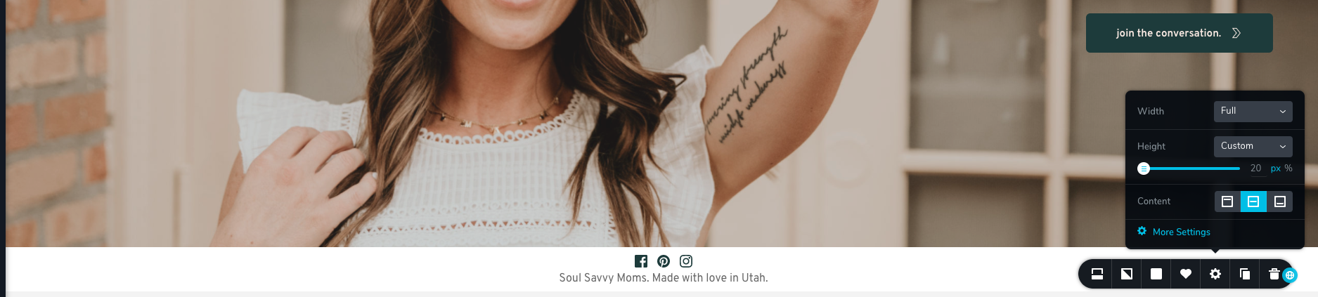
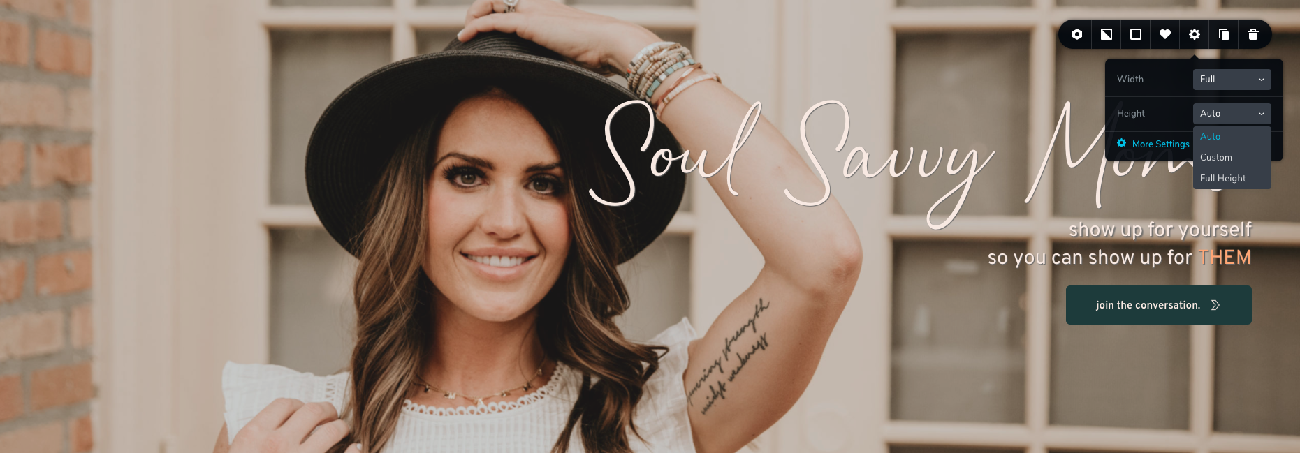
Settings for content
- in Brizy: width = full
- in Astra: Content layout - full width/stretched
Settings for header/menu in Astra: full width
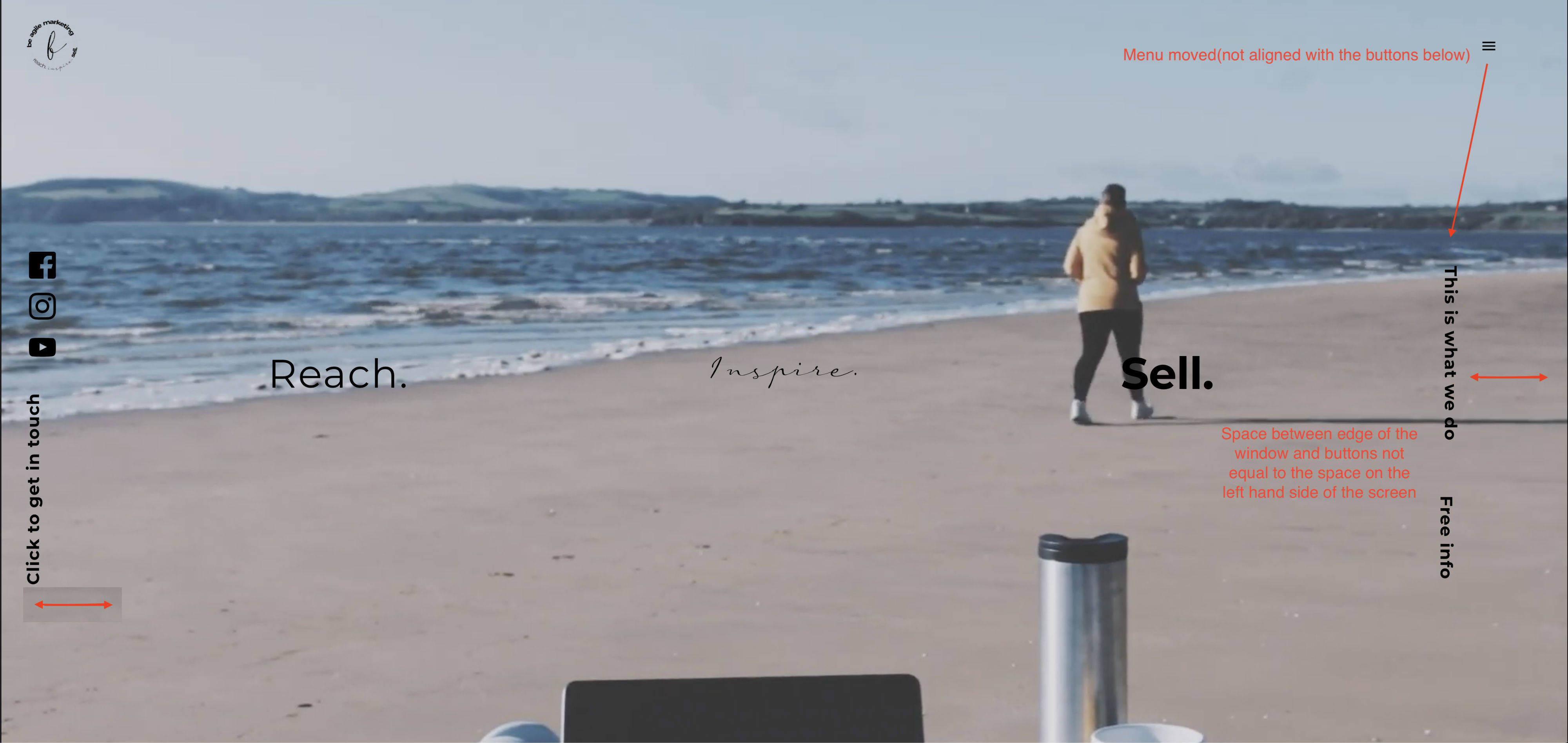
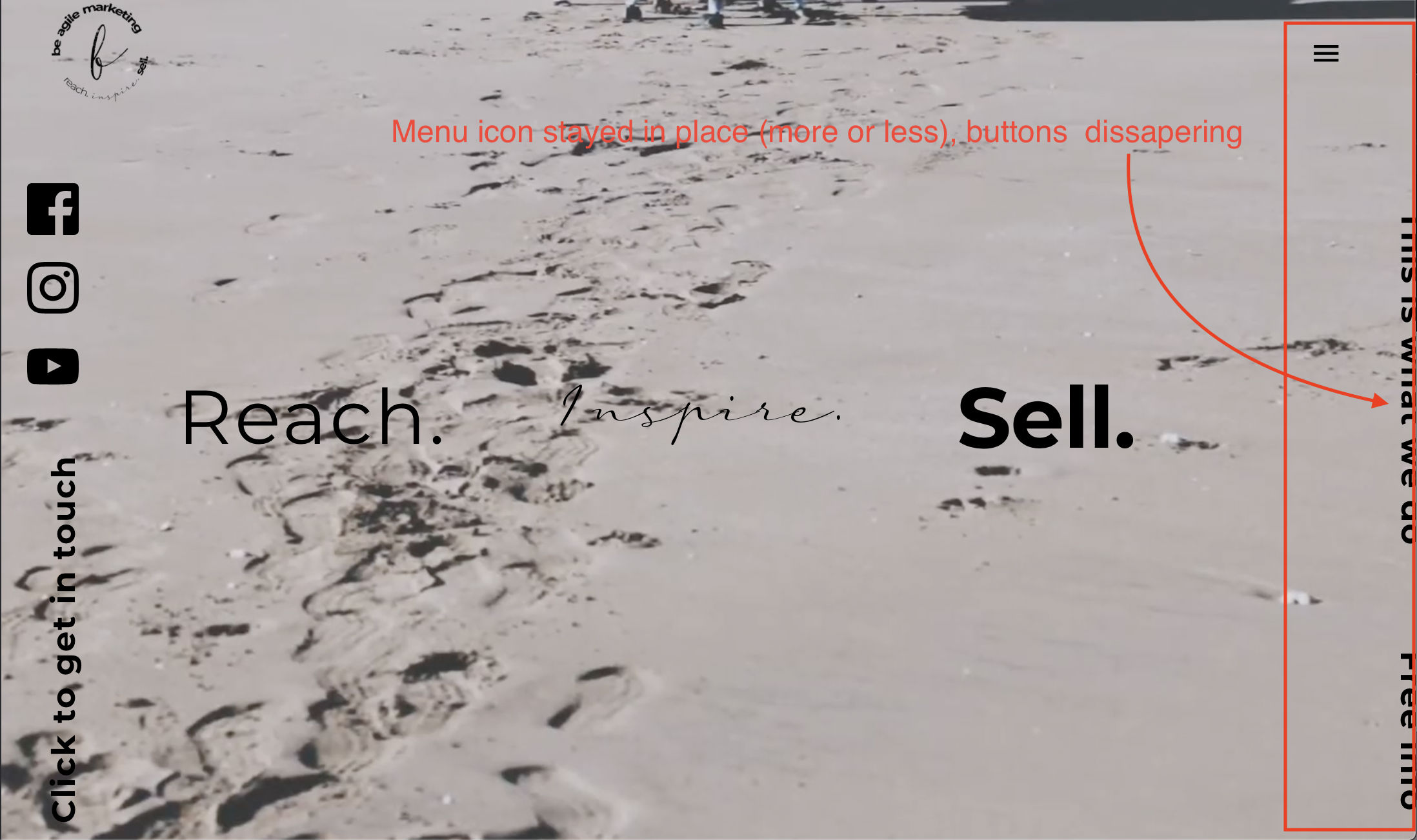
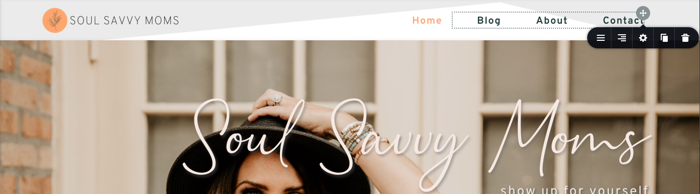
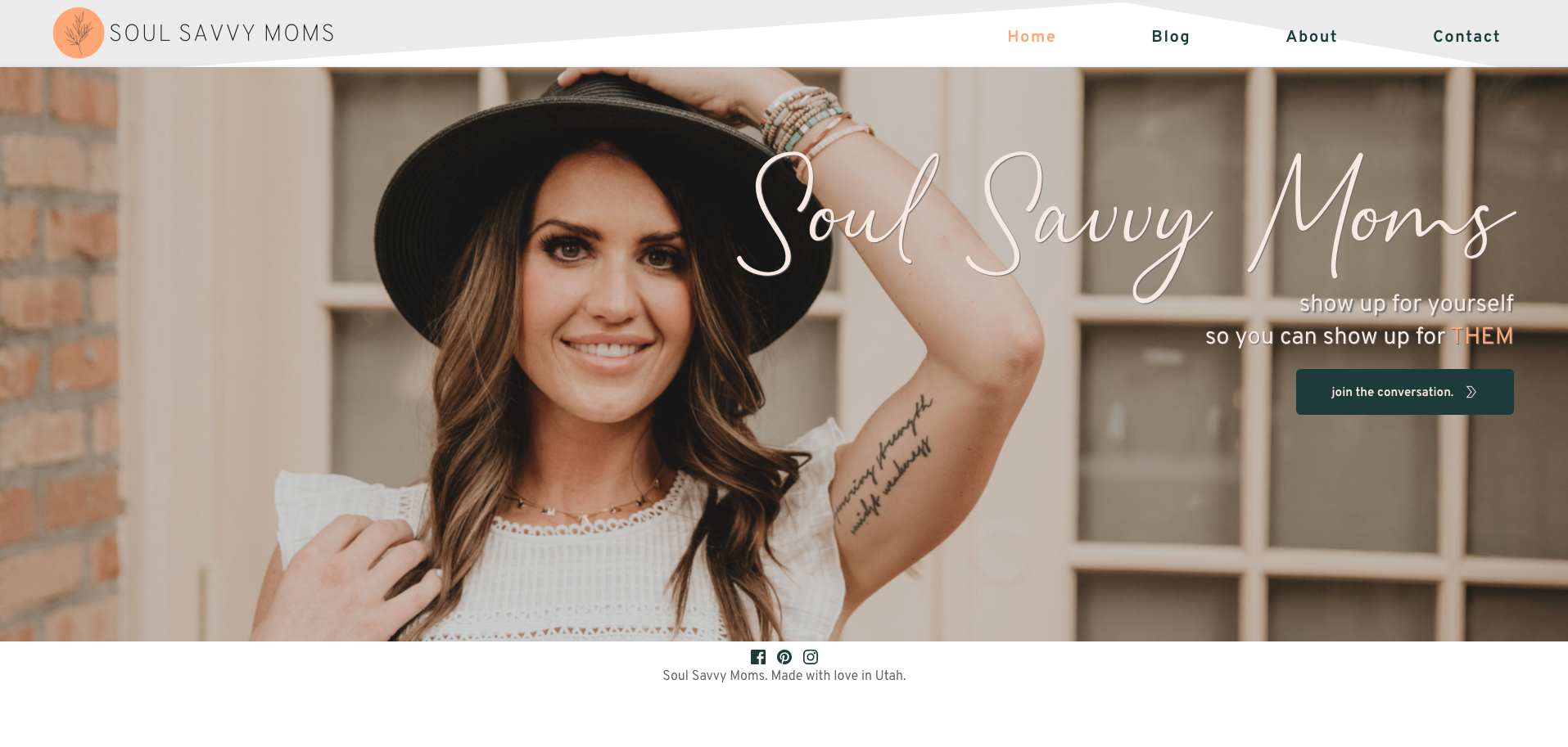
When resizing the browser window the content is moving (specifically right hand side) - see screenshots attached.
Is there any way i can fix this, so the content - buttons, would stay in line with menu icon, and when screen gets almost to the tablet size - buttons won't disappear (right hand side)?
I need this to be full width.

-

Hi,
how did you add these buttons? Are these Brizy buttons? The Menu is a theme element? Did you add any custom css to the buttons?
0 -
Hi Alex
Yes, they are Brizy buttons with little bit of CSS, on both sides. I need them to be rotated vertically. Everything works fine on the left hand side, but on the right its moving a lot. If the content width is boxed, everything is working as expected on both sides, but i need it to be full width.
The menu is Theme element, because Brizy do not support transparent header (yet?), even if the theme does. So i used default template instead of Brizy template when created the page.
Kind regards,
Kate
0 -
this is the CSS added:
.rotate {
/* Safari */
-webkit-transform: rotate(-90deg);/* Firefox */
-moz-transform: rotate(-90deg);/* IE */
-ms-transform: rotate(-90deg);/* Opera */
-o-transform: rotate(-90deg);float: left;
}
Please let me know if i need to add something to this?
0 -
Please send the link to your site and I will check the CSS styles. If you do not want it to be public, you can send it in a private request.
0 -
Hi Alex,
Our site is not launched as of yet, therefore you would need to log in into WP as administrator.
i have sent a request to Brizy support with login information.
Thank you in advance.
Kate
0 -
Hi Kate,
the section is very confusing. Lots of unused rows, columns, spaces, CSS. It is easier for me to create a new section than to inspect your current version.
I created a clean version of the section. You can find it here: https://beagilemarketing.com/test-support/ It seems to be much more responsive now :)
The thing is that it is not too easy to work with vertical columns and elements. I added only the text elements. You could still play with this section and add other elements or keep it that way and add social links in another place.
This is not a bug or anything in this regard. This is a problem about how it was built, so, unfortunately, I cannot spend more time on it.
Thank you for your understanding.
0 -
Hi Alex
Thank you so much for looking into this and for your time. It does look so much better!
Kind regards,
Kate
0 -
Glad to have been of help!
Cheers
0 -

Hey Brizy Team,
I'm having a similar issue. I've been working on this site for a while now and every time I switch to a different desktop size, the styling changes. It's not responsive. My mobile and tablet versions don't seem to be having issues with responsiveness, just desktop. I've attached some screenshots to show what I'm talking about. This happens w/the headers and footers, sometimes the text on the main page will move around as well.I'm using the Brizy starter theme in WP. Thank you!
Screenshot off my Macbook Air at full screen
Screenshot off my hp 21" monitor
 0
0 -
Hi,
I'm not sure I understand exactly what the problem is. Do you mean the difference in terms of spaces? menu position? Is the menu aligned to the right in settings: https://jmp.sh/WJ9VfcE ?
0 -
Hi Alex,
I apologize for the confusion. Here are two more screen shots. Yes, the menu is aligned to the right in settings and the logo png is aligned to the left, but whenever I change screen sizes (macbook, desktop monitor, etc.) the header is not aligned where I want it to be (which can be seen on my macbook screenshot). This happens on all my pages if I switch screen sizes. Hopefully that makes more sense.
Screen Shot taken off my 21" desktop computer - header moved inward as compared to its position on my macbook screen.

Screen Shot taken off my Macbook - header is placed where I want it, aligned with the main information on the page.
 0
0 -
Hi,
Thanks for these details. Can you please confirm the header section and slider section have the width set to the same value? For example to "boxed": https://jmp.sh/MvPSpYo -> https://jmp.sh/MvPSpYo
0 -
Okay, I put both of them to 'full' in their settings and that fixed the issue for the header, thank you so much! I'm still having a similar issues with my footer. The footer is also set to 'full'. The issue I'm having is height though. On my desktop the height is much bigger than on my macbook. I'm assuming this is something I need to fix with the slider section? I'm not sure, I've attached screenshots to add context. Thank you!
Screen Shot showing footer height on desktop 21" screen, lots of extra padding shows up
Screen shot showing footer height on my macbook

Screen Shot of footer settings
Screen Shot of slider settings
 0
0 -
Hi,
the footer looks bigger on the desktop because the content of the page is not enough to cover the entire visible space on the desktop, so the remaining space is filled with white. As a solution, you can set the slider height to Full-Height and this problem will be solved.
0 -
Okay that makes sense, I see that now. I'm sure I made it obvious, but Brizy is a new tool for me, so thank you for all our help!
0 -
This happens with all new things so no problem at all. We are here to help you so let us know if you need anything else.
0 -

Hi Alex,
I'm also having a similar issue. In short, I'm trying to overlay two logos to line up with the borders of the background images but when on a different screen size they shift to the right of the screen. I've had a play with both the 'fixed' and 'absolute' settings but this problem is still occurring. I'll attach some screenshots below. I would massively appreciate any advice as this is just the holding page and we're spending far too much time on it lol x
imac 27" screen
song 15" screen
I have tried converting the look we're aiming for as a PNG and setting that as the background but then having the issue of that image not being responsive to the screen size and cutting off the edges when the client wants each section advertised.
Thank you, Jess
0 -
Hi,
It's not really an issue guys. What you are trying to do is not exactly the standard builder functionality. These are manipulations that are often solved by tricks (and no one guarantees that this works). You will need to involve custom CSS to do what I saw in your example. That's what I managed to do quickly: https://jmp.sh/pP6nKeP
Hope this helps.
0 -
Thanks for getting back to us. Neither of us really understand the coding side of things or even what we're looking at. I'm trying to work through the screenshot you sent (which we appreciate you putting the time in to create) however, I'm still feeling a bit lost. If you have any tips that might help us achieve the look we're going for, that would be grand.
Thanks again
0 -
Hi,
It will be a bit difficult to do that just with the options of the builder, or even impossible )). All you have to do is adapt the code I gave you to your section or think of a different structure for this section based on the possibilities of the builder.
0
Please sign in to leave a comment.
Comments
20 comments