Column wrapping / uneven column number responsive wrapping

How do you make an uneven number of columns responsive?
Desired Layout: I have 2 rows with 3 columns each on desktop. On tablet it should be 3 rows with 2 columns each and on mobile 6 rows with 1 column.
Setup: 2 rows with 3 columns each, on mobile each column will be extended to 50%, on mobile to 100%.
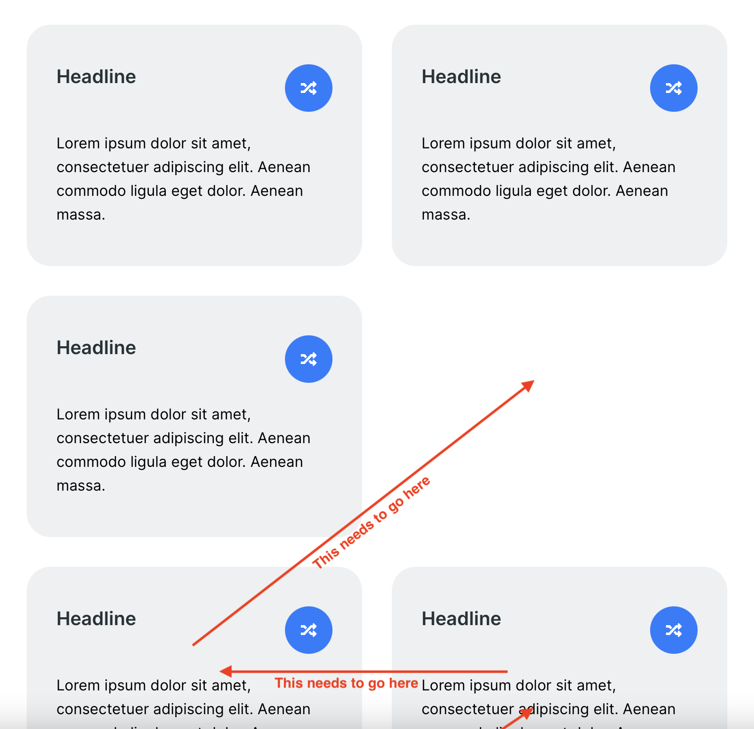
Problem: On tablet you'll get one brizy row with to virtual "rows" inside: 2 columns at the top and one at the bottom. Leaving one space empty.
Other page builders have a wrapping option for the row. You add all 6 columns to one row, but increase their width (to 33.33%, 50%, etc). They then wrap like Brizy does on tablet and mobile. Brizy however seems to only allow column wrapping (extending a column over the row) on tablet and mobile, not on desktop.
Any way to achieve 3x2 on desktop and 2x3 on tablet then?
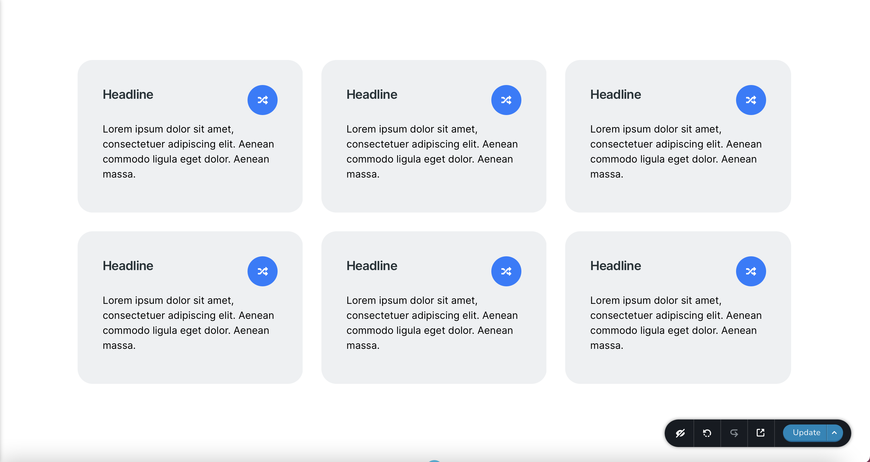
Desktop:
Tablet:
-

Hi Fabian,
Unfortunately, in this case, when in the desktop mode is added 3 columns per row, it isn't possible to display on the tablet mode 2 columns in the second row and I will try to explain this behaviour.
This happens because the row is a container and it is a bootstrap class attached to the <div> tag. The <div> tag is a block element, therefore, it can't display other elements, like another row, next to, in the empty spaces. For this reason, on the tablet mode, when the row is set to display 2 columns, the 3rd columns are pushed on the bottom. Near the 3rd column can't be floated the columns from the next row because as I stated before, the <div> is a block element.
If you want to display the 1st column from the 2nd row near to the 3rd column from the 1st row, I can recommend adding some Custom CSS to set those rows with floating properties. See here for more details about <div> and float properties.
Thank you!
Best regards,
Sandra0 -
Hi Sandra, thanks for the in depth analysis and feedback. I get why this happens. But it doesn't need to be this way. Why not have the tablet feature available for desktop as well (that's a feature request now). This is how it could work with the flexbox behavior:
Instead of 3 row containers with 3 columns each, you add 1 row container and 9 columns in there. But you change the width of each column to 33,33% in desktop view (this is currently not possible). The row container wraps them into new rows (just like it currently does on tablet but for some reason doesn't allow on desktop). Now it looks like it is 3 rows with 3 columns, but in fact it is one container (row) with 9 columns in the code. Now you can simply resize each column to 50% on tablet and 100% on mobile and you will have the desired behavior described.
So, why limit wrapping elements to tablet and mobile? The only thing you would need to allow is resizing a column in the desktop mode even above the width of the row and let them wrap. Then we could add more columns and let them wrap into new rows. You have the same thing for tablet, why not for desktop?
0 -
Hi,
At the moment, this isn't possible to realize in Brizy builder but I will inform our team about this suggestion and feature request!
Thank you!
Best regards,
Sandra1 -
Thanks for forwarding this :)
For everyone else having the same problem: Add the CSS Code below to your theme's custom CSS settings (or use a child theme or a custom CSS plugin). Adjust the percentage values to your liking for all breakpoints.Now add the class "wrapping-row" to every row (not column!) where you would like to have columns wrap automatically in the row. Add as many rows as you'd like, I added 6 columns (max for now). You will no longer be able to use the resizing tools for the columns in the backend.
/* Desktop 3 columns 33.33 percent */
.wrapping-row .brz-columns {
  max-width: 33.33% !important;
  flex: 1 1 33.33% !important;
}

/* Tablet 2 columns 50 percent */
@media (max-width: 991px) and (min-width: 768px) {
  .wrapping-row .brz-columns {
    max-width: 50% !important;
    flex: 1 1 50% !important;
  }
}

/* Mobile 1 column 100 percent */
@media (max-width: 767px) {
  .wrapping-row .brz-columns {
    max-width: 100% !important;
    flex: 1 1 100% !important;
  }
}
0 -
Hi,
Thank you for your implication and for share with other users the solution you found!
Best regards,
Sandra0
Please sign in to leave a comment.
Comments
5 comments