Laptop 15"

Hi there,
A cutomer of mine mentioned to me that the website I've realized for him with brizy is all screwed up on his 15" Laptop Pc Monitor.
That same website looks just fine on my side on my 17" et 21" Monitors.
The jpeg 701 is what my customer sees on his side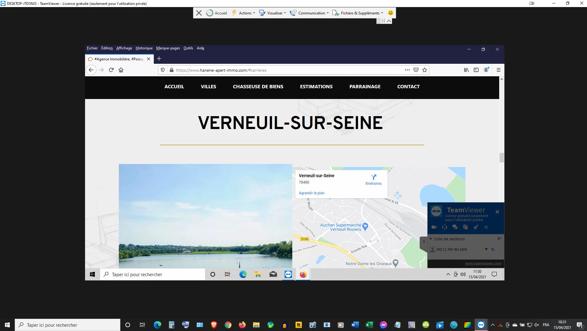
The Jpeg 801 is what I see on my side...
How can I correct those issues ??
Thanks for your time.
Cheers.
JR
-
On my Monitors I can see the title and the images full size.
On my customers' side, he can only see haf size of the images...
0 -

Hi,
I'm not sure I understand. Is the problem with the images? It would have been good to send me a screenshot of the same section so I could see the difference.
Did you set 100% width and 100% height for the images? Have you tried checking this on a 15inch device simulation found on the net?
0 -
Alex,
I did get your point.
When I said image in fact I meant the real estate visibility..
Whatever I see on my 18" inch monitor looks exactly the same on my 21" Monitor, with of course larger text, larger images on the same scale.
The thing is everything is cutt off on a 15" Monitor. My customer just mentioned to me that he's having the same issue on his 27" Mac Pro Monitor.
That's the first time, that this issue is reported to me.
I never had in the past to worry about screen size, except for tablet and Mobile devices.
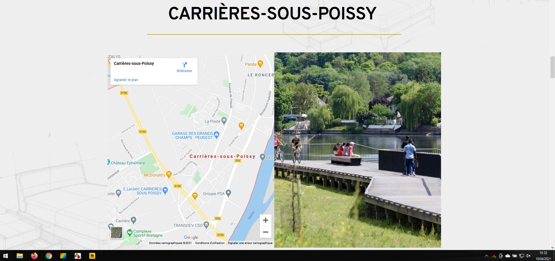
Here is My customer's website...
https://www.hanene-apert-immo.com/
Here is the Monitor device simulation that I found Online...
https://searchenginereports.net/screen-resolution-simulator
Do you see any issues on different devices ?
Let me Know,
Thanks for your time.
Cheers.
0 -
Alex,
Could you please double check my Customer's website on 10" and 12" Monitors ?
...It does not look good at all concerning the Button.
Is there any way to corect that issue on my Backend ??
Let me know.
CXheers.
0 -
It does not look good as well on the Apple Ipad, and the Samsung Tab 7"...
I had to hide the Button on all Mobile devices....
Is there any way to corect those issues too on my Backend ??
Let me know.
Cheers...
0 -
Hi,
I tried to check the site on different devices but I don't see any serious problems: https://jmp.sh/nLuzF5d When the screen is smaller the image is cut a bit but this happens because the size of the columns is reduced and from what I saw you have the image set as the background so it is a normal behavior. Try to use image element instead of image background so the image will not be cropped due to the screen size.
0 -
I get it, thanks for your time.
Cheers..
0 -
Let us know if you need anything else.
0
Please sign in to leave a comment.
Comments
8 comments