My "add to cart" button Looks bad

Hi there,
My add to cart button looks odd/glitchy. I've just updated the latest version of Brizy and Brizy pro and deleted my cache but it's still going on.
I can't seem to seperate it from the stock quantity. I don't mind but it's displaying it wonky.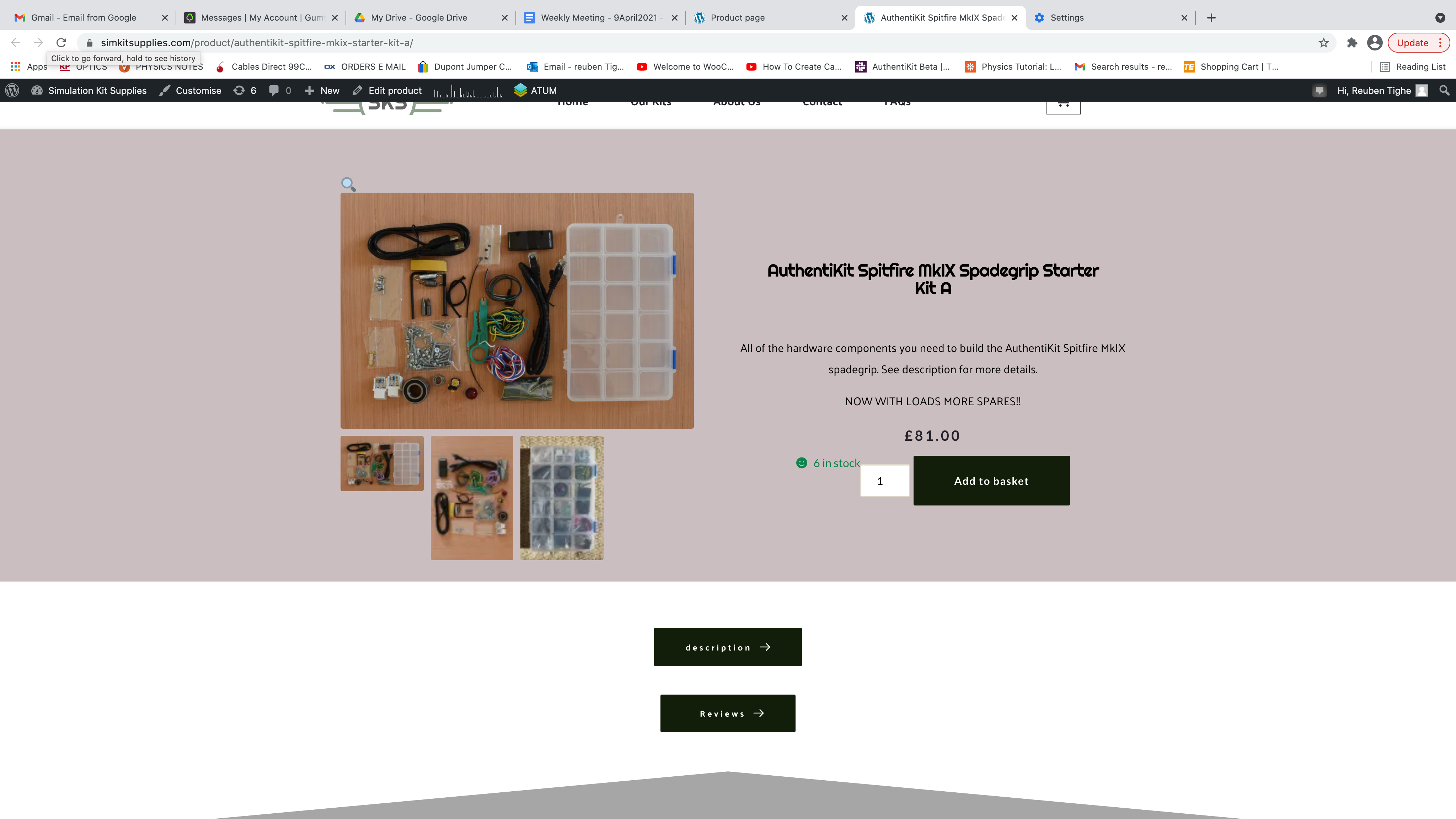
Not sure what else to do? Obviously need my Add to Cart button on there...
Any help/advice would be appreciated. Thank you.
Reuben
-

Hi Reuben,
Unfortunately, at the moment, it isn't possible to customize the way of displaying the "Add to Cart" element but we have added a featured request on this topic. They will investigate this request and if we will receive some notifications, we will inform you too.
Thanks!
Best regards,
Sandra0 -
OK, so I just have to leave it looking like that? With the "6 in stock" hanging over the "add to basket" feature? Seems odd, is there nothing to be done about that?
0 -
Hi,
Mostly, the position of the Stock is generated from the theme. In my case for the simple products, the stock is displaying in such a way https://jmp.sh/oALnDzm. For variable products, it is displayed in such a way https://jmp.sh/esiwdtH. At the moment, I'm using the Twenty Nineteen theme.
Best regards,
Sandra0 -

Hi Sandra,
I am facing the sae problem with the number of stock showing, and it's not working well with the design. Do you have any updates on how to fix this? or Would it be possible to delete the number of stocks?
Thank you
Jessica
0 -

Hi Jessica,
As mentioned earlier the position of "stock" depends on theme and theme styles. You can hide this one using custom CSS code.
Best regards,
Denis.0
Please sign in to leave a comment.
Comments
5 comments