Alignment/positioning problem | Brizy builder doesn't match preview

Hi, I have a problem with the positioning of my sections, they don't want to align properly. I've tried to use just tabs, and the 'spacer' to get everything on the same height. (I'm on the latest version of both Brizy and Brizy Pro and I'm using the OceanWP theme).
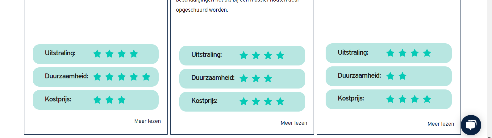
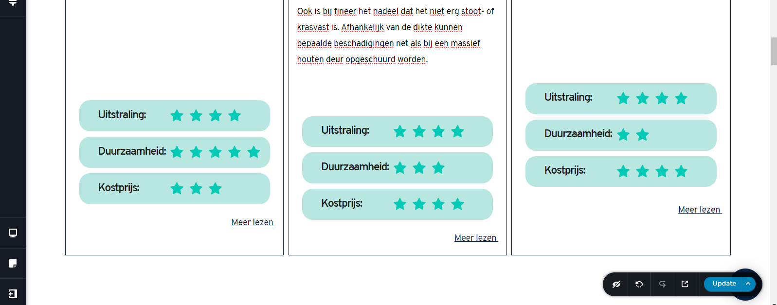
Just to show you the problem. The first image is the preview, the second image is in the builder. As you can see, I have to do some weird positioning in the builder to get it somewhat decent looking in the preview. What's the best way to do this? (also in terms of responsiveness.
Thanks in advance,
Yonik
-

Hi,
Than you for your message. To be honest, it is a bit strange to find that on the preview the blocks are displaying in such a way in the preview mode. They should display the same as in the builder mode. See here. This isn't a problem of alignment and happen because the text from the second column is a bit longer and for this reason, the content is moved to the bottom. The first and latest columns have the same height as the middle one because the columns in a row have the same height in the row, the height of the longer column.
At the moment, if you want the Rating elements to be displayed in the same line, I can suggest adding some space element for the first and last column and place them between text and ratings. Also, you can go to the tablet and mobile mode and adjust the space. The second recommendation is to create text that will have the same height and length.
Best regards,
Sandra0 -
Hi Sandra,
There are already space elements under the text box (on all 3 sections). I tried to press enter in the text fields until the box has the same length as the middle one, but that didn't work. Then I tried using space elements but the result is the same. I have 5 of these 3 columns on this page and on other page 4 of these as well. A total of 28 of these, so it's a real struggle to position everything the way that I'm doing it now.
I could try and change all top margins, but I think I've tried that as well.
Best regards,
Yonik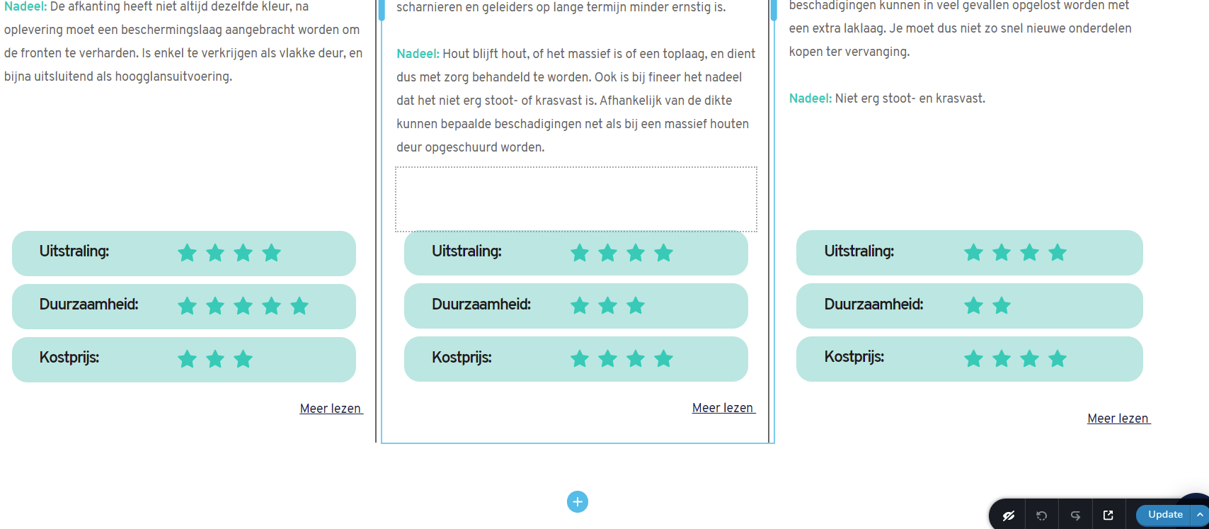 0
0 -
And I have a similar problem here. The margin and padding is exactly the same (in numbers), but the pink and grey field isn't. So i'm having troubles to get everything in positions here as well. (There are 5 columns next to each other, and I know that if I'd place the GIF on top and make it 4 columns that my problem here is solved. but that's not what I wanted to create here).
Thanks for your help.
Best regards, 0
0 -
Hi,
We don't recommend taping on "Enter" in the text element because this action will not help you at all. In the Brizy builder, you can find the Space element that can be adjusted with a custom pixel value. See here.
Also, in these situations, we don't recommend adding margin or padding because this can confuse you and this will not help you the same for the long term.
In your last reply, in the screenshot, you send us I found that all elements have padding and margins and for this reason, all the situation is confused and you can feel it non-aligned. To simplify this case, we can recommend display 3 columns. In the first one to add 3 Icon boxes, in the second the gif image and in the last column, the last 3 icon boxes.
Best regards,
Sandra0 -
Hi,
Sorry for the late response, I've been quite busy.
The last problem is solved by using only 3 columns, thanks!
But I'm still struggling with the first one. I tried using rating elements instead of icons. It looked great when it was underneath the columns, but of course, that doesn't work well when you switch over to tablet/mobile mode. So I have to put in inside of the column and add space elements to align everything.
It would be nice to know how much space there's needed to get it on the same height as 1 line of text. (I know that depends on the text line height). Or like a 'smart spacing element' that assumes the positioting for you. (because it's common that you want everything on the same height).
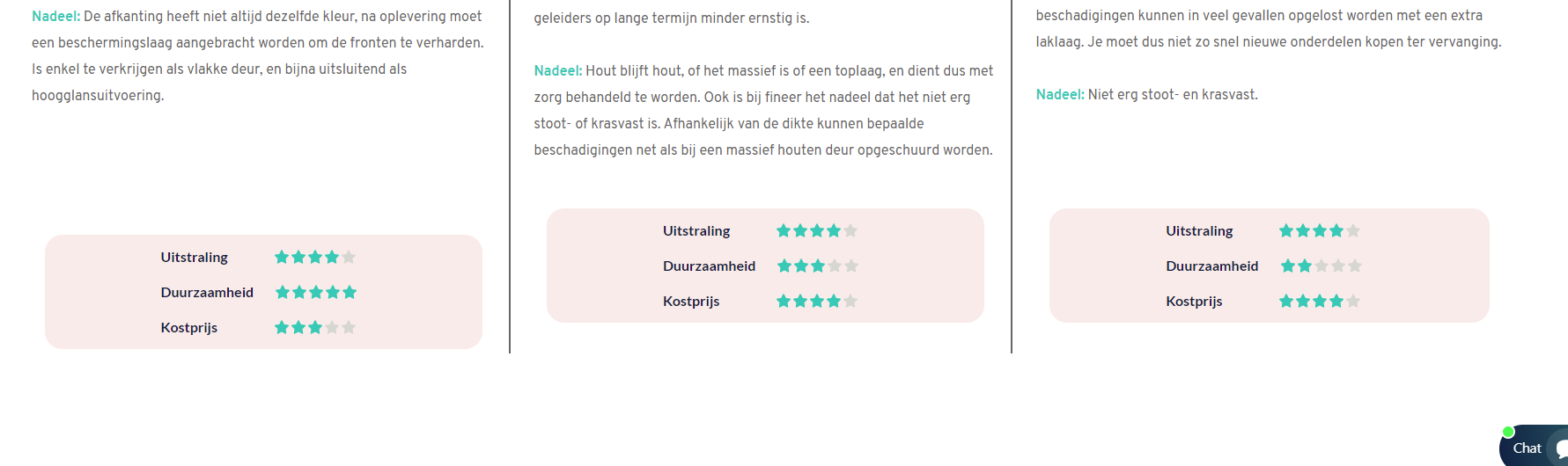
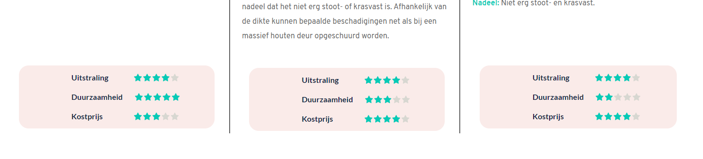
I'll show some pics again.
The first image is in the builder, 2nd one is a preview on a 24" screen (notice the 1st one goes up), 3rd is on a 15" screen (here the left 1 goes down).
It seems like such a simple thing to do,..and yet I can't figure it out.
Hopefully you can help me out.
Thanks in advance.
Best regards,
Yonik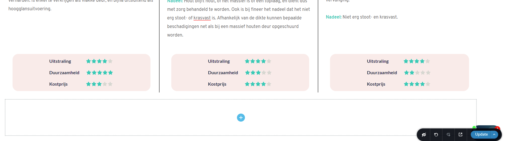
 0
0 -
Hi,
Yes, I can suggest you a solution but this will need a bit more work. This solution means that you have to create a new row where you will have 3 columns and in each column, you will duplicate the ratings. I strived to explain in words how you have to do but understand that it will be more difficult to explain in words :) therefore, I created a video that will show you all the steps you have to do. See here. Hope it will be useful and helpful for you.
Best regards,
Sandra0 -
Hi Sandra,
Your video was very helpful and your solution worked great. Thank you so much!
Sorry for the late response, I've been very busy.
I saw 2 different problems on the website (if you want me to make a new post for this, because it's a different topic, I can).
I noticed that the mega menu on mobile has a hamburger menu within the main hamburger menu (wich doesn't work very well of course). Any idea how to fix this?Is it also possible to use the original main menu in tablet mode (instead of a hamburger menu)?
There is also this purple shadow on my popup (made with Brizy pop up builder that I can't get rid of), it was like this by default.
Here is a video so you can see what I mean: https://www.loom.com/share/07a59c7587ba4d608636c94b2fe4ba5f
Once again thank you so so much for the help!
Best regards,
Yonik
0 -
Hi,
Thank you for the message! Great to know that the video and suggestion work fine for you!
Yes, you can post here the other questions/problem you identify or can create a new post. It is fine in both cases.
In the mega menu, I notice that you added a menu element. If you don't want that this menu (from inside the mega menu) to display as a hamburger in mobile mode, you can disable this option and display it in the normal state. See here.
The same you can do in the tablet mode. You have to open the tablet mode, go to the menu settings and un-check the "Make it Hamburger" option to display the classic menu. See here.
Purple shadow - to delete this shadow, you have to open the pop-up in the editor and go to the row settings. From there, access the Colours -> Shadow and set the Shadow with the "None" option. See here.
Best regards,
Sandra0 -
Hi Sandra,
Once again, thank you very much for your assistance. All my problems are solved!
Have a nice weekend!
Best regards,
Yonik0 -
Hi,
Happy to help! Thank you for updating us regarding this issue! It is a pleasure to know that all is working fine now!
Best regards,
Sandra0
Please sign in to leave a comment.
Comments
10 comments