Thumbnail strip variable products WooCommerce

Hello Brizy team,
We're working with WooCommerce and using both simple and variable products. The thumbnail strip below the main product image seems to respond differently in the top margin settings. The result is that in case of the variable products the strip becomes an overlay above the main image… This is only on mobile view.
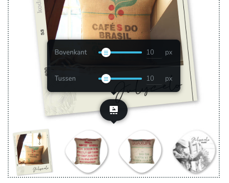

When we adjust these settings in the Brizy template, the simple products works perfect. But the variable products (related to the same template) always ends up with a -32 px top margin, no matter what the Brizy settings are:
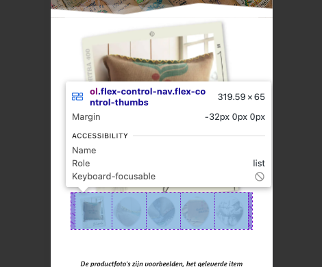
I made a deep dive in our hosting panel and found this file “woocommerce.min.css” path: Hoofdmap > httpdocs >wp-content > themes > kadence > assets > css.
I found this:
woocommerce div.product div.images .flex-control-thumbs{overflow:hidden;zoom:1;margin:0;padding:0;max-width:94%;margin:0;transform:translate(-50%, 0);margin-top:-32px;background:rgba(0,0,0,0);padding:0;width:100%;flex-wrap:wrap;display:inline-flex;justify-content:center;position:relative;left:50%}.
Maybe this -32px could be related to this issue? Is there a solid solution? Because editing the CSS file doesn’t seem to work and isn’t update proof.
Thank you, as always great Brizy support.
Best regards, Xander
-

Hi Xander,
Thank you for reaching out.
Could you please provide us the URL of this product so we can inspect it?
This is how some products look like on my end:
Once we can confirm the issue, we should be able to provide a CSS-based fix if needed.
Looking forward to your update.
Best regards,
Ariel H.0 -
Hello Ariel,
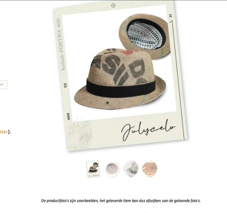
Thanx for the quick response 🙏🏼 I've made an overview of some of our productpages:
SIMPLE
https://jutekoffiezakken.nl/product/wanddecoratie-recht-medium-fincaelparaiso/
https://jutekoffiezakken.nl/product/hoed-corretto-fincaelplatanillo/
Thumbnail strip settings in Brizy match in the front end.
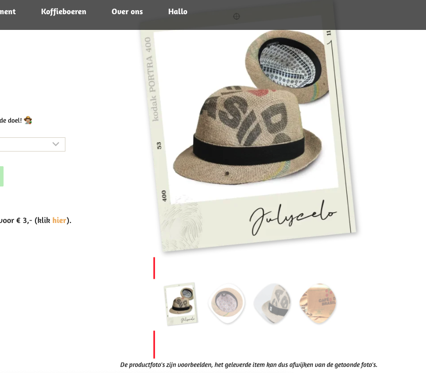
VARIABLE
https://jutekoffiezakken.nl/product/hoed-corretto-rehmco/
https://jutekoffiezakken.nl/product/dienblad-medium-wit-cleancoffee-guatemala/
Thumbnail strip settings in Brizy mismatch -32 px top-margin.
I just found out also the desktop pages have the same shift in thumbnail strip... so it isn't only a mobile issue.
Thank you for a CSS-based solution.
Best regards, Xander
0 -
Hi Xander,
After clearing the cache, the simple products now appear to display correctly. You may also want to purge the NP cache to ensure the simple product pages continue to work properly on the front end.
For the variable products, you can apply the following CSS to control the spacing across devices:
/* Desktop (default) */
.woocommerce-product-gallery ol.flex-control-nav.flex-control-thumbs {
    margin-top: 30px !important;
}

/* Tablet */
@media (max-width: 1024px) {
    .woocommerce-product-gallery ol.flex-control-nav.flex-control-thumbs {
        margin-top: 15px !important;
    }
}

/* Mobile */
@media (max-width: 767px) {
    .woocommerce-product-gallery ol.flex-control-nav.flex-control-thumbs {
        margin-top: 15px !important;
    }
}
Please feel free to reach out if you have any other questions or concerns regarding your website.
Best regards,
Ariel H.0 -
Hello Ariel,
Thank you, the CSS solution fixed the issue for variable products! Only… the top margin in case of the simple products is frozen now. So we can’t adjust them anymore.
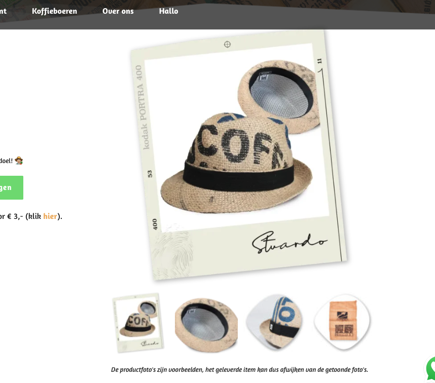
And also the size of the thumbnails in case of variable products has been reduced (mobile and desktop). I’ve check if the quantity of thumbnails may be involved, but whether tree or five thumbnails on a row: sizes are the same:


Could you adjust the CSS so both issues are solved? Or do we need another solution?
Thank you, Xander
0 -
Hi Xander,
Thank you for the update.
Could you please share a bit more detail about the issue you’re seeing with the header on mobile? I just want to make sure I fully understand your request. Are you looking to add some spacing underneath the logo, or is it something else you have in mind?
About the thumbnails, they appear to be at an appropriate size for mobile. Increasing them further could cause layout issues on smaller screens, as they may no longer fit properly. Instead, I added a small adjustment to introduce some spacing above and below the thumbnails so they don’t feel too compressed on mobile devices.
@media (max-width:1024px){
  ol.flex-control-nav.flex-control-thumbs{padding:20px 0!important;}
}
Please let me know if this aligns with what you were expecting, or if you can share a screenshot or short recording of the header issue so I can take a closer look.
Kind regards,
Ariel H.0 -
Hello Ariel,
Thank you, let me explain the issue clearer:
Top margin
We’ve injected your first CSS and made a small change to a zero top-margin for mobile, this works great for variable products:

But for simple products, the top margin increase:

Also notice that the text underneath the thumbnail strip has more top margin in case of variable product than a simple product.
Notice that we use the same hat-template all the time.
Our goal: we like the top-margin above the thumbnail strip in case of the variable products and want the text beneath this strip like the simple product. Is this possible with a new CSS code?
Thumbnail size desktop
This is what the desktop thumbnails look like for a simple product:
And here, same template, but a variable product:
So you see the difference in thumbnail size? And also more padding beneath the strip? This is after using your first CSS. We’d love the thumbnail size in case of the simple products including padding beneath the strip, if this could be the default for desktop it would be great.
Thanks again 🙏🏼
0 -
Hello Ariel,
Sorry it looks likes we're editing the same CSS code in the Kadence theme at this moment. We're facing some other difficulties, so that's why we're in the editor too. We've enabled testmode on NitroPack during this editing, so I could imagine your test-result may have affect this. We're now out of the CSS editor and enabled NitroPack back on. Note that our productpages needs a cache warm up, so when visiting the page, the first result could be non cached / delayed.
Good luck, thank you Xander
0 -
Hi Xander,
Could you please try adding the CSS below and let me know if it helps resolve the spacing and thumbnail size on mobile, especially for the variant products? This should remove the gap at the top and make the thumbnails a bit larger.
/* remove gap at top on mobile, make thumbnail bigger in variant prods */
.brz .brz-css-7erym4 {
    margin: 0px 0px -30px 0px;
    align-items: flex-start;
}

.woocommerce div.product div.images .flex-control-thumbs {
    transform: translate(-50%, 0) scale(1.5);
    margin-top: 50px !important;
    margin-bottom: 20px !important;
}
Once you’ve applied it, please let me know how it looks or if you have any other concerns I can help with.
Kind regards,
Ariel H.0 -
Hello Ariel,
Thank you, we’ve checked the pages. This is the result:
Variable product, mobile:

You see, way to much padding between top and bottom.
Simple product, mobile:

This looks nice, top-padding above the thumbnail strip could be a little less, but all right.
And the same pages, desktop results:
Variable product:
Again, way to much padding between top and bottom.
Simple product:
Looks nice, love it.
So could you adjust the CSS code for the variable products?
We’ve encountered a new issue… the top of the menu in desktop version responds on the -30px code we’ve injected:

At this moment, we’ve enabled NitroPacks testmode. Please use the “?testnitro=1” slug to test the pages above:
https://jutekoffiezakken.nl/product/hoed-corretto-cafesdobrasil/?testnitro=1
https://jutekoffiezakken.nl/product/hoed-corretto-fincaelplatanillo/?testnitro=1
If you purge the cache of these productpages, you see the optimization result in the NitroPack dashboard within WP.
Thank you 🙏🏼
0 -
Hi Xander,
Thank you for your message. Could you please share the templates you’re using for the variable and simple products? We may need to tweak the templates directly to properly address this.
At the moment, the CSS behavior isn’t fully consistent because the container for the product thumbnails doesn’t have the same size across product types.
Kind regards,
Ariel H.0 -
Hello Ariel,
Thank you, the template we use is in our Brizy Templates library. Name of the template = "Hoed" (hat / cap). To be clear: we use only 1 template for our hats. In our case we have 3 types of hats in stock, 2 of them are variable (Brasil and Vietnam), only one is simple (Guatemala). All the hats use the same template. I saw you've edited the template this morning, so that's the right file. Do you need any more info about this template?
We use another template for a productline who also share both simple and variable products. This template is "Jute koffiezak". You'll find it in the Brizy Templates library.
For now we disable testmode, so please when you need to edit CSS again please give us a heads up so we first enable testmode. 🤓
Thanks again, Xander
0 -
Note that we edit your last CSS from:
margin: 0px 0px -30px 0px;
to:
margin: 0px 0px 0px 0px;
because our topmenu was broken...
0 -
Hi Xander,
Would it be okay if I clone your website into my local test environment? The layout is quite complex, and testing it locally will allow me to investigate the issue more thoroughly without any risk of affecting your live site.
The copy would only be used in a secure staging environment strictly for testing purposes.
Thank you for your understanding.
Best regards,
Ariel H.0 -
Yes, that’s fine. Thank you for taking this issue so seriously.
Good luck, Xander
0 -
A short question... did you disable our plugin: "Object Cache 4 everyone" ?
0 -
Hi Xander, I didn’t disable any plugins on your site.
Kind regards,
Ariel H.0 -
Allright, thank you for the quick response 👍🏻
0 -
Hi Xander,
Thank you for your patience.
About the variable products issue, this is coming from the Kadence theme.
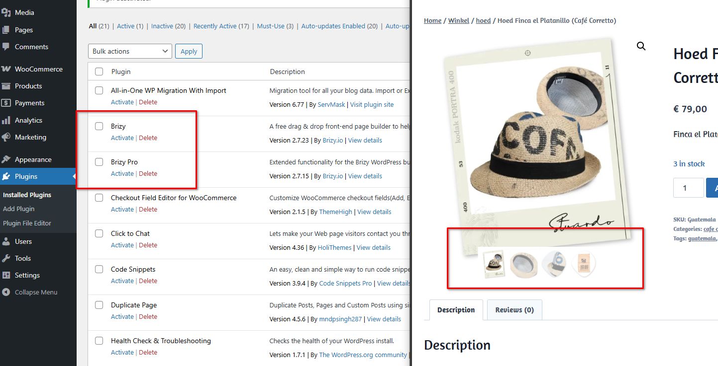
We’ve attached a screenshot showing that even with both Brizy and Brizy Pro disabled, the product thumbnails are overlapping. Unfortunately, resolving this via custom CSS would be beyond our scope and would require significant time.
As an alternative, we recommend switching to a different theme that doesn’t exhibit this behavior. We tested your site with the Astra theme, and it works well with only minor tweaks. Additionally, the WooCommerce product gallery in Astra doesn’t rely heavily on complex CSS, which helps avoid issues like this.
About the menu issue, the header is currently quite complex due to the use of negative margins, which makes the layout difficult to manage. For this type of design, the recommended approach is to create separate headers for desktop, tablet, and mobile.
You can review this setup on the staging site here:
https://staging.brizywp.online/jutekoffiezakken-nl/wp-admin/post.php?action=in-front-editor&post=20356The staging site uses the same credentials as your live site. You’re free to review the changes there, download the templates, and apply them to your live website. We also recommend inspecting the product template on the staging site and comparing it with how it’s currently built on your website.
You’ll have full access to this staging server, and we’ll remove it once everything is working correctly on your side.
Please let us know if you have any questions or need clarification.
Best regards,
Ariel H.0 -
Hello Ariel,
Thank you for this deep dive-in. I've just checked a couple of productpages and the thumbnail strip and padding on mobile suddenly looks fine 👍🏻 We’re still on the Kadence theme. Maybe the latest update to Brizy 2.7.23 / 2.7.15 solved this part of our issue?
Do I need to maintain the latest CSS injection?
This one:
/* remove gap at top on mobile, make thumbnail bigger in variant prods */
.brz .brz-css-7erym4 {
margin: 0px 0px 0px 0px;
align-items: flex-start;
}@media (min-width: 768px) {
.woocommerce div.product div.images .flex-control-thumbs {
transform: translate(-50%, 0) scale(1.5);
margin-top: 15px !important;
margin-bottom: -15px !important;
}
}@media (max-width: 767px) {
.woocommerce div.product div.images .flex-control-thumbs {
transform: translate(-50%, 0) scale(1.5);
margin-top: 22px !important;
margin-bottom: -22px !important;
}
}Unfortunately there is a new issue….: after clicking one of the thumbnails on desktop, the page creates a huge white space, I made a recording:
url:
https://jutekoffiezakken.nl/product/loungekussen-large-monsoonedmalabaraa/
On mobile I also noticed a small shift after clicking a thumbnail, maybe you could test it.
This are three other productpages:
1 https://jutekoffiezakken.nl/product/dienblad-medium-wit-cultivar-peru/
2 https://jutekoffiezakken.nl/product/hoed-corretto-cafesdobrasil/
3 https://jutekoffiezakken.nl/product/wanddecoratie-rond-large-cohonducafe/
Note that we’ve completely set up the Kadence theme, including the plugin Kadence Woocommerce Email Designer, so we would like to stay with Kadence.
Please help. Thank you, Xander
0 -
Hi Xander,
We’ve checked this on the staging site, and the issue does not occur there.
https://staging.brizywp.online/jutekoffiezakken-nl/product/loungekussen-large-monsoonedmalabaraa/
https://staging.brizywp.online/jutekoffiezakken-nl/product/hoed-corretto-cafesdobrasil/
https://staging.brizywp.online/jutekoffiezakken-nl/product/dienblad-medium-wit-cultivar-peru/
https://staging.brizywp.online/jutekoffiezakken-nl/product/wanddecoratie-rond-large-cohonducafe/Could you please temporarily disable NitroPack and see if that makes any difference? This will help us confirm whether it’s contributing to the behavior on the live site.
About the CSS, it will still be required if you prefer to continue using Kadence.
Please let us know what you find after testing.
Best regards,
Ariel H.0 -
Hello Ariel,
Thank you, we've checked some productpages disabling NitroPack. It's quite easy to check when you ad the ?nonitro slug after the url. So https://jutekoffiezakken.nl/product/hoed-corretto-cafesdobrasil/ becomes https://jutekoffiezakken.nl/product/hoed-corretto-cafesdobrasil/?nonitro without NitroPack.
It looks like you are right: the shifting errors doesn't occur when NitroPack is disabled. Quite strange: sometimes enabling NitroPack the thumbnails don't create the white space, so it's very fickle... I'll keep you informed when there is any news.
Thank you, Xander
0
Please sign in to leave a comment.
Comments
21 comments