Differences in Desktop and Mobile view.

Hello,
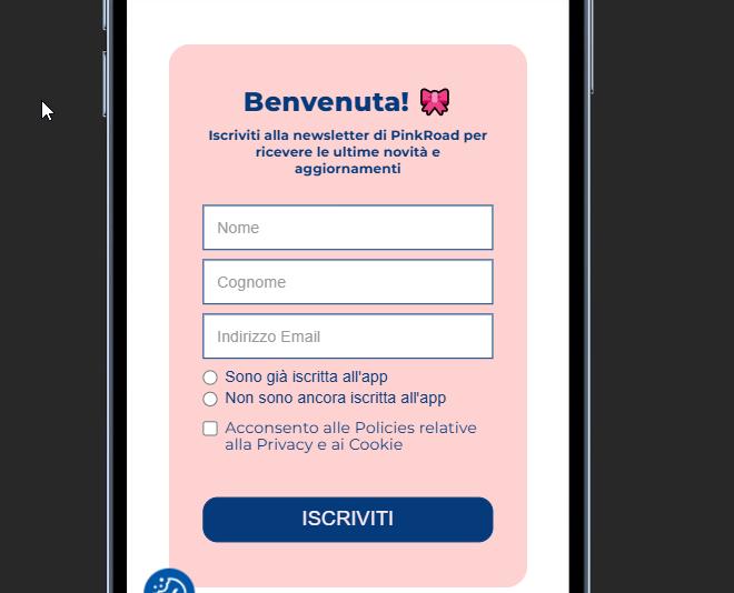
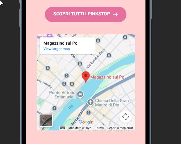
I am trying to adjust the forms and maps in my site, and on the desktop side i am not facing any issue; the problem is on the mobile part, because all the forms and maps seem stretched.
Do you know how i can modify the mobile part without affecting the desktop segments?
Thank you,
Simone
-

Hi Simone,
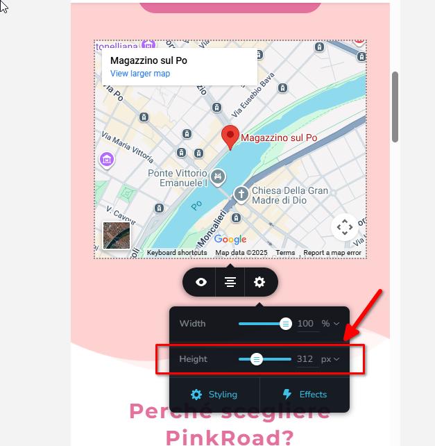
Thank you for reaching out. You can adjust the map height specifically in mobile view so it doesn’t look stretched, this change will only apply to mobile and won’t affect the desktop layout.
For the forms, I recommend adding a bit more space on both the left and right sides in mobile view.
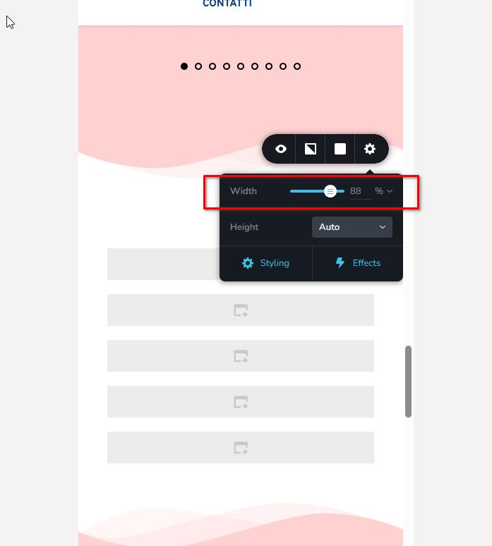
You can do this by increasing the width (length) of the form’s parent block, which helps prevent the form from looking squeezed on smaller screens.
Kind regards,
Ariel H.0
Please sign in to leave a comment.
Comments
1 comment