Why are images losing its positions in different resolutions and how to avoid it?

Hi!
I have a design consisting of 4 squares. where every 2nd square is an image, the others a few text blocks. They are all visually connected to each other to the inner corner.
1st image shows brizy editor. All 4 corners nicely connected to each other.
2nd image shows a slight deviation in the inner corner for one of the images on a 16" screen.
3rd image shows how images have just "floated away" on a 13" screen.
1. How can I avoid this "floating" even if text areas will increase in vertical direction? I've tested the "Medical" layout which have similar design (and does work) and replicated its settings, but with no success.
2. Why this small artefact between brizy editor and live view?
For reference, this is the behaviour I'm looking for (try it by making the web window narrower):
https://maiamarketing.se/seo/
-

Hello Mikael,
It is possible to make the above design responsive for different screen sizes in Brizy. For example, have a look at https://restaurant-1.brizy.site/4-column-design using different screen sizes.
Can we look at your design to see why it is not responsive? Please send us your desing in the ZIP file format following these steps
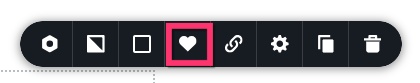
- Save the block by selecting the "heart" icon.
- In the Saved Blocks and Layout Library, hover over the saved block and click on the download icon to download the block.
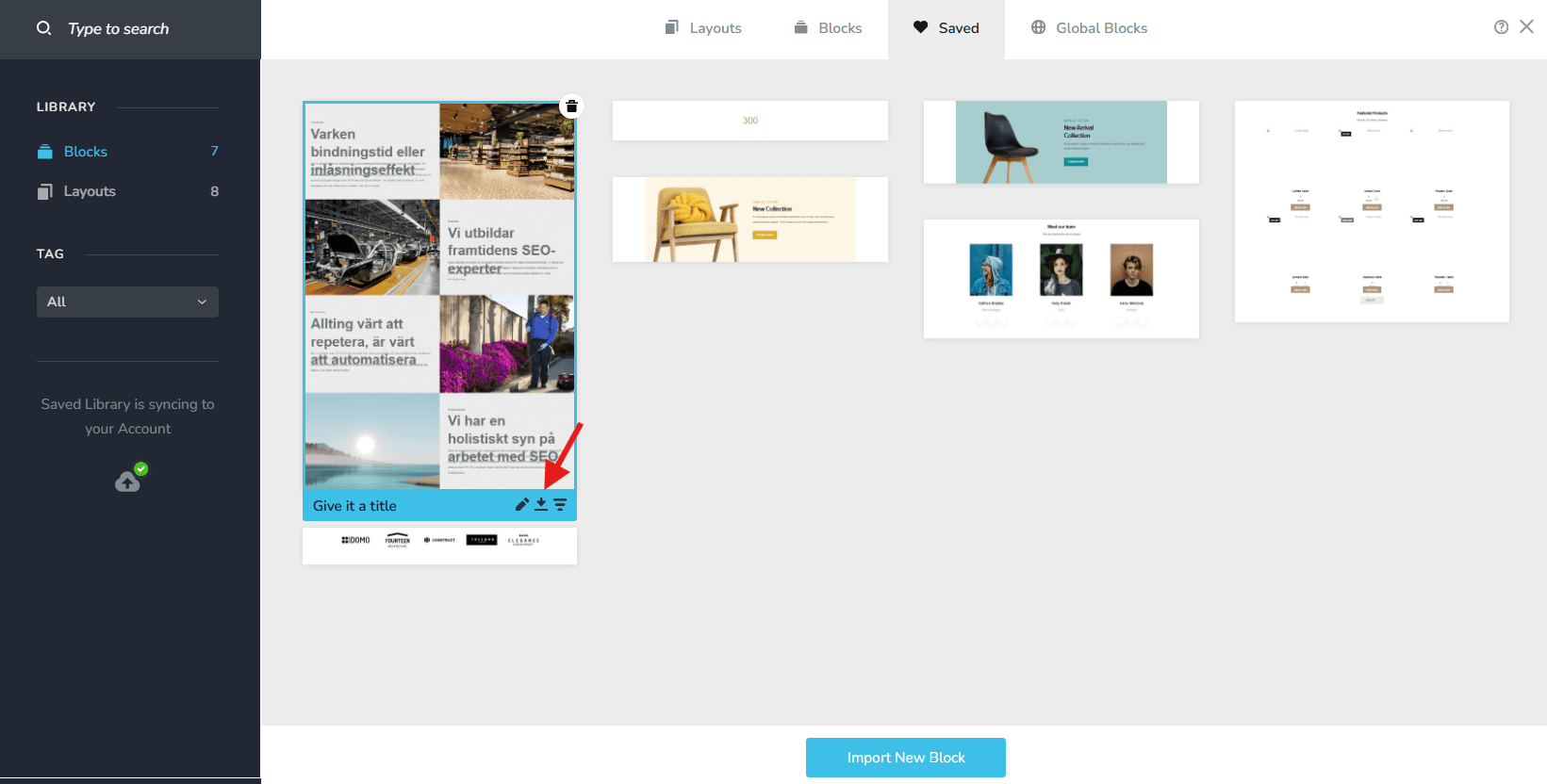
- Upload the ZIP file to an online drive such as Google Drive, Jumpshare, OneDrive, Dropbox and send us a link to the ZIP file
0 - Save the block by selecting the "heart" icon.
-

Hi Mikael,
You can also try this approach: https://youtu.be/F340fpvcb68
We recommend building this layout using a Row element with two columns. Make sure the second column (the image column) has zero padding and zero margin, and also check that the image element itself and the entire row have no padding or margin applied, as these can create gaps. Place the text and other elements in the first column and enable vertical centering for better alignment as the content height changes.
Once the first row is set up, you can duplicate the row, replace the image, and then use the switch/flip columns option so the image column moves to the opposite side. This makes it much easier to keep everything aligned. You can repeat this same process for additional rows. Using this structure should keep the elements visually connected across screen sizes and avoid the issue you’re seeing between the editor and live view.
Best regards,
Ariel H.0 -
Hi Brizy support team!
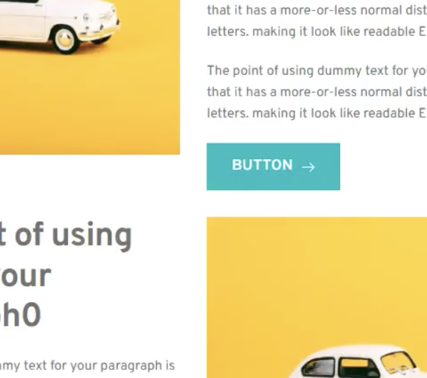
Ariel, I checked out the video you posted for this purpose. Appreciated!
However that video shows the issue. You can clearly see how the text is pushing the images aside (see attached images). In all other posted links above this behaviour doesn't exist.
How can this be solved?
BR
//M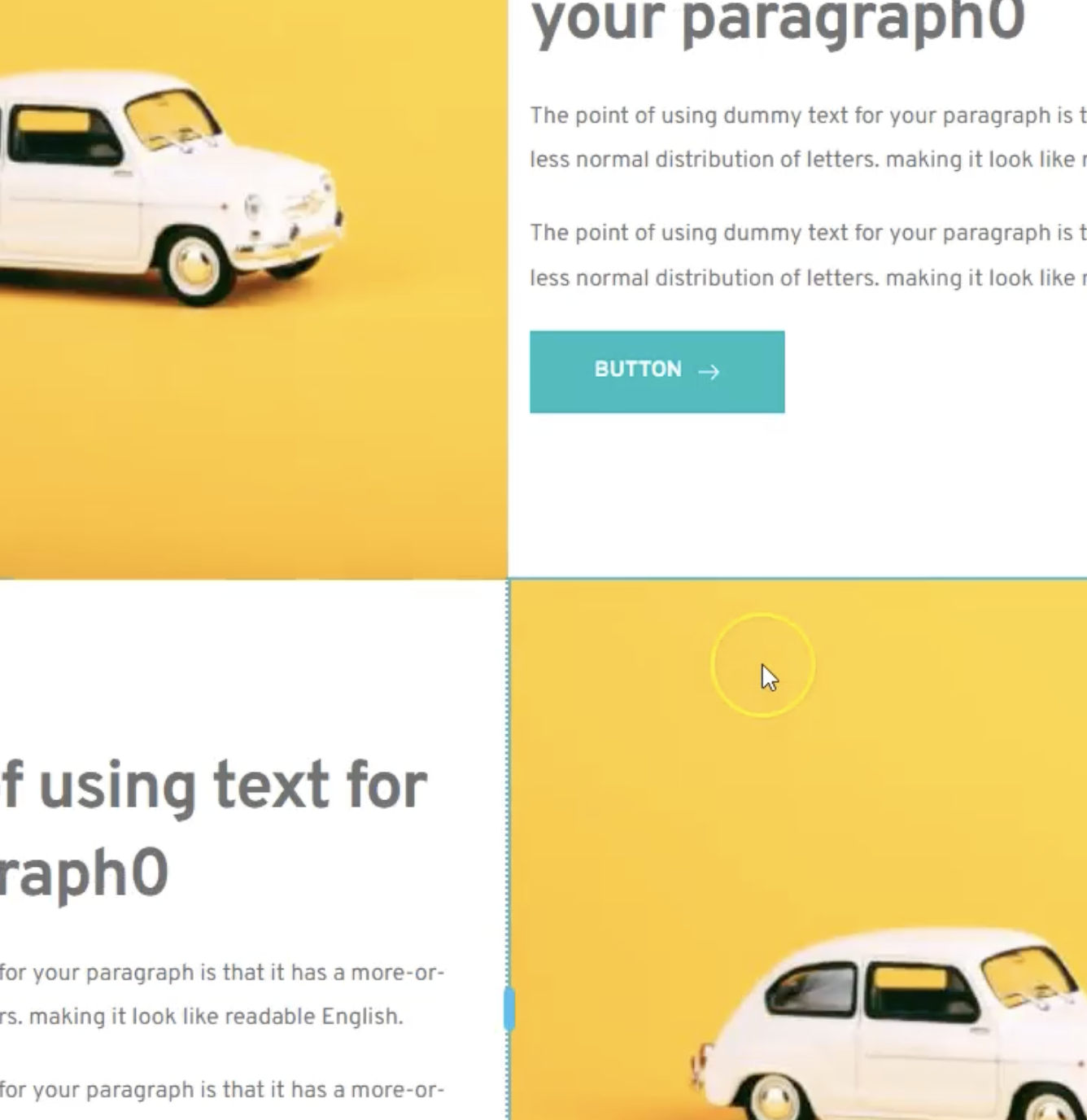
 0
0 -
Hi Mikael, I see what you mean, instead of using the image element, please set the image as a background to the column instead - https://youtu.be/FRVbehrclhQ
0 -
Perfect thx!
Indeed it solved the problem.
Thx, you great support!0
Please sign in to leave a comment.
Comments
5 comments