The tablet hero image not displaying correctly on live site

The hero image looks fine in the editor in both, desktop, tablet and mobile, but not on a live site, with regard to viewing on a tablet in a horizontal orientation.
I have no idea how to fix this. I assume it's a bug, or human error, though its hard to correct when the editor shows that it's working fine.
Please can you fix it, or provide a detailed step by step guide on how to resolve this.
Thank you. Kind regards
Nigel
https://brainslim.com
P.S.
Sometime the live URL gives a longer version, but i don't know why or if it's related?
https://www.brainslim.com/#dupxuffnsrfedrkxolifymghrwqbcozhmcpu_dupxuffnsrfedrkxolifymghrwqbcozhmcpu
-

Hello Nigel,
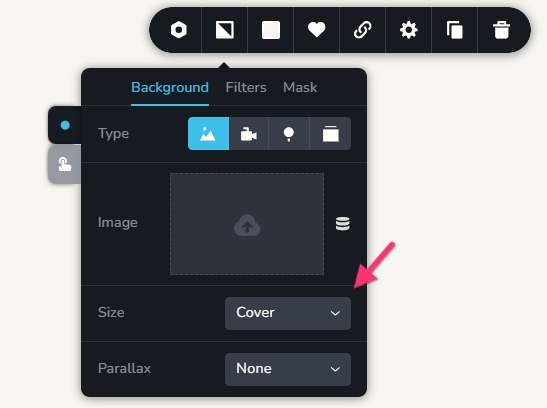
Are your concerned about the background image not covering the entire screen width and height in tablets in landscape mode? To fix the issue, kindly select the "Cover" option for your background images.
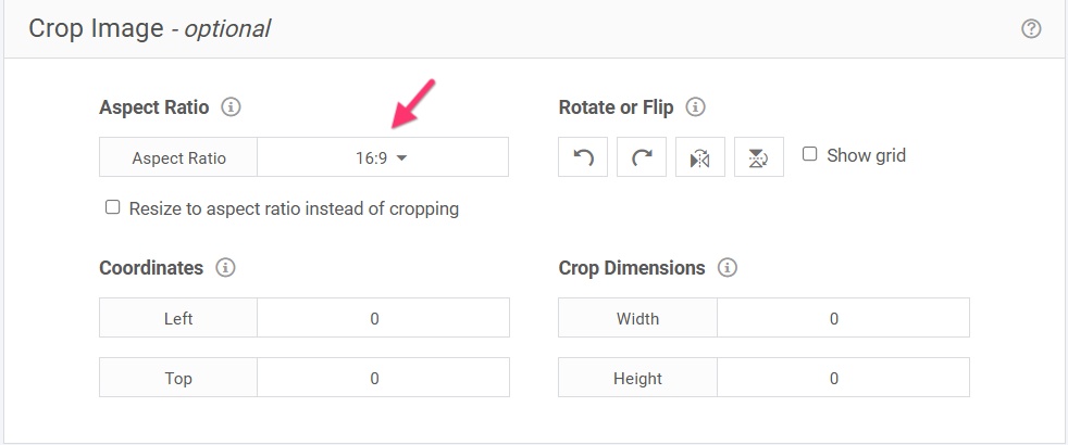
Cropping your image to 16:9 aspect ratio might also help to provide an immersive viewing experience in most of the devices. You can use https://redketchup.io/image-resizer to crop your image to this aspect ratio.
 0
0
Please sign in to leave a comment.
Comments
1 comment