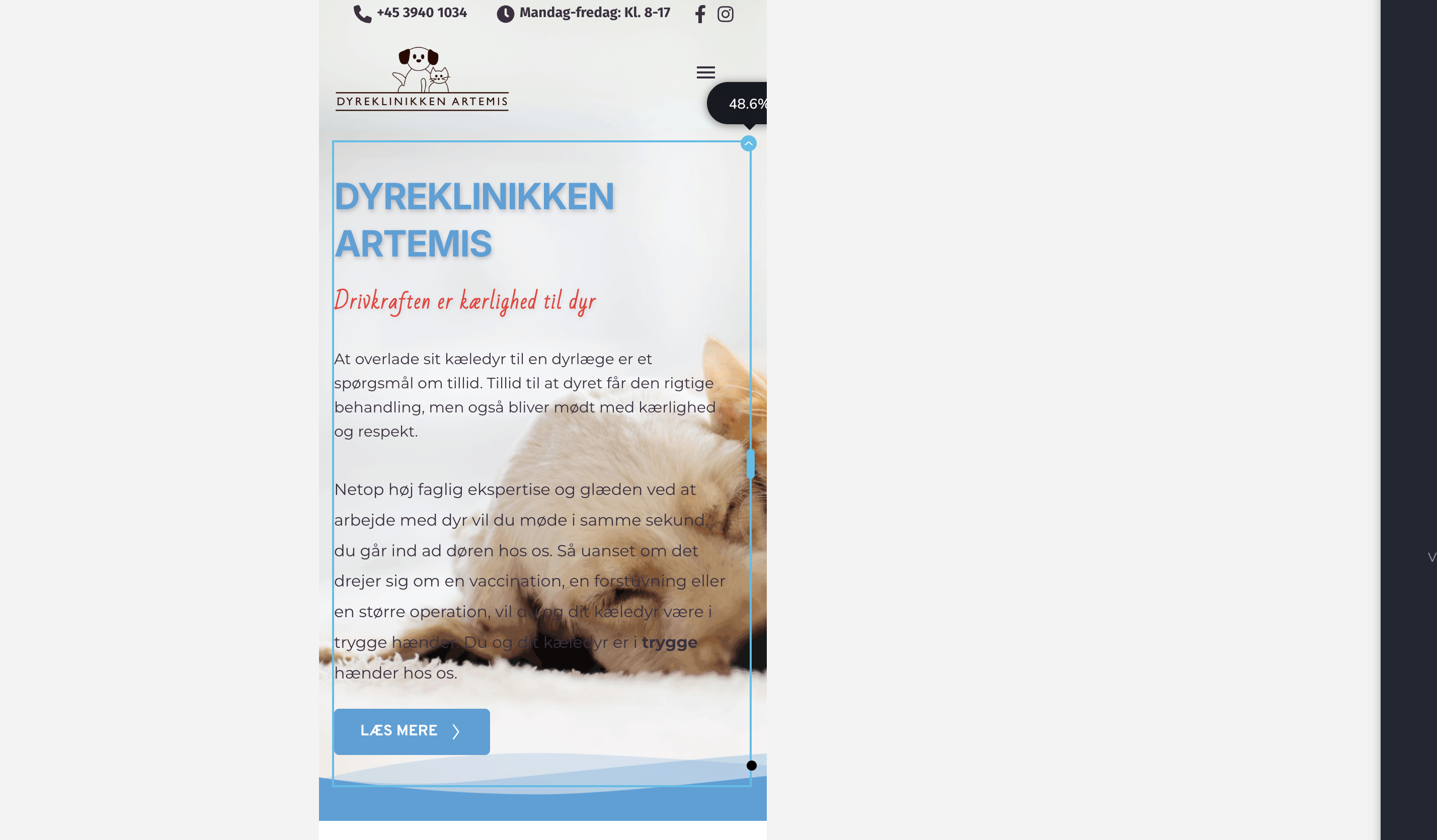
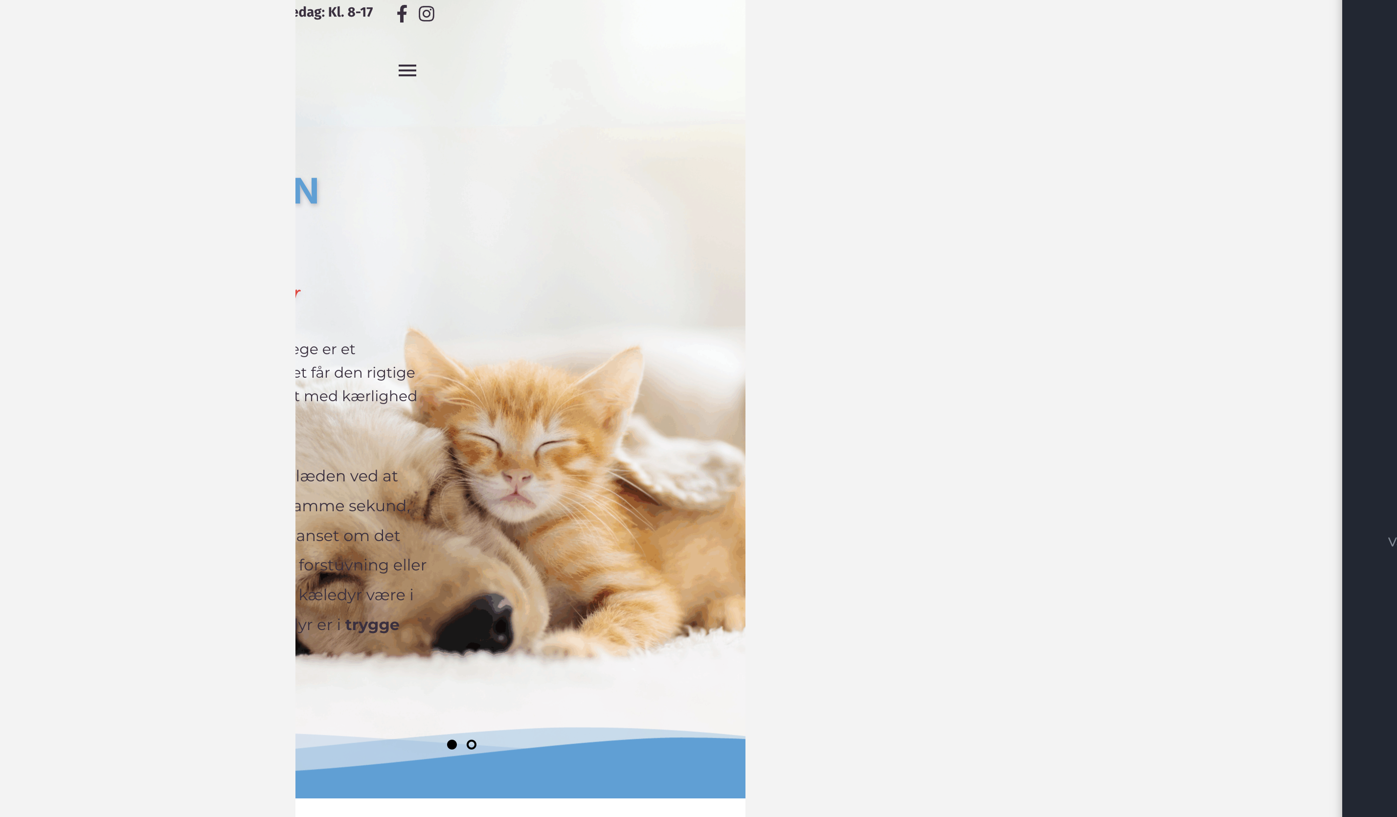
Responsive (mobile/tablet) is very wide

Dear Brizy Support,
When editing my design in mobile or tablet view, the layout appears much wider than the screen, requiring horizontal scrolling to view all content. I have already verified that all elements are set to 100% width and that no elements have negative margins applied.
Could you please advise on what might be causing this issue and how I can resolve it?
Kind regards,
-

Hi Ss,
Thank you for contacting us.
We’ll need to check this directly on your website to better understand the issue. Could you please provide us with temporary access to your WordPress admin page so we can take a closer look? Please add us as an Admin user and send the following details to communitysupport@brizy.io.
Community Post link: https://support.brizy.io/hc/en-us/community/posts/28765216619666
WordPress Admin URL:
Username:
Password:Looking forward to your reply.
Best regards,
Ariel H.0
Please sign in to leave a comment.
Comments
1 comment