Can't click any items in website

Hi,
I'm working on this website's mobile design where I'm trying to have a sticky header on top of the page and also the bottom. The top will have the logo and the hamburger menu while the bottom has call to action buttons like request appointment and call #.
I was able to design this in Brizy Cloud with multiple headers, however, it seems like because of how I set it up, I can't click anything within the website anymore since I used margins (-%175) to shift the bottom header to stick at the bottom of the page when I scroll down the website.

Can someone point me to how I can fix this issue please?
Also, is there a better way to ensure the bottom header does stick to the bottom no matter the screen size?
Thanks
-

Hello Kim,
Developing a sticky footer for mobile phones by adding a top margin to a header block is not a recommended approach. Instead, you can design a sticky footer for mobile devices using the Brizy popup builder. A sticky header developed using the popup builder may look like the one at https://restaurant-1.brizy.site/. Kindly check this link on a mobile.
You can also implement a sticky menu on mobiles by following the procedure at https://jmp.sh/8wEDw3s4 using the "Fixed" position for elements.
1 -
Thanks for the response.
Is there a way to only show the bottom sticky footer once you start scrolling down the page? I want some elements from the header to become hidden as well once I start scrolling the page.
Thanks
0 -
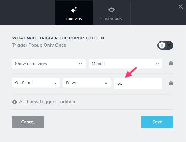
Hello Kim,
The sticky footer will appear when the user scrolls down half of the page length if you select these "Trigger" conditions for your popup. (50 means 50% of the page length). Check out https://restaurant-1.brizy.site/ on a mobile.
 0
0 -
Thank you. Used the pop up method to build the sticky footer menu
0
Please sign in to leave a comment.
Comments
4 comments