Issue with Menu - Vertical with Submenu

After the last update I now have an issue with the Menu element which I use as a mobile menu for most of my websites. The issue is when menu is displayed vertically, it is now leaving a big gap when there are sub items (drop down) in the menu. This was not happening before the last update and is now happening on all of my client sites. I have also disabled any caching and cleared to make sure that was not the issue.

-

Hi Ian,
Thank you for contacting us.
Could you please share the URL of one of the affected sites so we can inspect it?
In the meantime, please try editing the global header that contains the menu. Add a small change like adding 1px of padding to the global block, save the changes, and then preview the live site. If this resolves the issue, you can revert the padding and click Update again. This step helps force Brizy to recompile the page, which can sometimes fix display issues after updates.
Please try this and let me know how it goes.
Best regards,
Ariel H.0 -
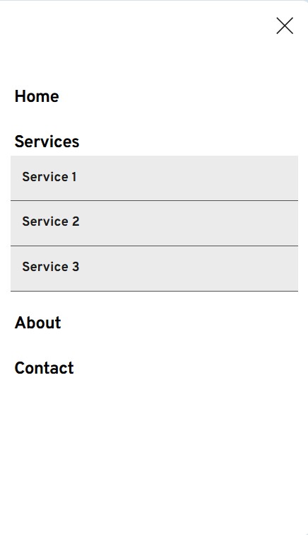
Apparently, it is happening in Cloud as well. Here is an example, it seems to only happen in tablet and mobile - https://bushbaby34771aa7.brizy.site/
 0
0 -

Hello Ian,
This seems to be a bug with the Menu element. On mobile devices, additional space is left free for the submenus to open when they are added to a menu. We will report this bug and work on fixing it.
To fix this issue in your project until then, move the "Services" menu to the bottom (as the last item in your menu)
 0
0
Please sign in to leave a comment.
Comments
3 comments