Website update - desktop size and responsiveness

Hello,
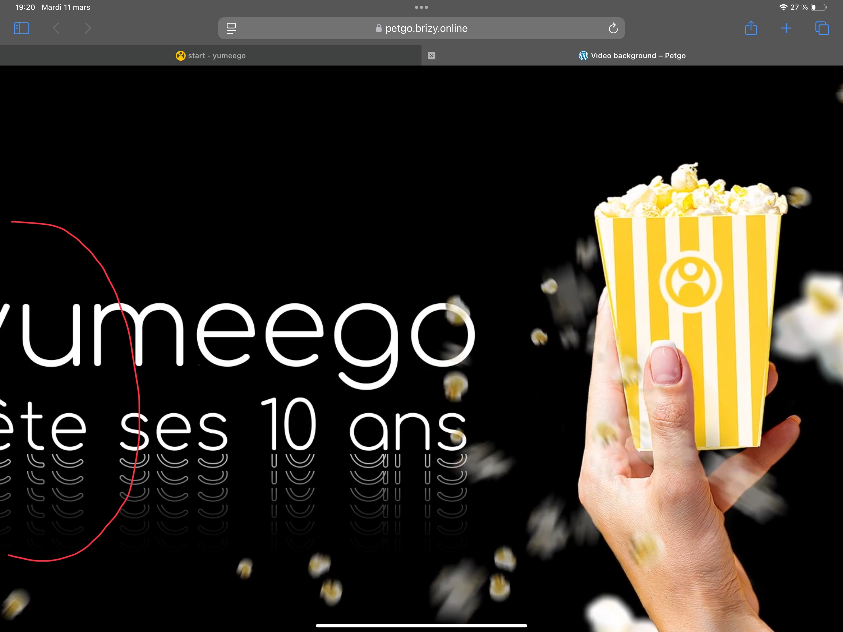
We are celebrating or 10 years business anniversary this year. Consequently, I developped a more minimalistic website with a new look and fill. Unfortunately ( I am not a developer) I face issues with screen size adaptation.
We developped a video that I place in the background. The video is cut on the left hand size of the screen depending on the resolution. It does not seem to adapt itself to the screen properly (or as expected).
I also hace display issue in terms of size when using Chrome or Safari on ipad.
I have different reaction as well related to email adress or phone number displayed on page. How can we make it just plain without any possible interaction? simply displayed.
I still did not tried to adapt the site to tablet or mobile yet since I am not fully satisfied with the desktop version. I also do not cleary understand with an ipad, if we are in desktop mode when in landscape and in tablet mode when vertical...
The pages for you to access the futur version of the site are:
yumeego.fr/splash
yumeego.fr/start
I also join a serie of screenshot for you to best understand my questions.
Many thanks for you support and congratulation for the great tool anyway.
Alex
-

Hello Alex,
To display the video in full width on all three devices, kindly try these settings.
-
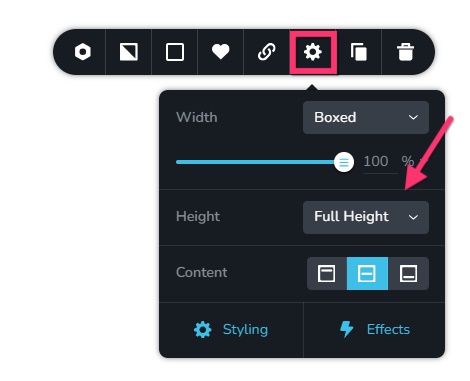
Desktop: In the desktop, set the block to "Full Height"
-
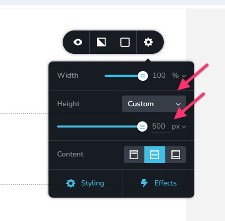
Tablet: In the tablet design, set the block to "Custom Height" and set its height to approximately 500 pixels. Explore higher and lower pixel heights for optimal viewing of the video.
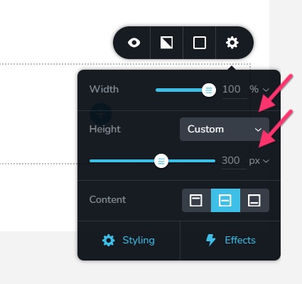
- Mobile: Set the block to "Custom Height" and set the height of the block to approximately to 300 pixels. Explore higher and lower heights before finalizing an optimal one.
0 -
Desktop: In the desktop, set the block to "Full Height"
-
Hello George,
Thanks for your reply, nevertheless nothing has changed... As explained, I have issues with the site to be displayed on all size on desktops and making it sure it is homogenious on major browsers (Chrome, Safari, Firefox).
Now with ipad (I have an ipad pro), what happens when horizontal ? It is no Tablet but Desktop. And when we turn it verticaly, it is still the horizontal desktop version displayed vertically. So when do the "Tablette" or "Desktop" works ? Whatever I do nothing changes and I still do not have the same results horizontaly with Chrome and Safary.
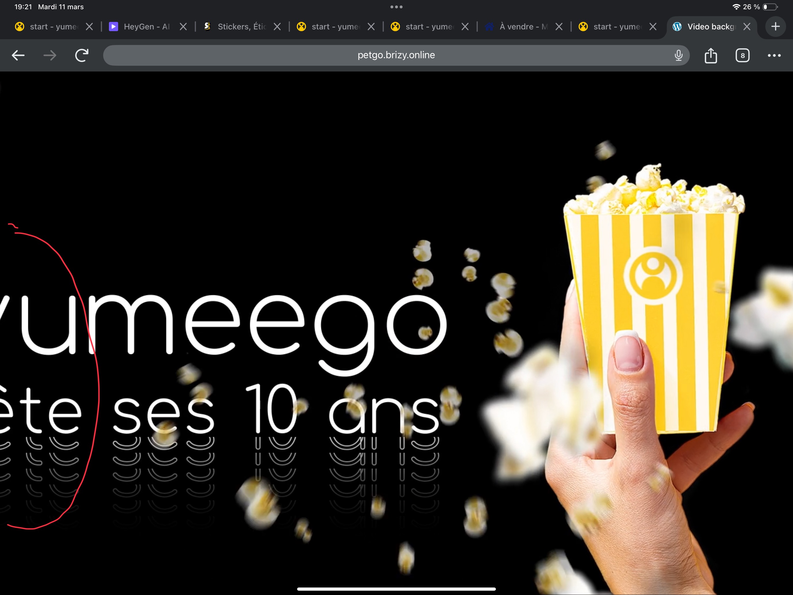
Since I could achieve a good result with the video (still cropped on the left side, please check here : yumeego.fr/splash), I decided to have the video on a popup....still same issue. The page is for desktop, ultra long...I am lost.
Is there a way for me to have my simple website working with the help of someone? I can share my access code and have it fix. You can charge me for that since I spent already too much time on it. I thought it was easy with Brizy but since it's not my main competency, I need help. Can you help me please?
0 -
Hello Alexandre,
Kindly test the page https://petgo.brizy.online/video-background/ on a mobile, tablet and laptop/desktop and check if the entire width of the video is visible. If everything looks good, I will share the settings for the mobile, tablet and desktop designs.
0 -
Hello George,
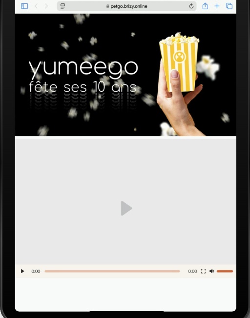
Thanks for your test URL. As you can see it is badly displayed on ipad. Both on Chrome or Safary...
The video is HD : 1920x1080
 0
0 -
Hello Alexandre,
You are right, certain tablets with higher screen widths will display the desktop design. I am afraid we can't fix this issue. Let's say there are 100 variations of tablet screen sizes. Your video is likely to play well on 95 tablet screen sizes while parts of the video will go out of the view port in 5 tablet screen sizes.
For instance, this is how the page displays on iPad Air
 0
0
Please sign in to leave a comment.
Comments
5 comments