Hiding mobile and tablet sections in a global block isn't working

Hello
I'm trying to design my tablet and mobile menu headers because I cannot get the columns in the order I want.
I almost have it how I want it. I have 3 headers and am hiding the relevant ones on each screen size.
The problem is that it won't let me hide the mobile and tablet versions from my desktop editor.
The site is here: https://gtgirrigation.brizy.site/
At the moment you'll see 3 headers, trouble is I can't hide the top two (mobile and tablet). But on the mobile and tablet editor I am able to hide the ones I don't need.
I've attached some screenshots to demonstrate:
Image 1 - 2 sections I want to hide - but the editor doesn't show the "eye" icon to turn them off.
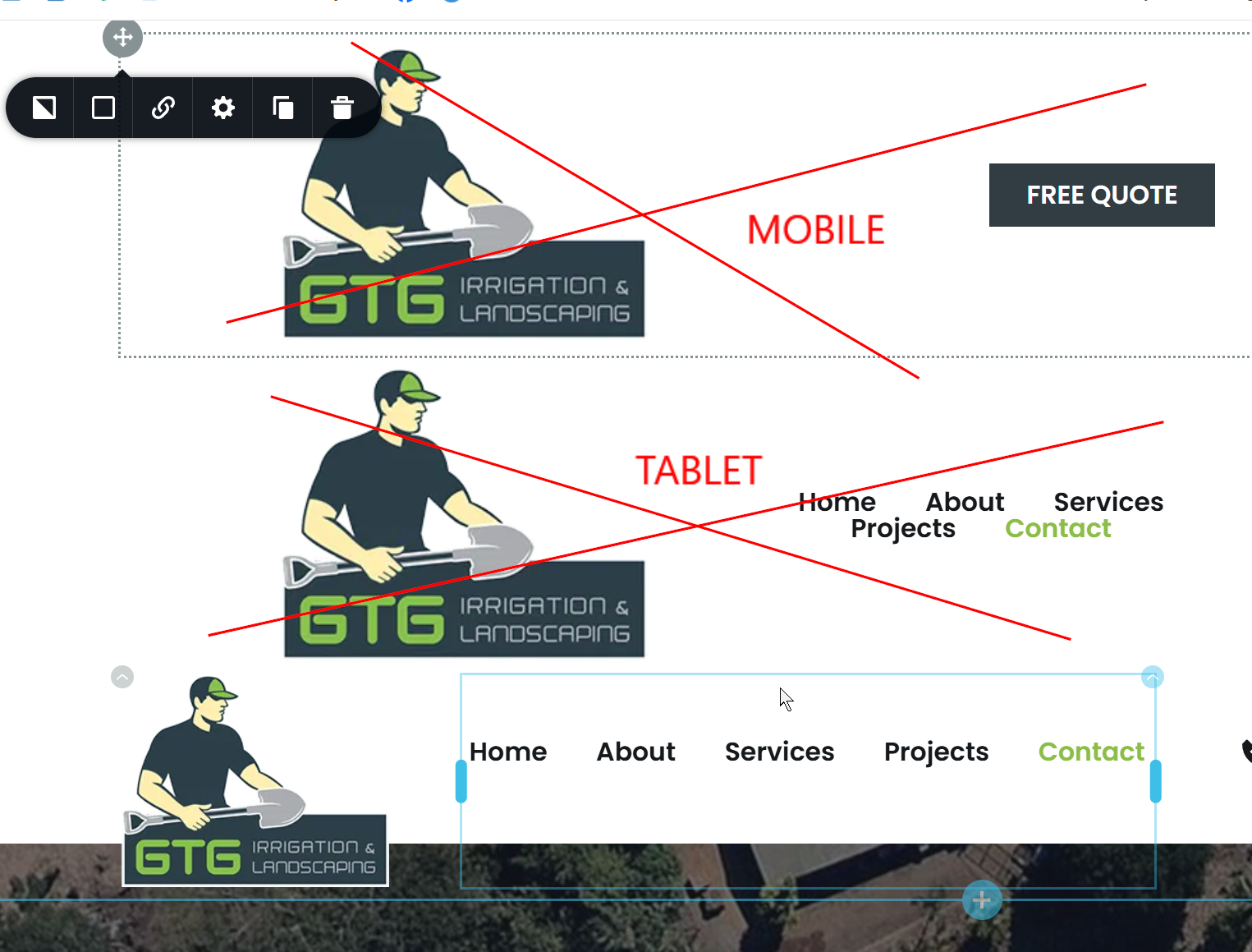
Image 2 - Tablet version - looks good, as I'm able to hide the desktop and mobile

Image 3 - Mobile version - looks good, as I'm able to hide the desktop and tablet

Image 4 - Desktop version - has another separate design which looks good, except I cant turn off the other two (as per the first screenshot) which sit above it.

I hope this makes sense, can you advise how I go about customising the tablet/mobile menus? I have each column in a row so I was hoping to arrow them around on each screen size but it doesn't work, it moves groups of sections, not independent columns from left to right.
Thanks.
-

Hello Eva,
I have hidden the mobile and tablet designs in the desktop design view and have also created a screen recording with the procedure. Kindly have a look at https://jmp.sh/yn683U5J for the procedure.
0 -
Thank you! I was looking everywhere for the little 'eye' icon like on the other screens.
Do you think I'm going about this procedure the right way (ie creating 3 versions of the menu)?
I would have thought it would be better to just do one menu and tweak it for each screen size but I couldn't have fine control over moving columns from left to right (it moves in groups not single sections) and if I hide one element it leaves a gap. On previous sites I did only have one menu design but the hamburger menu was in the middle and it just didn't look ideal, so for this one I did the 3 versions. Just want to make sure I'm doing it the right way for future jobs.
Thanks again.
0 -
Hello Eva,
It is difficult achieve a required design by rearranging 5 columns within the header block. Hence having separate headers for desktop, tablet and mobile is a good solution for this project.
0 -
Thanks :)
0
Please sign in to leave a comment.
Comments
4 comments