How to make embedded form redirect go to page outside of iframe

I have an embedded form on the page https://www.innovationassessment.org/assessment. When the form is submitted, it's supposed to redirect the user to https://www.innovationassessment.org/confirmation, however, the redirect is happening inside the iframe on the first page. How can I fix that?
Also, I would like the embed window to take up more of the page width, is it possible to do that? I am not a coder, so any specific code you can provide would be helpful. This is the code that is in the iframe and how it looks on the page:
<style>
.responsive-form {
position: relative;
width: 100%;
height: 0;
padding-bottom: 150%; /* Increased height for longer forms */
}
.responsive-form iframe {
position: absolute;
top: 0;
left: 0;
width: 100%;
height: 100%;
border: 0;
}
</style>
<div class="responsive-form">
<style>
.responsive-form {
position: relative;
width: 100%;
height: 0;
padding-bottom: 150%; /* Increased height for longer forms */
}
.responsive-form iframe {
position: absolute;
top: 0;
left: 0;
width: 100%;
height: 100%;
border: 0;
}
</style>
<iframe src="https://getformly.app/8pPPCe" scrolling='yes' style='border: 0px; max-width: 1000px; width: 100%; height:1350px; overflow: hidden;'></iframe>

-

Hi Camille,
Thank you for reaching out to us.
The script you’ve embedded may require some customization, so I recommend contacting the developers of the script for assistance. They may have encountered a similar issue and could provide a quick solution.
Additionally, feel free to send me a copy of the script, and I can check if there's anything we can do. I can also assist with adjusting the embed window to take up the full page width. However, please contact the script developers first and see if they can suggest a solution for the redirection issue.
Best regards,
Ariel H.0 -
Hi Ariel,
Thank you for your response. I have tried with the script developer and they said the redirect only allows for redirection in the iframe. I have provided the embed code above and will paste again here in hopes you can provide some guidance.
<style>
.responsive-form {
position: relative;
width: 100%;
height: 0;
padding-bottom: 150%; /* Increased height for longer forms */
}.responsive-form iframe {
position: absolute;
top: 0;
left: 0;
width: 100%;
height: 100%;
border: 0;
}
</style><div class="responsive-form">
<style>
.responsive-form {
position: relative;
width: 100%;
height: 0;
padding-bottom: 150%; /* Increased height for longer forms */
}.responsive-form iframe {
position: absolute;
top: 0;
left: 0;
width: 100%;
height: 100%;
border: 0;
}
</style>
<iframe src="https://getformly.app/8pPPCe" scrolling='yes' style='border: 0px; max-width: 1000px; width: 100%; height:1350px; overflow: hidden;'></iframe>0 -
Hi Camille,
Please try the below script, this should fit for Boxed and Full Width blocks.
<style>
.responsive-form {
  position: relative;
  width: 100%;
  height: 0;
  padding-bottom: 80%;
}

.responsive-form iframe {
  position: absolute;
  top: 0;
  left: 0;
  width: 100%;
  border: 0;
}
</style>

<div class="responsive-form">
  <iframe
    src="https://getformly.app/8pPPCe"
    scrolling="yes"
    style="border: 0; width: 100%; height: 100%; overflow: hidden;">
  </iframe>
</div>
Best regards,
Ariel H.0 -
Ariel,
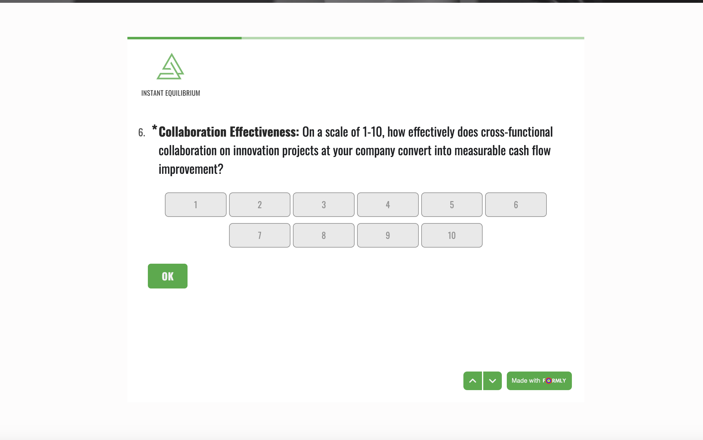
Thank you for providing the code. This makes the iframe shorter, but makes the width smaller and doesn't work for the way the survey I'm embedding is displayed. The scale from 1-10 is now wrapped to two rows.
Is there a way to adjust the code to fix this?
 0
0 -
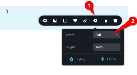
Hi Camille,
Thank you for the update. Could you please try setting the block to full width?
Best regards,
Ariel H.0 -
Hi Ariel,
Thank you so much! That fixed it.
All the best,
Camille Nisich
0 -
Hi Ariel,
I apologize. It seems to have made it too wide for mobile.
Is it possible to make an adjustment to prevent overlapping text?
 0
0 -
Hi Camille,
Could you share the URL of the page so I can check it in mobile view?
0 -
Hi Ariel,
0 -
Hi Camille, please try this:
<style>
.responsive-form {
position: relative;
width: 100%;
height: 0;
padding-bottom: 135%; /* Adjusted height for the form */
}
.responsive-form iframe {
position: absolute;
top: 0;
left: 0;
width: 100%;
height: 100%;
border: 0;
}
</style>
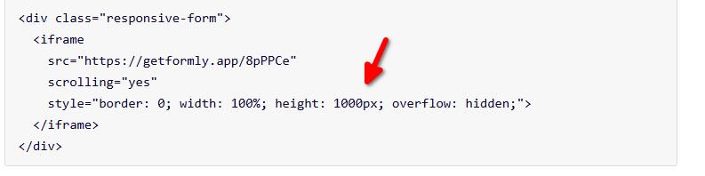
<div class="responsive-form">
<iframe
src="https://getformly.app/8pPPCe"
scrolling="yes"
style="border: 0; width: 100%; height: 1000px; overflow: hidden;">
</iframe>
</div>0 -
Hi Ariel,
That improved the overlap, but for some questions, the OK button on the selection can't be scrolled to view and confirm the response.
 0
0 -
Hi Camille, please try increasing the height to 1350 or higher.
 0
0
Please sign in to leave a comment.
Comments
12 comments