Responsive icon size

Hi there!
Two questions regarding the use of icons:
Is it somehow possible to make an icon responsive — i.e. to adapt it to the size of the viewport?
And how do I change the icon size in the tablet and mobile view?
Best regards.
-

Hello Tilman,
There is no way to make the icon responsive to a viewport. However you can set responsive sizes for the Desktop, Tablet and Mobile following the procedure at https://jmp.sh/l8bnb4Ih
0 -
Hey K C George!
Thank you for your answer. Unfortunately the link isn’t working …I’m having a button with text and an icon — it doesn't seem to be possible to change the size of the icon in tablet and mobile view.
0 -
Hello Tilman,
I am sorry about that. I have fixed the broken link. Please check
0 -
Hey K C George!
Like I said — I’m having a button with text and an icon — and I’d to change the size of the icon which is within that button in tablet and mobile view. This doesn't seem to be possible.0 -

Hi Tilman,Thank you for the update.
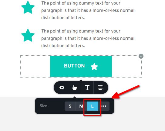
Unfortunately, there isn't an option to change the icon size of a button specifically for tablet or mobile views. The icon size set in the Desktop view will be applied to mobile as well. However, you can choose between small, medium, or large button sizes, and the icon should adjust accordingly.
If you’d like to adjust the icon size specifically for tablet or mobile, you can use the following CSS:
/* Tablet view */
@media (max-width: 1024px) {
    .brz-btn .brz-icon-svg {
        font-size: 100px;
    }
}

/* Mobile view */
@media (max-width: 767px) {
    .brz-btn .brz-icon-svg {
        font-size: 40px;
    }
}
Feel free to modify the font-size values as needed. You can add this CSS by going to Appearance -> Customize -> Additional CSS.
Best regards,
Ariel H.0 -
Ok, thanks.
0
Please sign in to leave a comment.
Comments
6 comments