popup login mobile screen size remains magnified after login

When using the popup login element, on mobile devices (iphone in this case) using Safari and Brave (this issue doesn't happen using Chrome), due to the magnification of the screen when clicking on the login text fields, the screen remains magnified after login. This makes the website cutoff and forces the user to manually reduce the screen size back to the correct 100% format, if they know to do that (otherwise they'll think something is wrong with the site's size). This doesn't happen when using a login page instead of the popup login, ostensibly because the page reloads back to the 100% setting.
1) Is there a way to disable the screen enlarging when the login text fields are clicked? This would be the ideal fix for me, as I don't like how it enlarges anyway.
2) If that's not possible, is there a way to go to the previous page after login using a login page?
3) Or is there a way to automatically reload the page after login using the popup?
Any of these three would work. I would just use a login page instead, as the issue doesn't seem to happen that way, but then I lose the popup login which keeps the user on the same page after login... which isn't convenient...
Before clicking and screen enlarging...

After clicking/enlarging...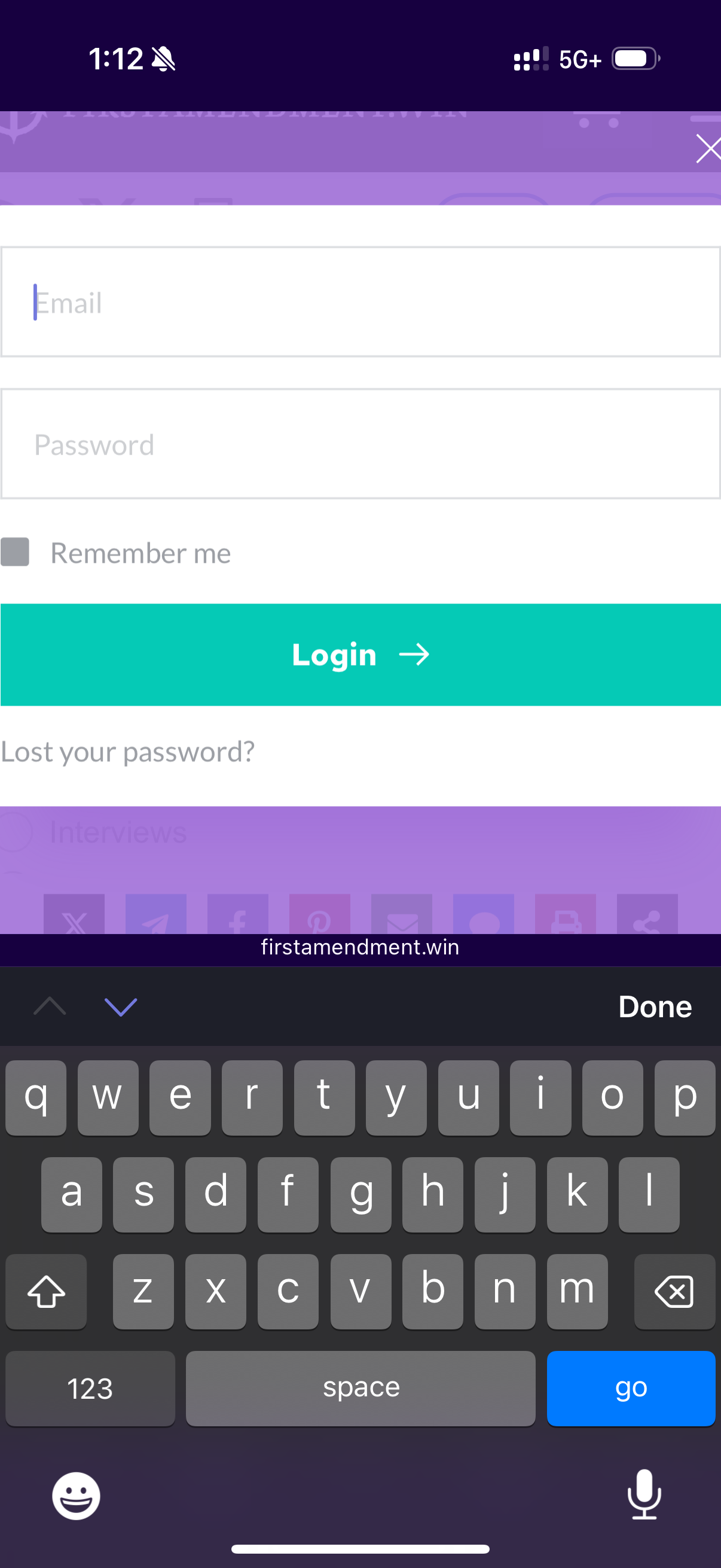
Screen remains enlarged after login using the popup login...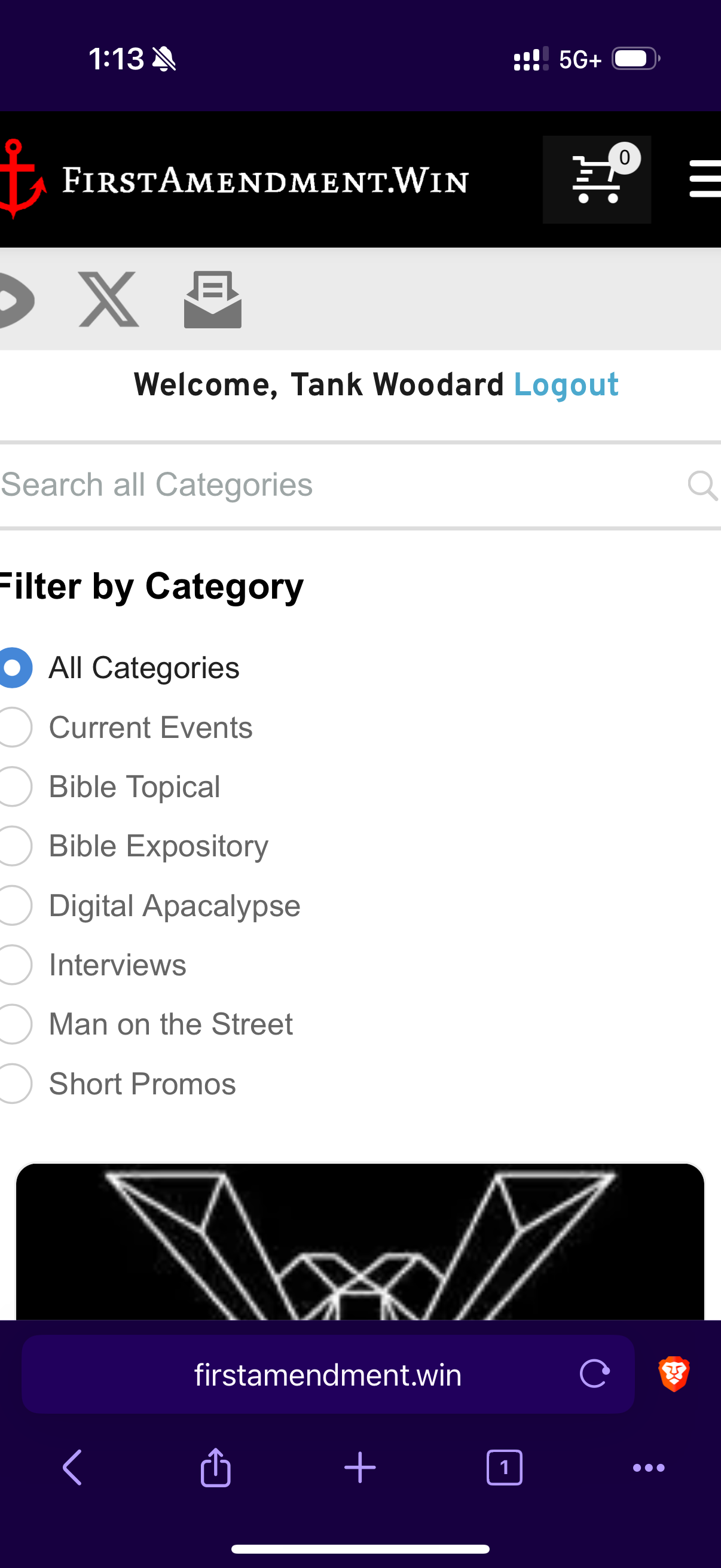
P.s. I don't think it's a browser setting because when the search text field is clicked the screen does not enlarge...
-

Hi Daniel,
Thank you for contacting us.
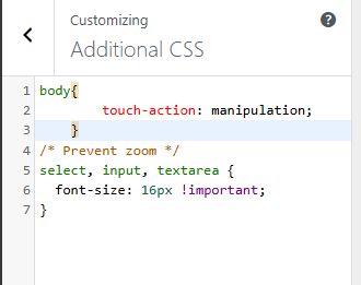
Please try adding the following CSS in Appearance > Customize > Additional CSS.
body{
        touch-action: manipulation;
    }

/* Prevent zoom */
select, input, textarea {
  font-size: 16px !important;
}
This CSS was applied to this page if you want to give it a try first - https://demo.pro-site.cloud/demo02/login/
If you have any further questions, please let us know.
Best regards,
Ariel H.0 -
That worked, thank you!
0
Please sign in to leave a comment.
Comments
2 comments