Why is my text displaying like this on mobile

I have edited the header text in the mobile view on my site, but can't seem to fix this issue. How do a fix this space that shows up in landscape and wrap that shows in portrait. These is not what I set in the builder.

-

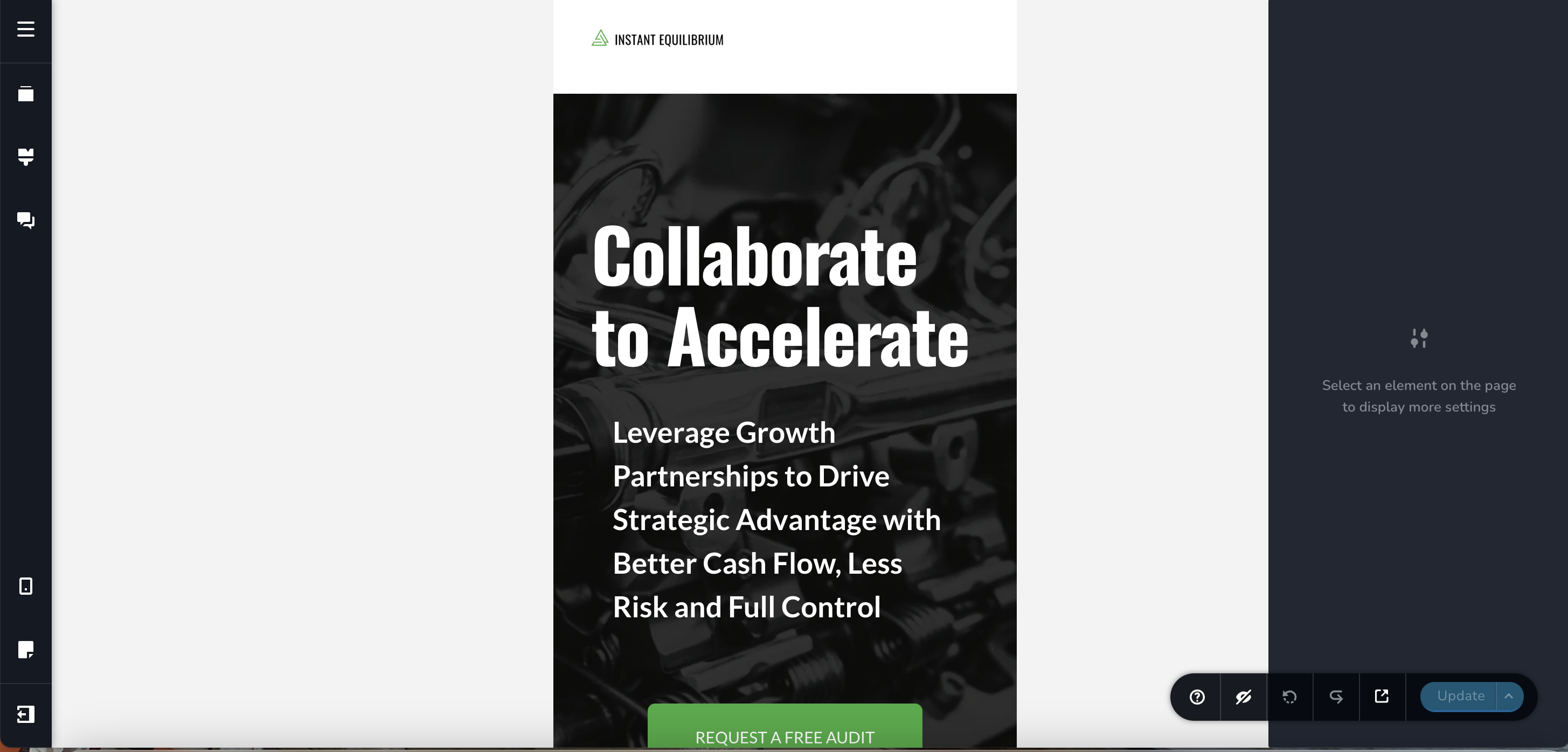
Hello Camille,
The text "Collaborate to Accelerate" was justified (aligned to left and right) and hence you were seeing a gap in the mobile landscape mode. I have set text alignment to "Left" now.
I have also reduced the font size of the "Collaborate to Accelerate" text in mobile design to ensure that it appears in two lines (instead of three). Kindly check.
0 -
Hi KC,
Thank you for the edits.
I still had to change the width of the row for the header to make it display properly.
It's correct now, but for some reason what I see in the builder is still different than what I see on an actual mobile device.
All the best, Camille
0
Please sign in to leave a comment.
Comments
2 comments