landscape view questions

Two questions regarding landscape view on a smartphone...
1. How can I get the two buttons to stay to the right instead of spread out to the left? They stay to the right on the computer and tablet views, just not on the landscape smartphone view...
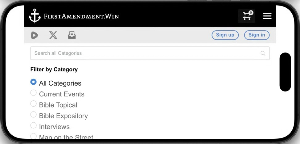
2. Can I make it view the larger screen option of 3 columns instead of one huge single column? It shows 3 columns on the computer and tablet views, just not on the landscape smartphone view...
Screenshots attached for reference... thanks!
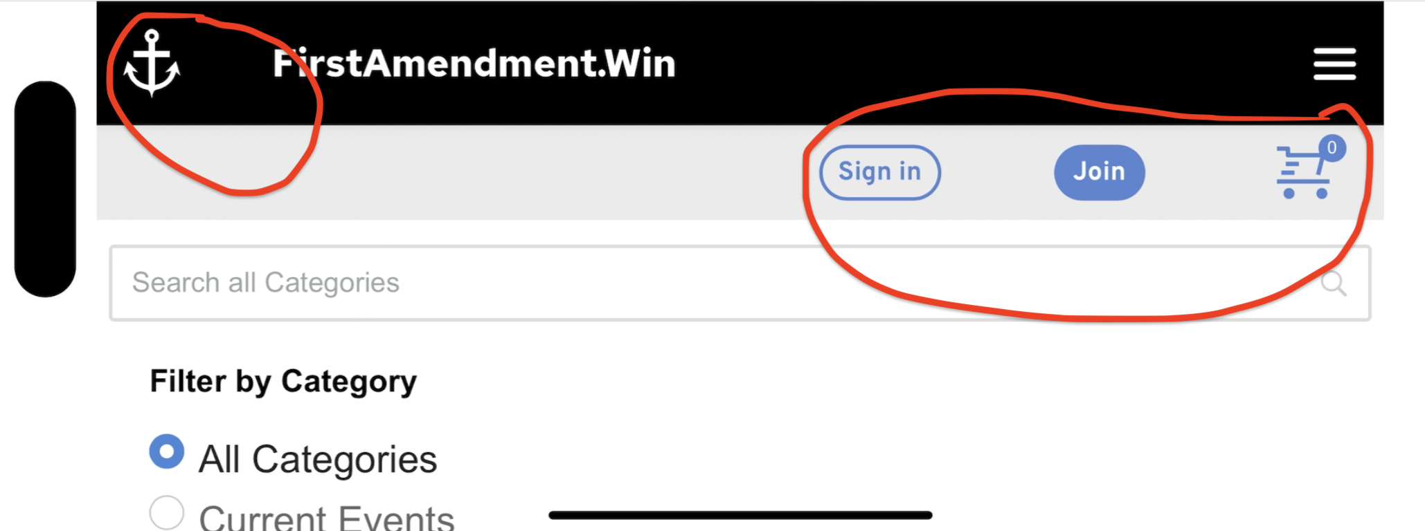
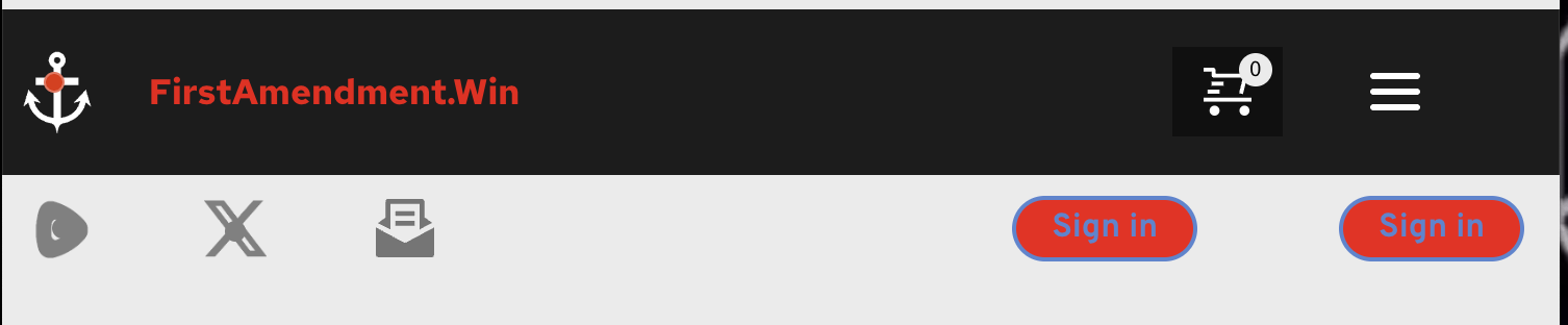
Buttons spread apart and to the left instead of stay close together and to the right...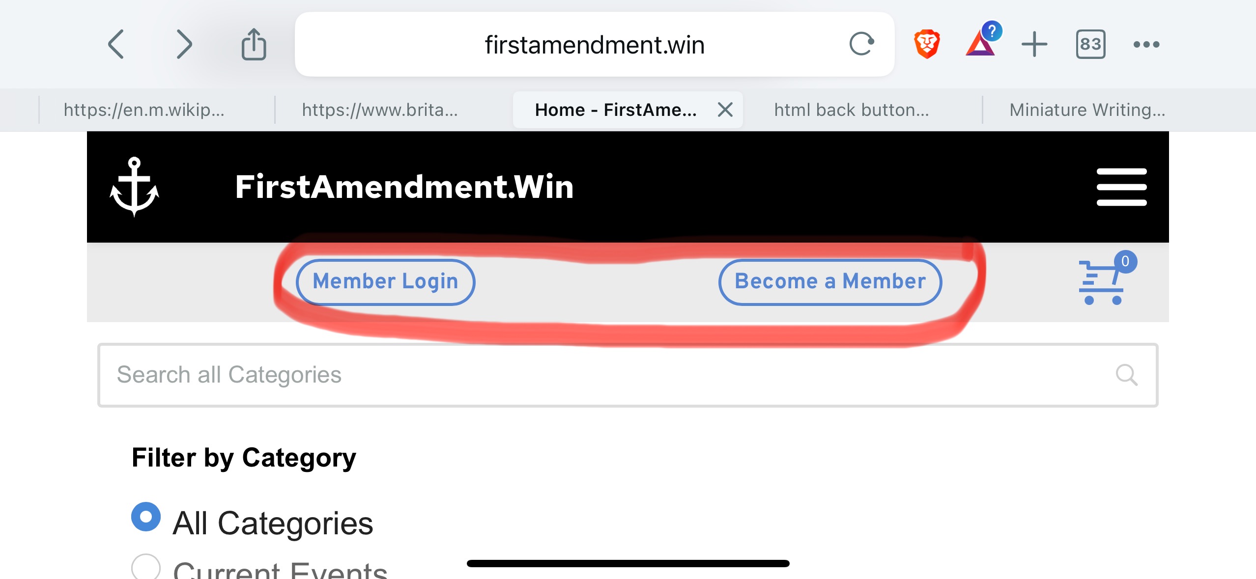
How the buttons should look, and also the 3 columns view I'd like on landscape smartphone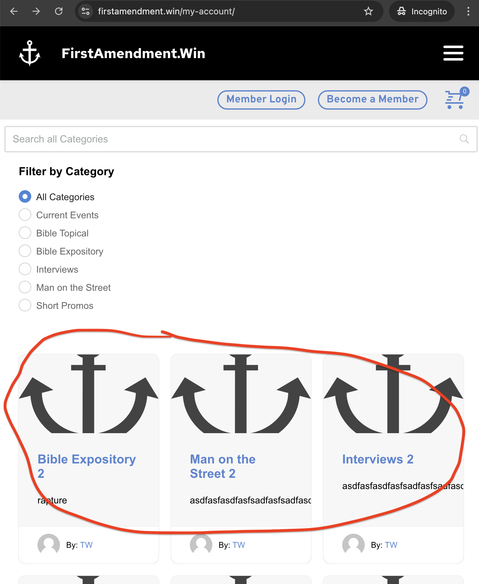
The huge single column that shows now on landscape smartphone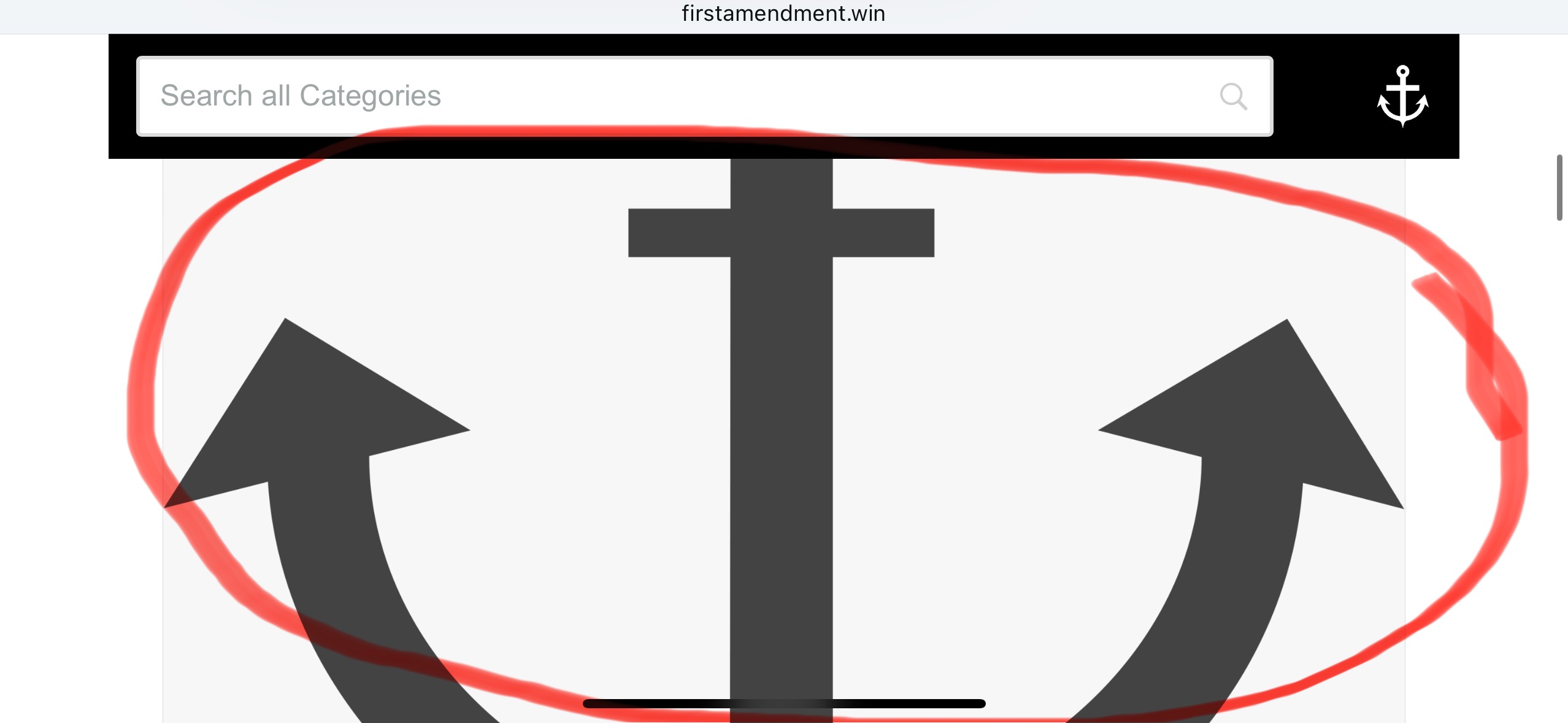
-

Hi Daniel,
Thank you for reaching out.
1. To ensure the buttons align to the right in the mobile view, adjust the columns' width and alignment to position the buttons correctly, as illustrated in this example: https://youtu.be/7cOw-WkzqP0
2. Regrettably, in the mobile view, only one column is displayed by default with no option to change it. To enhance the mobile appearance, consider adding extra padding to the post images and resizing them for a better visual experience.
If you have any other questions, feel free to ask.
Best regards,
Ariel H.0 -
thanks... I tried what you said for question 1... it's still separating the buttons and creating too much space between the logo and the text in the header...
 0
0 -
Hi Daniel,
Thank you for your update.
Could you please provide temporary access to your WP Admin page so we can review your layout and determine how to fix it? We will create a screencast for you to follow, so you’ll know how to resolve the issue if it occurs again. Kindly send your WP Admin credentials to communitysupport@brizy.io and include the reference number 21033657572754 in the subject line. Please provide the following details:
- WP admin login URL:
- Username:
- Password:Before sending your credentials, please ensure that a full backup of your site is made.
Best regards,
Ariel H.0 -
I just email you the information you requested... I sent the first email without the URL on accident... I sent a second email that included it... thank you.
0 -
Hi Daniel,
Thank you for the update.
Unfortunately, the layout you have sent differs from the original screenshots you previously provided. Additionally, your layout already looks good in the mobile view. The anchor logo on the left has sufficient spacing, and the sign-in button appears slightly squeezed. You might consider increasing its height and width in the mobile view.
If there is anything we have misunderstood regarding your desired outcome for this layout, please provide us with more details so we can assist you further.
Best regards,
Ariel H.0 -
yes, I changed it a bit because I don't like how the buttons expand so much on the mobile landscape view... the issue still persists on the other content and will persist when I add the second button later...
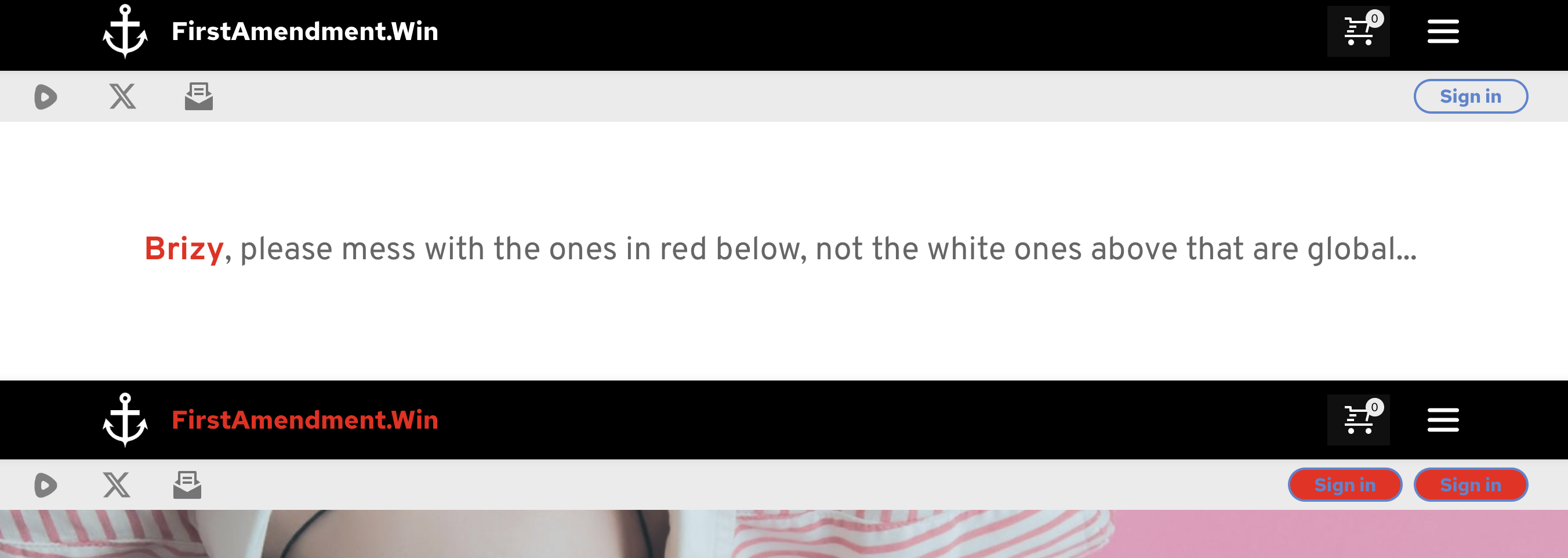
Portrait view (space between anchor and First... is small and social icons are close together)
Landscape view (too much space between anchor and First... and the social icons spread apart)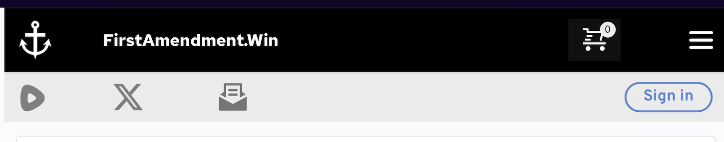
How can I keep the tighter format on the landscape view?
Please use the test template and the red non global versions when you login... you should still have the login I sent... I didn't change that... Thanks!
 0
0 -
Hi Daniel,Thank you for the update.
To resolve this, you can add an additional column between the domain and the shopping cart icon. The same applies to the second block. You can use the spacer element within the column to push the content towards the left and right, ensuring that the elements align properly.
Please try this and let me know how it goes.
Best regards,
Ariel H.0 -
I tried that before and I tried it again (it's currently that way now) and it makes no difference... it seems like there has to be a way for the web address to stay close to the anchor, etc... but it looks like on a phone in landscape view, there's no way for that to happen... it always expands and separates...
0 -

Hi Daniel,
Kindly watch this screen recording https://jmp.sh/THcVroUH
0 -
K C,
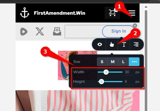
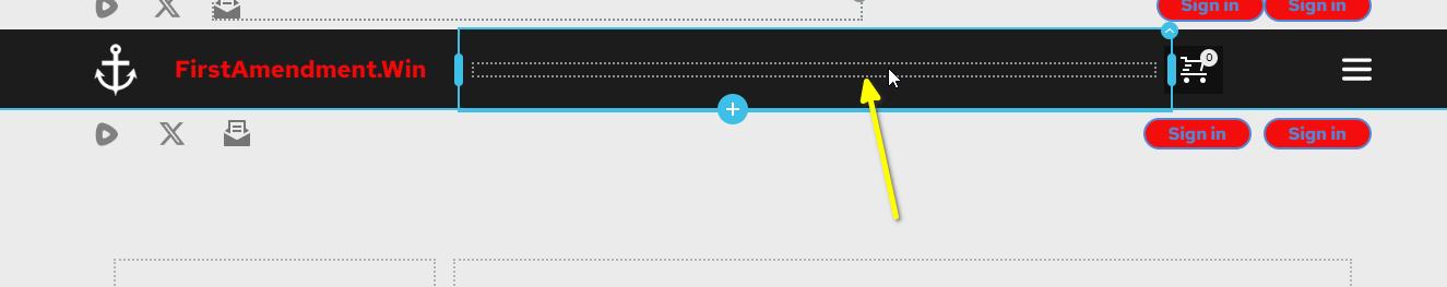
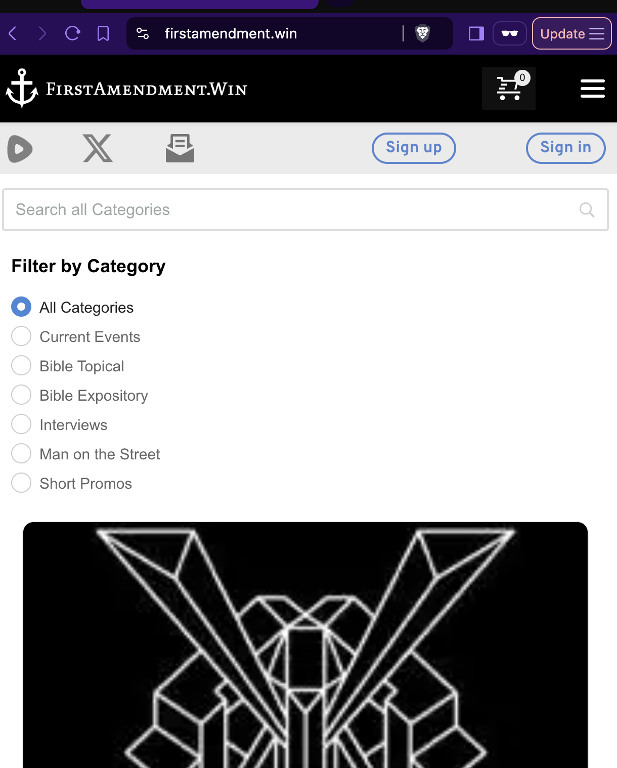
I appreciate your reply, however I'm aware of how to do that (I made sure this test block had zero padding like the live one does, it does now)... it doesn't change the result... it works on the mobile portrait view, but as soon as you turn the phone sideways (landscape view), the spacing expands... it can also be replicated by reducing the size of the desktop browser... Below you can see in the editor I have the spaces tighter than I want them just for testing purposes, and below that you can see how they respond when the browser size hits the "landscape view"
 0
0 -
I did a workaround on the anchor and web address by making them one image, so that works... the buttons still separate but I can live with it...
0 -
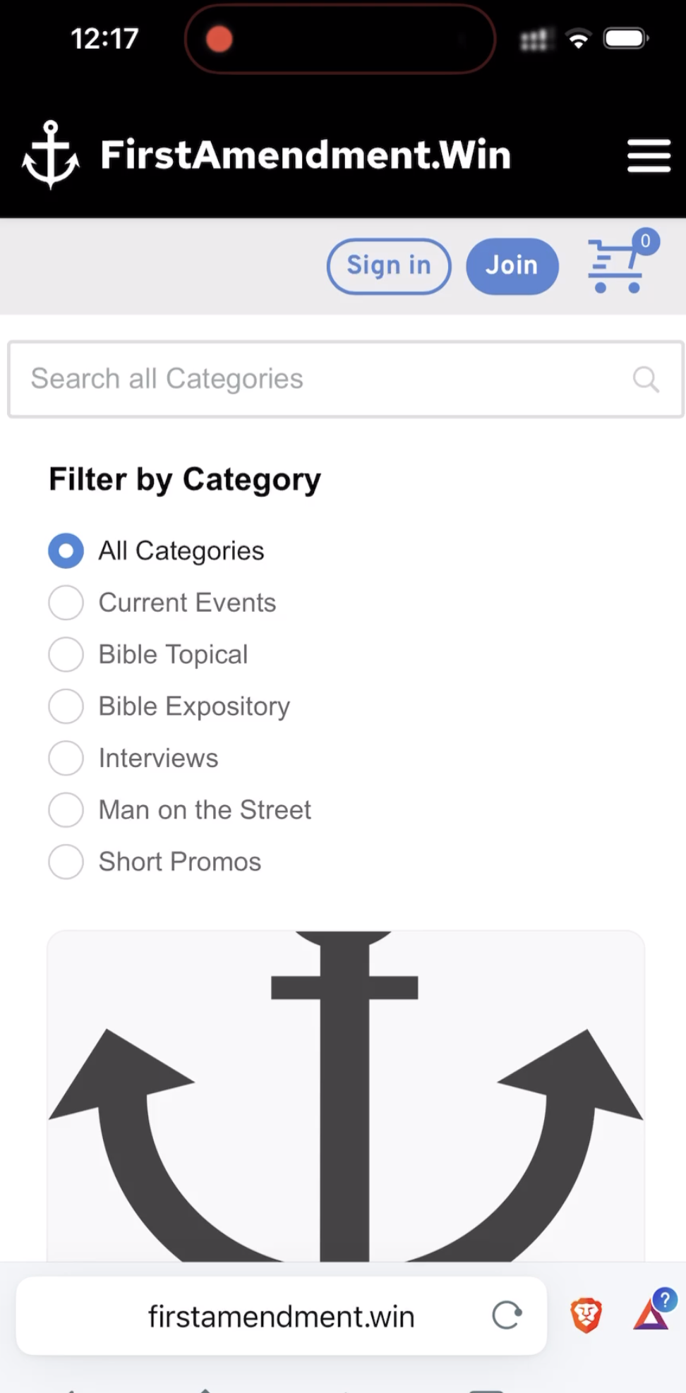
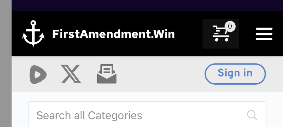
Hi Daniel,
The landscape view on a mobile shows like this at my end. The logo and the site name are close to each other and the buttons are also aligned to the right and close to each other.
It is possible that on a specific mobile phone, you are seeing a cached version of the website. Please visit your website on different mobile phones in landscape mode and check.
 0
0 -
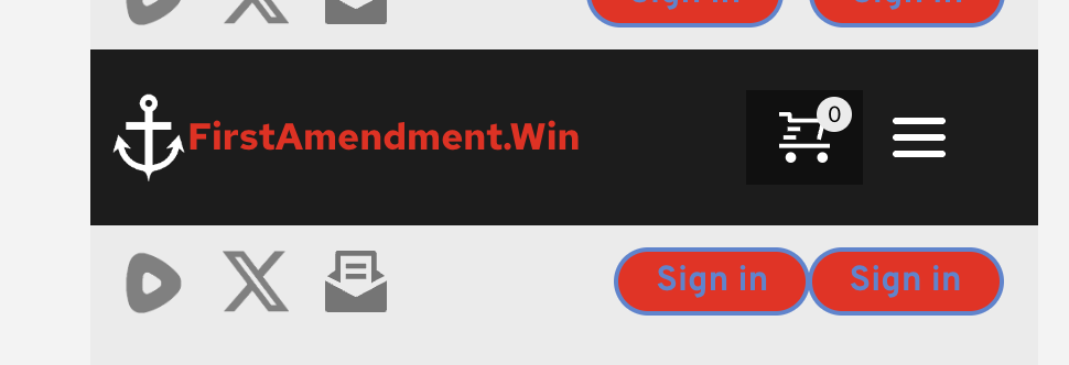
that's very strange... I've tested it on multiple iphones and it doesn't look like that... nor does it look like that on my macbook pro browsers when it's made small (see attachment) which creates the same display issue of the buttons spreading as on the iphone landscape... your phone looks like an iphone... is it? I'm wondering if it could be an issue on Apple hardware (I've not tested on Android or Windows hardware... I know I should)
The logo and site name will always look correct now because I made them a single image to overcome the issue... but the buttons and social icons are still expanding on my devices (all Apple as mentioned)
 0
0 -
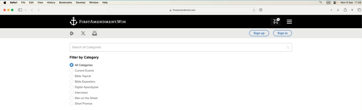
Hi Daniel,
It is indeed strange. On safari browser on a Mac machine, it looks like this at my end. Have you tried using different internet service providers?
 0
0 -
Mine looks like that until you make the browser smaller, triggering the smaller screen config... when you make your browser as small (narrow) as possible, do the buttons stay like that?
0 -
Hi Daniel,
You are correct, when I reduce the width of the browser window on a desktop, I see the landscape view you have described above. I suppose there's nothing we can do to enhance it.
0
Please sign in to leave a comment.
Comments
16 comments