Mobile version shows not working

Hello!
I have a few problems with my client's site waste off.se
First off: The mobile version works fine in the editor, but when I open the site on my actual phone, the tablet version is shown. I've checked on my phone's settings that im requesting the mobile version.
Also, the menu icon element shows on the desktop version even though I have put it off in the advanced section.
-

Hi Kristoffer,
Thank you for contacting us.
I have inspected your site; however, it appears to be working properly on mobile view as shown on the below screenshot. Could you please try using another browser and see this makes any difference?
 0
0 -
My apologies, the domain name is wasteoff.se
Auto-correct...
0 -

Hello Kristoffer,
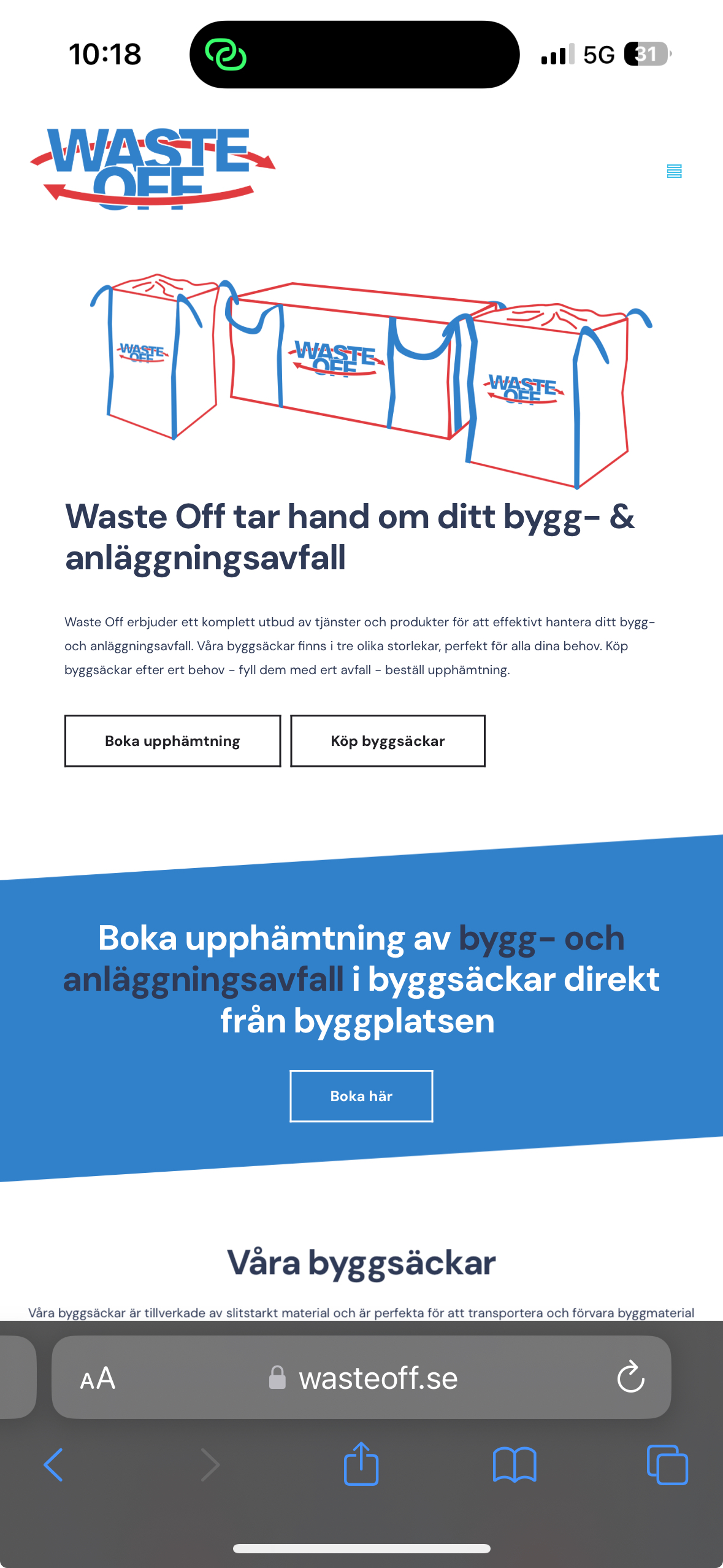
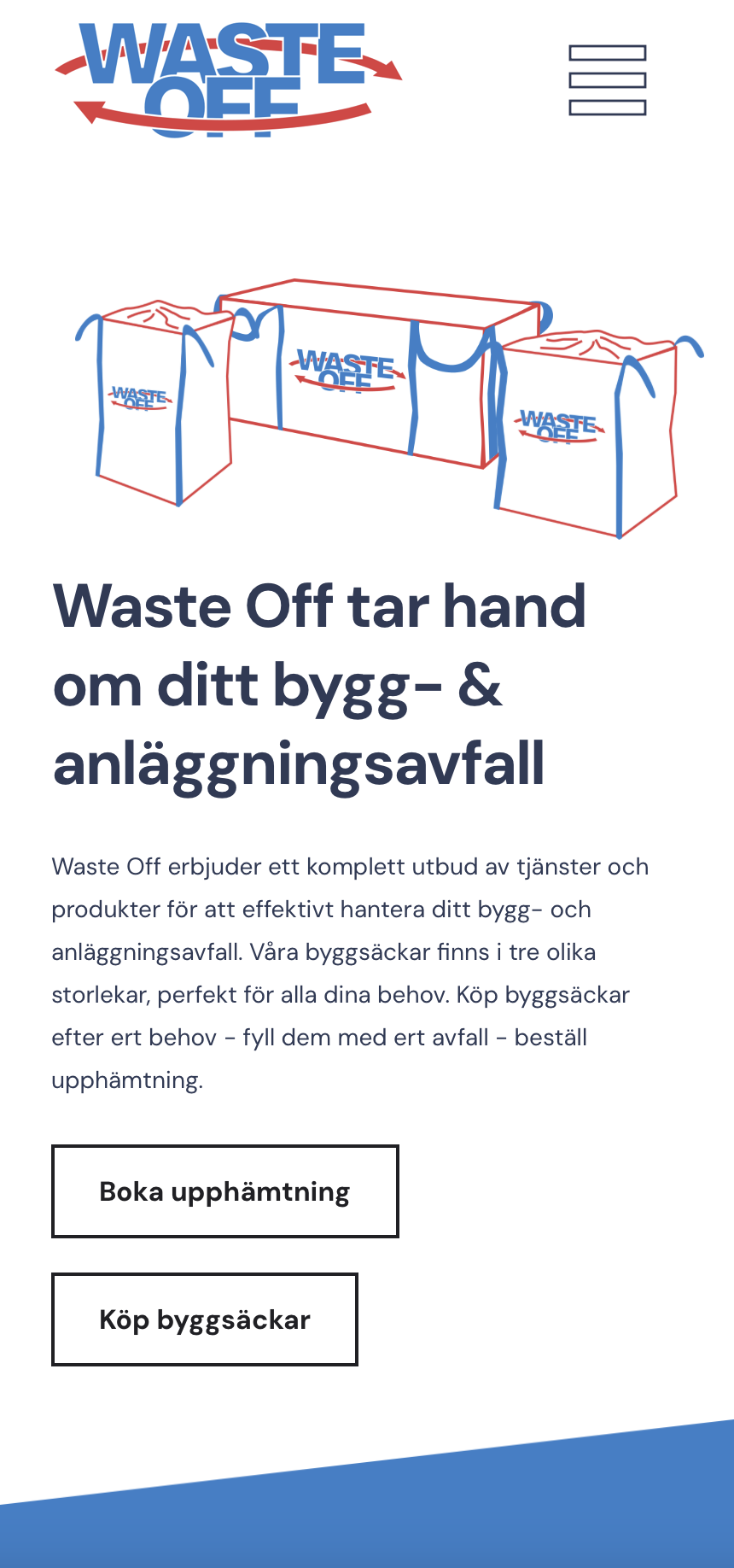
When visiting the page https://wasteoff.se/ on a mobile device, I see the design at https://jmp.sh/x4MnzUzd Do you not see this design?
Have you tried clearing cache from your website to remove the menu element from the desktop design? If nothing helps, we will take a look at your project to fix the issue.
0 -
Hi!
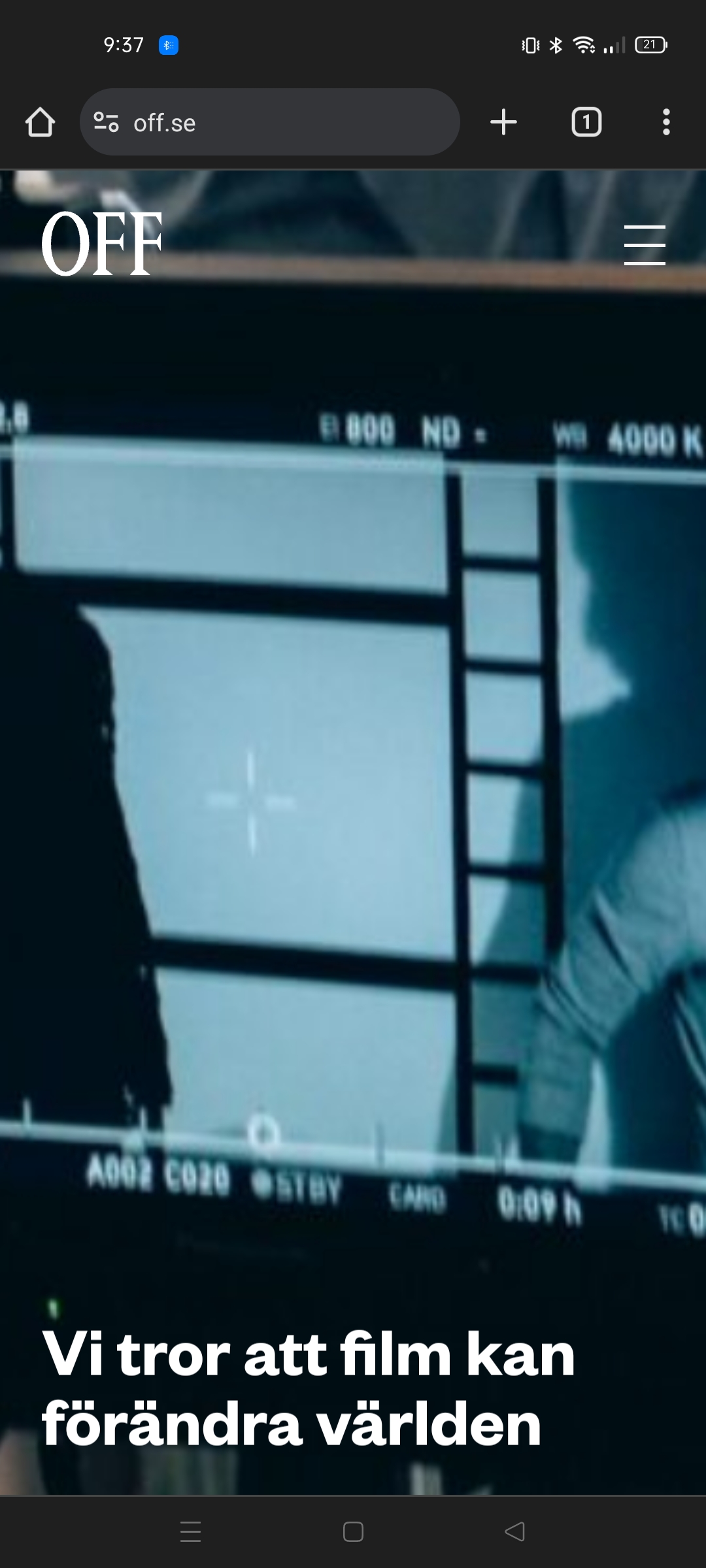
I've purged the cache of the website and it still doesn't look like it should.
I'll attach images on what's showing on my phone and what it should look like.
Also you can tell that there is a problem with the icon. It does not look like I've designed it to. And it shows up in the header on the desktop version even though I've hid it. There is also an icon on the page "om oss" that have an issue with an icon as it is really small even though I've given it a larger size in the editor.
On top of this, the footer does not show on any version.
 0
0 -
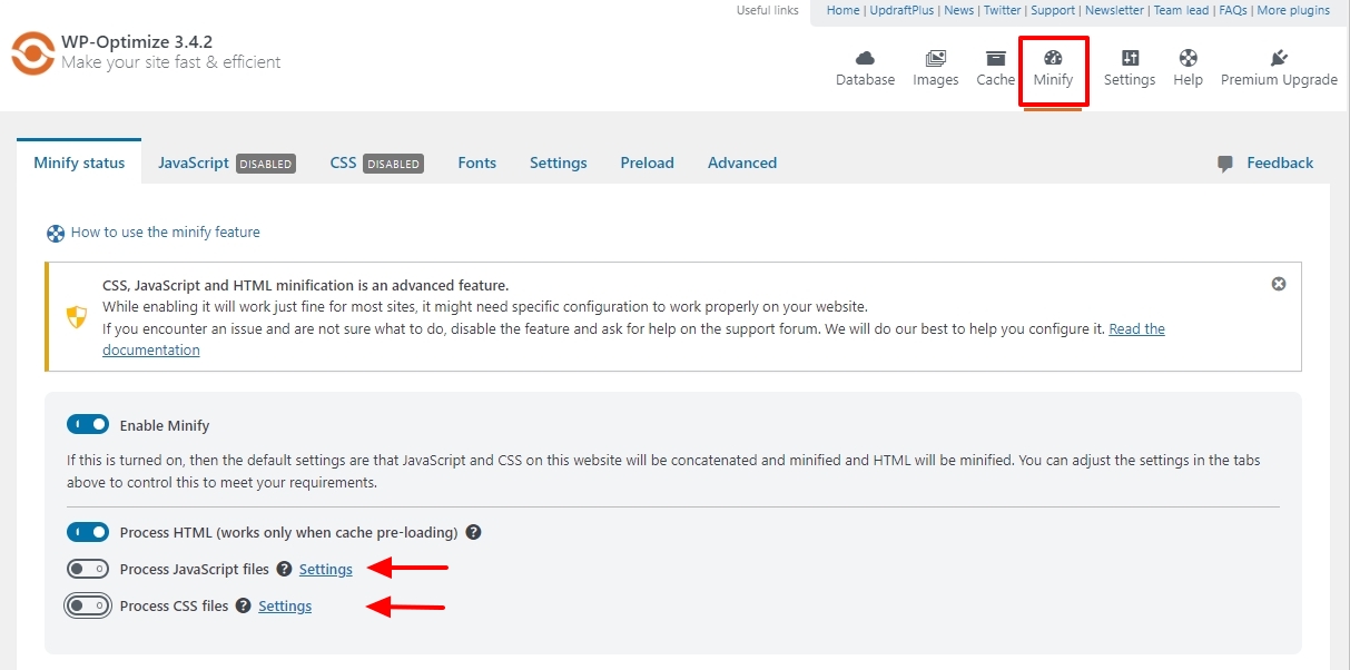
Hi Kristoffer,
If you are using WP Optimize plugin, in your WordPress Dashboard under 'WP Optimize' - 'Minify', kindly disable these two options and check if the issue resolves.
- Process JavaScript files
- Process CSS files
 0
0 -
Hello!
Thank you, 2 of 3 problems is now resolved. The footer is showing and icons working properly. But the mobile version still shows me the tablet version.
0 -
Hi Kristoffer,
I am seeing the design at https://jmp.sh/8LGWd3pZ when visiting https://wasteoff.se/ on my mobile. Is this your tablet design?
0 -
That is the correct design. The problem seems to be on my phone though it works fine on other phones. Any ideas?
0 -
Hi Kristoffer,
The mobile design will appear on phones with widths of up to 767 pixels. If your cell phone's width exceeds 767 pixels, your phone will show the tablet design. Do you use a mobile phone with a width higher than 767 pixels?
0
Please sign in to leave a comment.
Comments
9 comments