Can you designate a mobile-only site logo?

Such as a "shorter" one? Instead of changing it manually for each page's mobile view?
-

Hi Jenna,
You have the option to design the headers for desktop, tablet, and mobile and set your preferred sizes for the logo, text, etc.
You just need to create three separate menus and assign different layouts according to the screen size. For example, you can have a layout for desktop, hide it from the desktop view, and it will only show on desktop. The same goes for tablet and mobile.
In your case, if you are already satisfied with the desktop and tablet menu, you can create a specific layout that is only visible in mobile view and hidden in desktop and tablet view.
This is demonstrated in this screencast: https://youtu.be/yb2ciXxnHUk
With this example, you can resize the logo, text, etc., in the mobile view.
Let me know if there's anything else I can help you with!
Best regards,
Ariel H.0 -
Hi Ariel,
Okay thank you, I'll try that. Do the 3 headers have to be created as "header elements" though or can the just be a simple added block w/ image, text, etc? Because headers have a different menu right (such as an option to make it "sticky" etc). I forgot how to add the specific header element (my designer had created my original header w/ logo etc not as "header element"), but if I remember correctly you could (or should?!) only add one header, no? > Quick update: I saw I HAD already changed my desktop header to be a header element.
>>> Also, I assume you're supposed to "duplicate" this to create the other 2 versions? (Your video started after this step.) I just did that and see that then the duplicated block is not a header element anymore which means I can't even apply header-settings to the menus in tablet & mobile?
>>> Also, how can I create a proper separate header for mobile & tablet? It seems I can only edit when in desktop view, however in order to create a proper mobile (phone) menu I would need to see the dimensions of a phone, so I can lay things out properly (again your video skipped this step). I cant edit in the mobile view – can that be activated somehow? Bc the entire menu should be different obviously, such as stacked lines to click, not full menu items... sigh, sorry this is a lot of different issues now.
(I'm trying rn to create a mobile-only header – in desktop view... – and it's a mess :( the logo image I'm adding shows weird big when in mobile - not in desktop view - the image is on top the rest of the menu, not to the left of the rest as it should be: logo – blank space – hamburger menu etc etc etc. How can this be done in a cleaner and easier way??)
Also, I am wondering: do all these extra "invisible" blocks slow the sites down? I'm guessing they must be. And I've actually been noticing my site getting slower and slower to load (on the front-end, not when editing). I already have some "hidden blocks". So this is a big concern of mine with having to triple-produce blocks and then make them all invisible.
0 -
New problem. This problem I'm having now I literally already had about 1-2 years ago when I last worked on my site (I don't know the original thread but apparently it wasn't resolved).
When I change my (desktop right now) header from "fixed" to "sticky" Brizy's default logo/header instead of mine shows for the "sticky case", i.e. when the header should appear after scrolling down the page and then up:

This is obviously NOT my logo/header.
This is a snippet of MINE that's now only showing when scrolled all the way to the top.

What is the fix for this please?
0 -
(Newish problem)
I'm trying to add a square image as logo left. Why is there always this extra space?? I added it as a new column (we're still in the header bar), then added image, switched to thumbnail bc the whole pic was too big and showed cropped. Then it always adds the extra space!!?? How can I just simply create a simple, clean header-menu (this is for mobile rn)
 0
0 -
This whole thing would just be a gazillion times easier if you could just select a mobile-only logo! 😦 (This was the case with my previous website builder. You could just select one for mobile one for desktop, and bam, it was the easiest thing in the world.) Is there really no way to simply designate a mobile-only site logo?? It would solve about 100 problems for me... (Bc it seems my designer HAD set up all the desktop/mobile/etc headers fairly well. I’m currently messing them up by simply needing to switch the MOBILE LOGO/image!!)
This scenario (above) is creating SO many issues (and frankly an insane amount of frustration) for me. Ugh.
The most important problem that NEEDS to be fixed is the sticky menu selection/showing Brizy's default "Company" logo though! Can't believe this error still exists after over a year!
0 -
FYI, the scrolling issue (showing Brizy's default "Company" logo/header on "sticky") persists on mobile too. Pls look up my previous request/thread on this (again, I had abandoned it bc I couldn't work on my site for ~1 year) for more information. I added it from Brizy's menu blocks but obviously manually changed all elements. My mind is so blown that this error still exists. Thx
0 -

Hi Jenna,
I'm reviewing your questions and providing individual responses in the screen capture available at https://jmp.sh/OeinwOfl
If you have many additional questions, you have the option to clarify all of them during a Zoom call. You can discuss the design you're trying to achieve with us during the session, and we can show you how to implement each design using Brizy.
0 -
Hi KC George,
Thank you for your answers and going through my several questions/issues one by one; I appreciate the diligence!
1) Mobile-only logo question: No, you misunderstood me. My preference WAS to use a different logo file for the mobile version. I have a "longer"/rectangle version for the desktop, and would like to use a shorter/square version for the mobile view. So, I still have the problem/question of needing to create a separate mobile-header it seems... (which was causing me a lot of frustrations as I've tried to do it :/). Can you kindly explain what the *simplest* way to do this is? (I don't even want anything fancy. Just a proper mobile version header. My designer had created it almost perfectly, with the "hamburger menu" and all; I simply now decided I would like to use a shorter, *different* logo file for the mobile-only header.
2) My question about "hidden blocks" slowing down sites still stands as well, this is a fairly big concern of mine. (It is completely separate from this main issue here though.)
3) Thanks for explaining how to "fix" the sticky header situation. (FYI this is one of the most counter-intuitive things I've ever come across lol, maybe worth changing the approach to how users can "fix" this. But I appreciate your clarity in explaining and showing me how to fix it!)
4) The extra "white space" next to images... yeah, I couldn't show the full logo bc it's not live yet ha. But I am just getting (repeatedly) frustrated/confused as to when you add images, they almost always have extra space below/next/above them.
Here's a full screenshot w/ the logo blocked out, hope this is clear enough to understand?
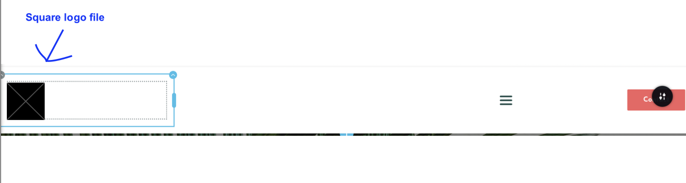
My (square) image here does NOT have anything to the right, yet when I add it Brizy adds this "white space" next to it. Do I need to add an extra column for this image-part only to the header?! I can do this, it just seems this is a very complicated approach to simply wanting a smaller/square logo to the left, then (by means of a spacer) white space in the middle (NOT part of/attached to the image), then menu etc on the right. This is for the mobile-version of my header, so it's important the "white space" in the middle" is not too big. And the extra space next to the logo/image messes up the whole view. I created this design by copying my desktop-header... to try to create this mobile-version header.. not sure this was even the right approach as I sorta mentioned above.
But any help how to fix all these issues is appreciated! (I can't do a zoom call rn, but thx for offering.)
Another FYI – this is what current "old" header looks like on a mobile phone:
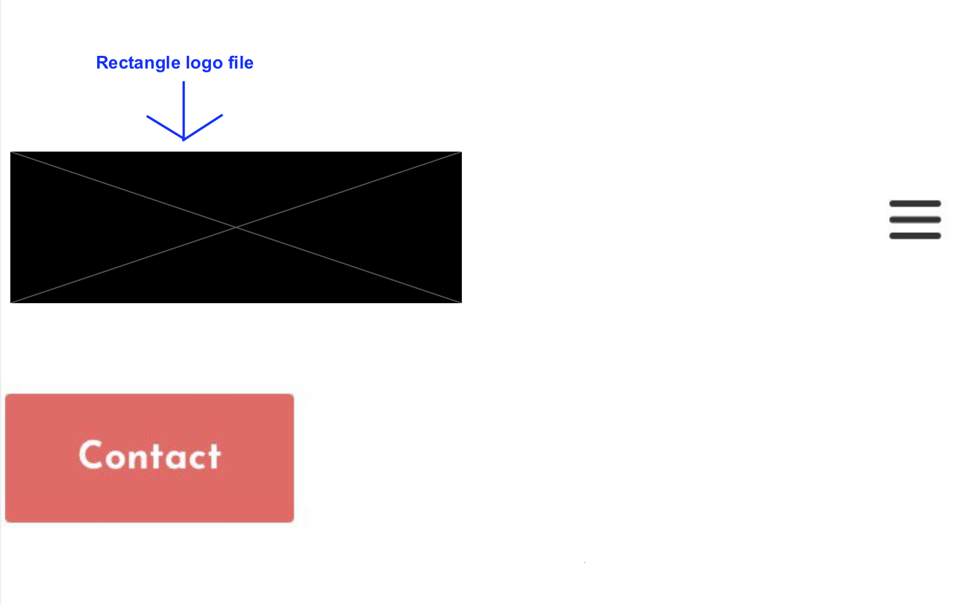
This header was adjusted from the desktop version with the same desktop-rectangle logo-file but was adjusted/changed for mobile-only > it was created by my designer (though I think I already messed it up a little from how my designer had created it; it was at least in one line a few days ago). But regardless of whether I can get it into one line again, my preference would be to use my other, square-logo file...
Thanks!
0 -
Hi Jenna,
Kindly watch this screen recording where I am demonstrating how you can implement a dual header design. https://jmp.sh/UWDfmQiN
0 -
Hi KC George,
It still doesnt work for me. :( When I change the width to 100%, my square logo is too big. I need to make it smaller (but retain all dimensions). It's essentially a "big square", and I need it to be a "little square". In your example, your "square logo" is already the size you want it (let's say 4x4. Mine is, let's say 16x16. So when I'm trying to reduce it, how do I do that?? I swear when I move it or change it in any way, there *ALWAYS* pops up this extra "space" then!!!? It is driving me mad :(
Actually, at the end of your video you say "to reduce the size (of the element w/ the square logo), just drag the handle. THIS KEEPS THE EXTRA "WHITE" SPACE!
I've kinda given up on this, it's cost me way too much stress and effort and hours already. It's not working as you described unfortunately (also my menu looks slightly different where you show the width and height so not sure where the misalignment in our two ways is). Anyway, I've chosen to adjust forget it now and keep the rectangle logo. But again, it's not working as you describe... perhaps the team could look into why this functions differently for some users/in some instances (it's very possible I overlooked a wrong setting I'm still stuck in or whatever). Thanks.
0 -
Hi Jenna,
It should not take more than 5-10 minutes for us to implement the dual header design for you. If you give us access to your project, we can implement the design for you and record a video. You can watch the video to learn the procedure.
0
Please sign in to leave a comment.
Comments
11 comments