Move Text to forefront (rather than behind) other element

Hello, I'm updating my site after a long time (of never really using it).
I'm trying to create a certain style (half-underlined portion of text via colored-in field)
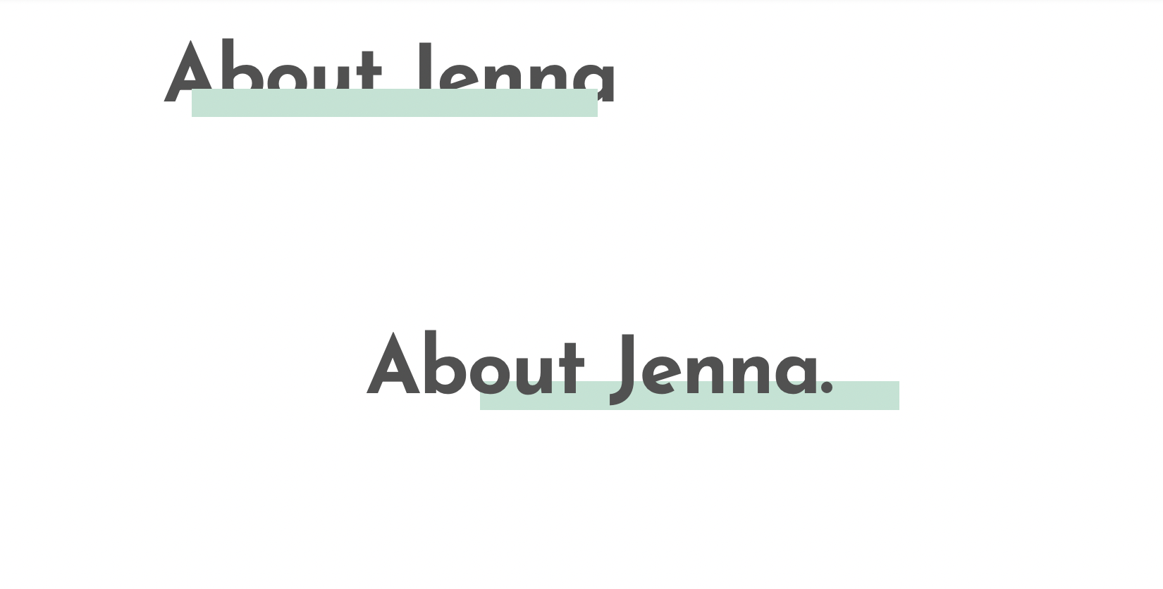
1-2 years ago I was able to create this (bottom part), but I just tried to create it again (upper part). I'm able to adjust the margins/padding etc of the "colored field" to get to the desired position/length/thickness/etc, but I forgot how to bring the text to the forefront again (or move the color block to background).
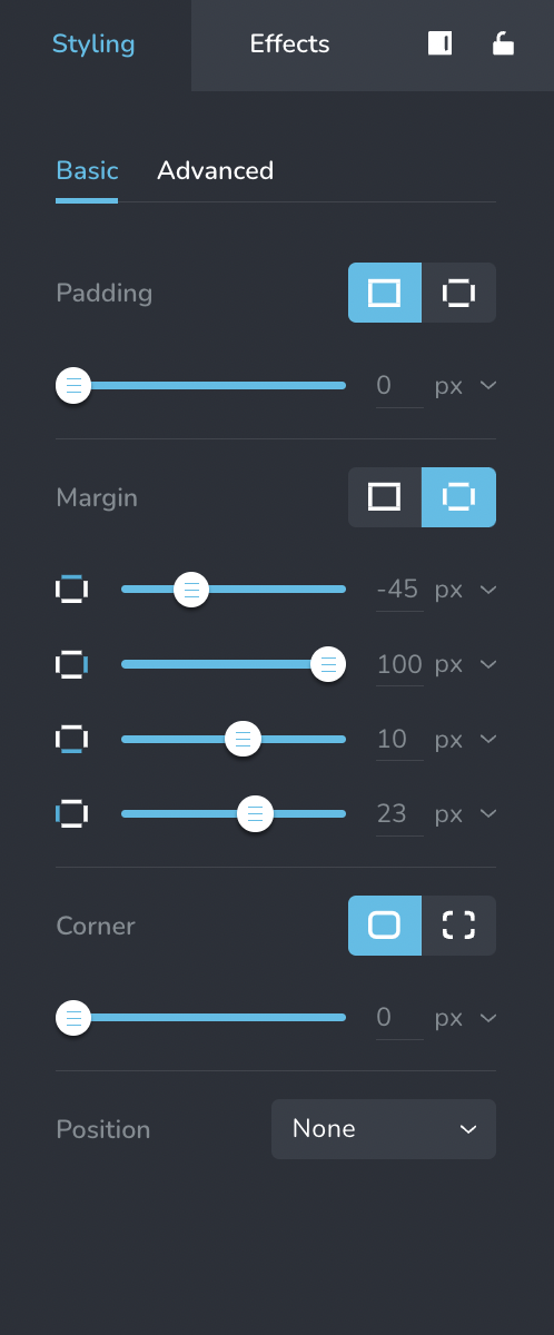
FYI, margins for the correct, older version [bottom part] (however note that this was part of a left column, empty right column setup, which I don't want anymore):
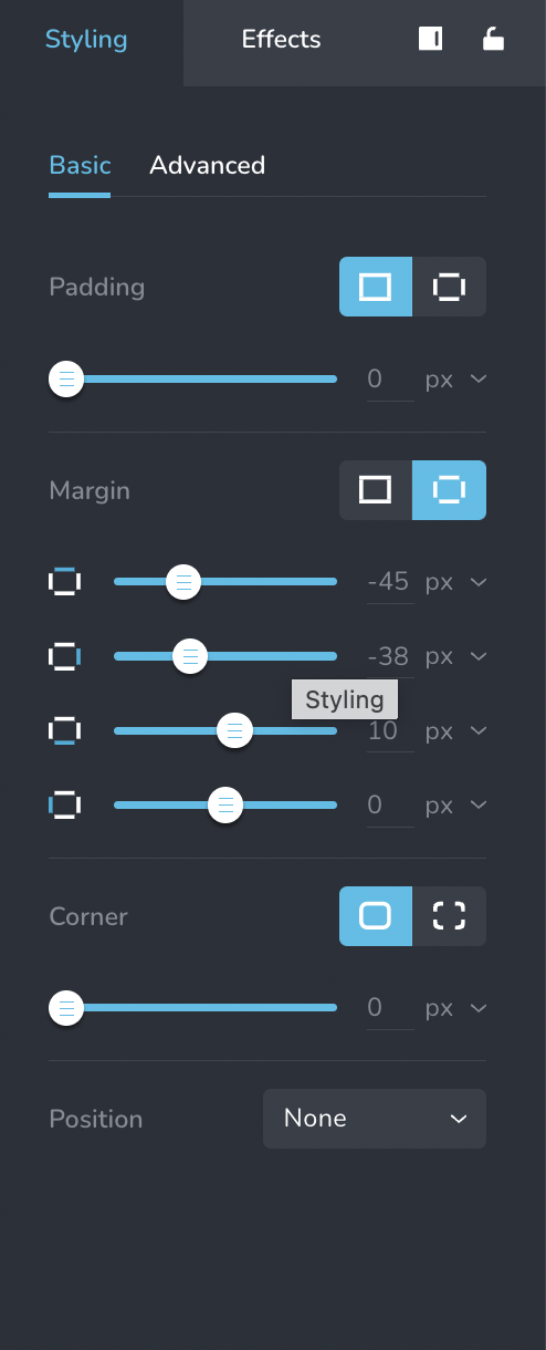
Margins for the faulty, newer version [upper part] (no columns set up). This should be one line/section only across the page:
Can someone help how to adjust the order of these two elements?
FYI, I think the "color field" is just a text field (w/ no text) and background color (I'm not sure as I had saved this block and just added from favorites).
Thanks!
-

Hi Jenna,
Your previous support request on this topic is available at https://support.brizy.io/hc/en-us/community/posts/10528190047121. In this thread, kindly look at the screen recording provided as part of my first comment, which explains the procedure to bring the text to the front.
 0
0 -
TY, KC George!
0 -
This whole effect doesn't look right after all. Is there a way to "attach" the "colored block" to a certain word or part of the text? So that it always displays "linked together" the way I'm defining it on my end (and not show randomly in various places based on a user's device)?
0 -
Hi Jenna,
Have a look at this alternate and easier approach to implement the above design https://jmp.sh/DYadoQCh
In this approach, the text and the coloured underline stay together.
0 -
I appreciate this, KC George, however the problem with all these editing options is that they render completely differently on different devices (which is user-controlled and I have zero influence on). I've played around with this desired look for a long time now (and have managed to adjust the margins/padding etc to make it look the way I want it on my end). However, it just looks completely different and then overall just messy externally. It won't work like this. :(
So, my original question stands: is there a way to "link/lock" two elements (eg. 2 text fields or text+image/etc) together so that they will "stick" together no matter what format/device the content is viewed in/on?
(I also have seen this look – the half-underlined style for headlines or just single words – quite a lot on other websites. While there may be slight differences as to how it looks on desktop vs mobile etc, I've seen this look beautiful and w/ no big issues several times. I wonder how other websites create this effect so easily? I'm assuming those websites are not using Brizy. So it's just disappointing that it's so hard (not possible?) on Brizy.)
0 -
Hi Jenna,
To keep the image and the colored strip together, the best option would be to design it in an external graphic design tool like https://www.canva.com/ and bring it in as an image to Brizy.
If you have seen a similar design implemented in another website, kindly share the URL. We can help you implement the design in your project exactly like in the reference website if you give us access to your project.
0
Please sign in to leave a comment.
Comments
6 comments