Tablet showing desktop view

Hello,
My website is showing the desktop view on tablets and when moved vertical it is showing the mobile view. But never the tablet view. I haven't bee able to figure out why this is happening or how to fix it.
The website is: https://athleteready.com/
Thanks!
-

Hi Roman,
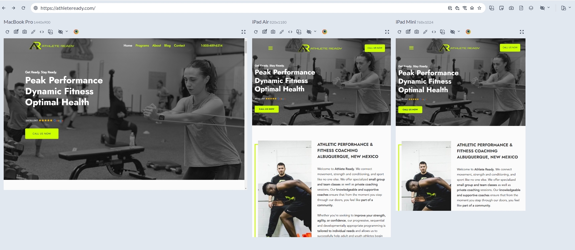
Here is a comparative view of your website on Macbook Pro, iPad Air and iPad Mini. Have a look at this screenshot https://jmp.sh/ldNSnQ4Q Can you see your tablet design in the two iPads here?
If a tablet is closer in screen size to a mobile, you might see the mobile design in a tablet.
 0
0 -
Hi George,
That is how it looks on my view within Brizy, but on my iPad Mini and on the gym's iPad Pro, it is showing up as the desktop version when loading the actual url and not how it looks in Brizy.0 -
Hi Roman,
Can you share a screenshot of the editor view and how the page appears on your iPad Mini so that we can see the difference?
0 -
 0
0 -
Hi George,
Here is a photo of the iPad mini. The header has the phone number rather than the click to call, the margins are pushed all the way to the far left, there is a gap between the top of the page and the top of the browser. It is the desktop version showing on a tablet.
0 -
Hi Roman,
Kindly try these steps and check if this resolves the issue. You could also watch this screen recording for the procedure. https://jmp.sh/KZWj3w8K
- Add the 'Row' element to the hero block and delete the one of the two columns within the Row
- Drag the hero block text into the Row element
- Set the Row width to 70%. Adjust the percentage as needed later
- Set the block to full width
When visiting a page in the landscape orientation of a tablet, you will see the desktop design. This is a common behavior for most websites.
0 -

Hi Roman,
Thank you for the update.
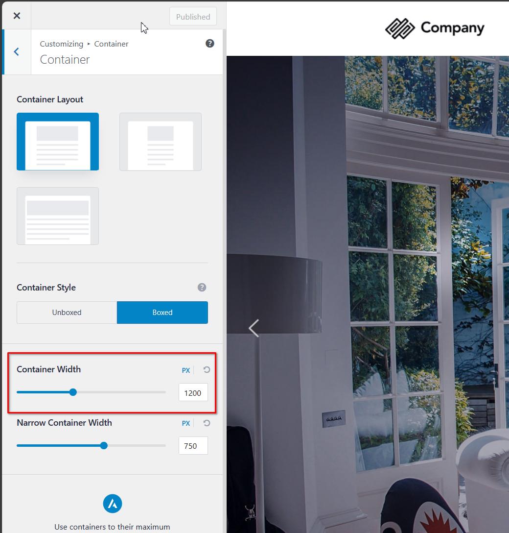
I'm sorry to inform you that we don't have a specific breakpoint for iPad mini. However, I suggest checking if your theme provides an option to adjust the container width. In this example, I am using the Astra theme, and the container width is currently set to 1200px. You can slightly reduce the container width to ensure it fits well on iPad Mini and other displays.
Additionally, after adjusting the container width, you may need to make some adjustments in the header. Specifically, you can reduce the gaps to ensure that the telephone number doesn't wrap and remains on a single line.
I hope this helps! If you have any further questions or concerns, feel free to let me know.
Best regards,
Ariel H.0 -
Hi Ariel,
I see what you're saying for the iPad mini, but the problem is also occurring on an iPad pro as well. I've attached a screen shot of it. The header is the header for desktop, and not the header that shows on the tablet view in the builder (the phone number displayed vs. being a click-to-call button).
Thanks!
 0
0 -
Hi Roman,
Thank you for the update.
The iPad Pro, with a resolution starting from 1668 pixels and higher, is already considered a desktop view. If the screen resolution exceeds 992 pixels, the website will display the desktop view based on the current breakpoints.
Mobile: 0-767 pixels
Tablets: 768 to 991 pixels
Desktop: 992 pixels and aboveHowever, we are working on resolving these issues with the Breakpoints Manager, which will be released soon. This tool will help us address and customize the breakpoints more effectively. Sorry for the inconvenience.
If you have any further questions, feel free to let us know.
Best regards,
Ariel H.0 -
Ok thanks for letting me know.
0
Please sign in to leave a comment.
Comments
10 comments