Brizy Cloud: Archive columns on mobile and tablets – Bug report

UDATE: CSS did the trickfor point 1. But I have no clue what to do with point 2.
Here is a CSS, I am sure someone can cup with better one. The “Kurzy_Posts_111“ is Custom ID of my particular Brizy Posts element:
/* For tablet screen size */
@media (min-width: 768px) and (max-width: 1024px) {
    #Kurzy_Posts_111 {
        display: flex;
        justify-content: space-around;
        flex-wrap: wrap;
    }
    #Kurzy_Posts_111 .brz-posts__item  {
        flex: 0 1 calc(33.33% - 20px);
        text-align: center;
    }
}

/* For mobile screen size */
@media (max-width: 767px) {
    #Kurzy_Posts_111 {
        display: flex;
        justify-content: space-around;
        flex-wrap: wrap;
    }
    #Kurzy_Posts_111 .brz-posts__item {
        flex: 0 1 calc(50% - 20px);
        text-align: center;
    }
}
Original text:
Hi,
- Consider featured image, not excerpt – just featured image: Archives /like posts, custom assets archives etc. do not show option for rows and columns as on desktop view and are only displayed one by one. This bug needs to be addressed as soon as possible plese.
- Tabs on tablet and mobile are not working as expected, they totally fall apart. If you have like 4, 5 TABs, on mobile and tablet they are no longer displayed in horizontal line, there is only one tab above the TAB 1 content and rest of the tabs are under that contant and it acts very weirdly. It is not usable at this state.
PS – as a workaround – can CSS be used to have some 4 columns of Posts on tablet and 2 on mobile? thank you
0
-

Hi Marek,
Thank you for reaching out to us.
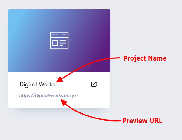
Could you kindly provide us with the Project Name and Preview URL of your project in the Brizy Cloud Dashboard, where this issue can be replicated?
I am looking forward to your response.
Best regards,
Ariel H.0
Please sign in to leave a comment.
Comments
1 comment