Custom Asset Blocks appear half size in Tablet view, but full size in Desktop and Mobile

I've created a simple demonstration site for this. https://passionfruit19474189.brizy.site/
When I create a Custom Asset block with only 1 column, it appears full size as expected in Desktop and Mobile viewpoints. But in the Tablet viewpoint, the block will reduce to half size (or the column count for the block is set to 2). There is no option in the UI to adjust the column count or the column size in the Tablet view.
I keep creating pleasant designs in Desktop that can't be used because of this, and I don't understand why we can't set the column count in Tablet view.
Desktop viewpoint:

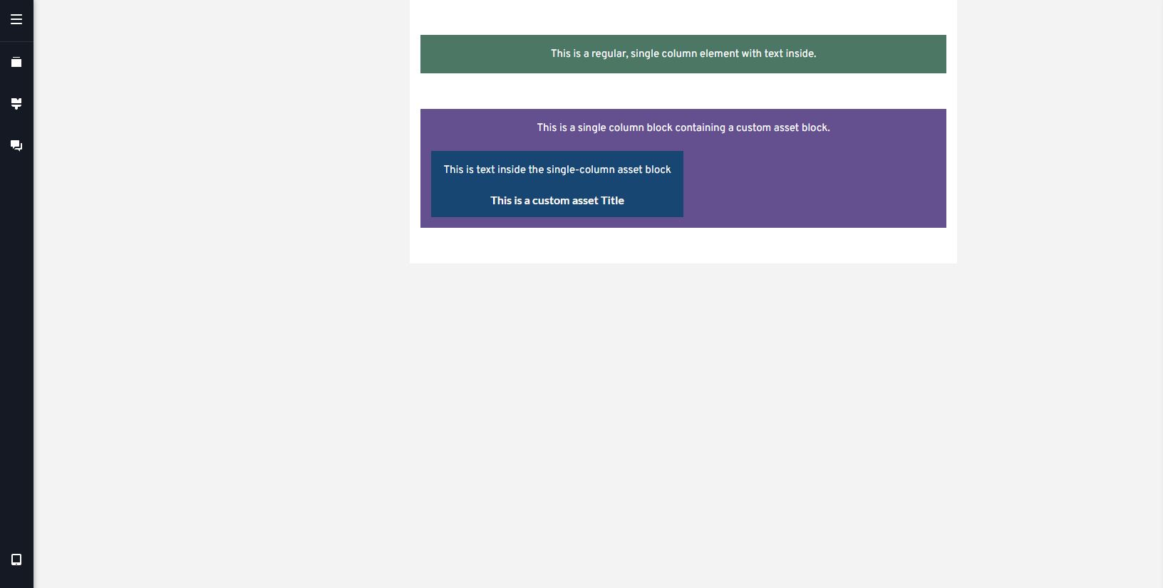
Tablet viewpoint:
Mobile viewpoint:

Tablet viewpoint block settings UI:

If this is intended behavior, is there any workaround for making single-column Custom Asset displays in Tablet view?
-

Hi Yamen,
Thank you for reaching out to us.
Unfortunately, I am unable to reproduce the issue as described.

Would it be possible for you to create a short screencast to demonstrate the issue. This will give us a clearer picture of the issue you are facing and possibly offer a solution.
Best regards,
Ariel H.0 -
Sure. Here's a recording of demonstrating the bug using the same project file as before.
0 -
Hi Yamen,
Thank you for your cooperation and for bringing this to our attention.
I asked one of our team members to look into this issue. I will reach out to you as soon as I have an update.Best regards,
Ariel H.0 -
Hi Yamen,
Thank you for your patience.
I've gathered some insights from my team, and it turns out that the behavior you're seeing is actually by design. In the tablet view, the default setting is to display two columns. If there's only one post, it will align to the right, leaving the next column empty.
However, it's possible to modify this behavior by using custom CSS. You'll need to insert it into the code section of the specific page in question, as demonstrated on this screencast - https://youtu.be/8ikTP-I2Ago?vq=hd1080
Here is the CSS:
@media (max-width: 991px) and (min-width: 768px){
.brz-posts__item {
    width: 100% !important;
}
}
If you have any further questions, please let us know.
Best regards,
Ariel H.0 -
Thanks for the CSS workaround.
It's unfortunate that this is the expected behavior, it takes design control away from site designers.
1 -

Just been battling with this too. The design choice shouldn't be your but the designers.
Please can you amend this - there's not reason for it?
0 -
Hi Ross,
Thank you for your feedback, and I apologize for any inconvenience this may have caused. I understand your concern about the design control being taken away from site designers.
I kindly request you to also share your feedback on our Ideas and Roadmaps page: https://www.brizy.io/ideas-and-roadmap
By doing so, other users who are also interested in this feature can join the discussion, vote for it, and increase its chances of being included in future updates.
Best regards,
Ariel H.0
Please sign in to leave a comment.
Comments
7 comments