Responsiveness of website is not good

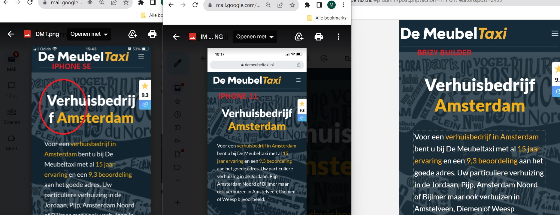
The responsiveness of the website is not good. When I make it in the Brizy builder, it looks good. Some page is shown correctly on Iphone 11, but not on Iphone SE. What is going wrong? I should be able to trust the preview in Brizy Builder when shown on all type of phones. See printscreens underneath:
IPHONE SE (goes wrong) IPHONE 11 BRIZY BUILDER
-

Hi
The text 'Verhuisbedrijf' wraps to the next line on mobile devices with a screen width of 350 pixels and lower. You must decrease the font size for the text "Verhuisbedrijf" in mobile design view if you want it to stop wrapping to the next line on screens that are 350 pixels wide or less. Try reducing the text size by two points and do another check.
0
Please sign in to leave a comment.
Comments
1 comment