Improve the way to manipulate columns and rows (Flex Grid)

Look, I'm honestly very disappointed with Brizy, but I'm still going to report how much you can still improve on really significant things that will really put this tool at a really good level and in line with its time.
The Row and Columns components use the CSS Flex property but it doesn't deliver all the power that this display mode has.
Where is the option that allows us to control with at least the two main orientation modes??
Vertical - with the `flex-direction: column;` property
Horizontal (which is the default for the Columns component) - with the `flex-direction: row;` property
Not to mention the possibility of the same reverse options: `flex-direction: column-reverse;` and `flex-direction: row-reverse;` - Excellent for situations where on the Mobile screen, a column that on the Desktop is to the left and below the mobile, can be set to Reverse (`flex-direction: column-reverse;`) and passes up. An example of how we would have more control and avoid custom CSS.
Another annoying thing, which helps and which was a very requested function here in the past - as I researched here - is that the columns need to have a defined Width in %. MY GOD!! We are in 2023!! but it seems that you are still inspired by the late 2000's TableLess mode when we were crawling with floating blocks and percentage-based widths.
OK! Nothing wrong with having the option to set in %, but having that path as the only one is annoying.
The Row/Columns component generates a div with the brz_row class that basically only receives the following properties:
  position: relative;
  display: flex;
  flex-wrap: wrap;
  text-align: left;
  flex-basis: 100%;
  max-width: 100%;
  width: 100%;
And its child elements - the columns (in an example containing only two columns) - something like this:
flex: 1 1 50%;
max-width: 50%;
justify-content: center;
The above properties are in a single class generated to hold only the column width settings.
However, there are much simpler forms and for many cases much more FLEXIBLE, making use of other FLEX properties.
To begin with, I could mention the `justify-content` property, which contains several variations of the distribution of child elements - space-between, space-around, start, end, etc.
Anyway, just look at several CSS style frameworks that already have Layout construction components with CSS FLEX and you will see why they are so successful. Especially TailwindCSS or the long-lived Bootstrap, among others.
In summary please consider giving more control of how columns can be distributed within a Row and Columns component. By the way, my suggestion is that they create a new component, calling it something like Flex GRID, so as not to disrupt the workflow of those who are already used to the Row and Columns components.
Keep in mind that this new Flex Grid component should be able to provide controls to control most existing FLEX CSS properties as well as columns (child elements) able to use the child properties of a FLEX element like:
- self-align
- justify-self
- flex-basis(set width, however not only in %, but also in px, rem, etc)
- flex-shrink
- flex-grow
- etc...
Alright, I'm here talking about one of the biggest web styling assets we've had in our fast-paced web development history since we left the charts.
CSS Flex is now more than supported by most browsers, and has been for quite some time.
I would love to see such a component. I could dedicate more time and do some drawings and prototypes, but it doesn't make sense for a client to pay to work, and I believe you are fully capable of doing that.
Can we already talk about a component based on CSS GRID ( `display: grid`) ????
-

Hi Adson,
Thank you for taking the time to share your feedback, and we appreciate your suggestions.
I have forwarded your request to our senior support team for careful consideration and review.Best regards,
Ariel H.0 -
Linked to this, the lack of control in Responsiveness Breakpoints also interfere a lot.
They could start with a simple fix and add other units for column widths, like Pixels (px) anyway.1 -
Hi Adson,
Thank you for the update.
We're currently working on a new breakpoints manager, which should be available soon - https://prnt.sc/PI9IhWLmLi_E
Best regards,
Ariel H.0 -
Yes yes!
I'm following.
By the way, have you been setting up this Trello board??
https://trello.com/b/0buMUNOS/brizy-cloud-public-roadmap
He looks kind of abandoned to me.
Returning to the subject of new controls for Grid, columns and rows, another very good thing would be to take advantage of the `gap` property of CSS Flex. It defines the spacing between the children of a Flex Box without having to use of `margin` or `padding`.0 -
Hi Adson,
Thank you for the update.
Currently, we are working on priority projects, and as a result, there haven't been any updates to the board recently. We expect to have some new updates to share soon. We also appreciate the additional feedback you have provided.
Kind regards,
Ariel H.0 -

we are in desperate ned for such functionality.
how can I create a wrap at a certain point currently?
I need only 5 Elements horizontally and want to the other 5 in the next row
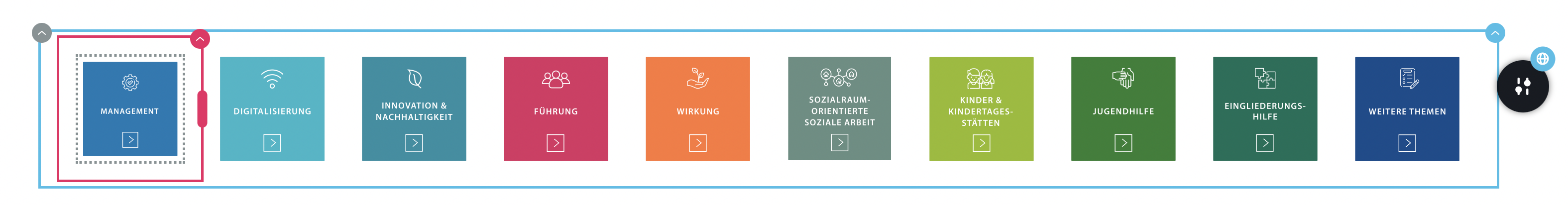
like this

But on mobile it has to be two in a row.
2 -
Hi Sandra,
Thank you for keeping in touch.
I assume that these boxes are images, you can accomplish this by using the Gallery element, in desktop view you can set the columns to 5, and on mobile, you can it to 2 columns as demonstrated on this screencast: https://youtu.be/Sd_ESyfx7eg
Please try this and let me know if this works for you.
Best regards,
Ariel H.0 -
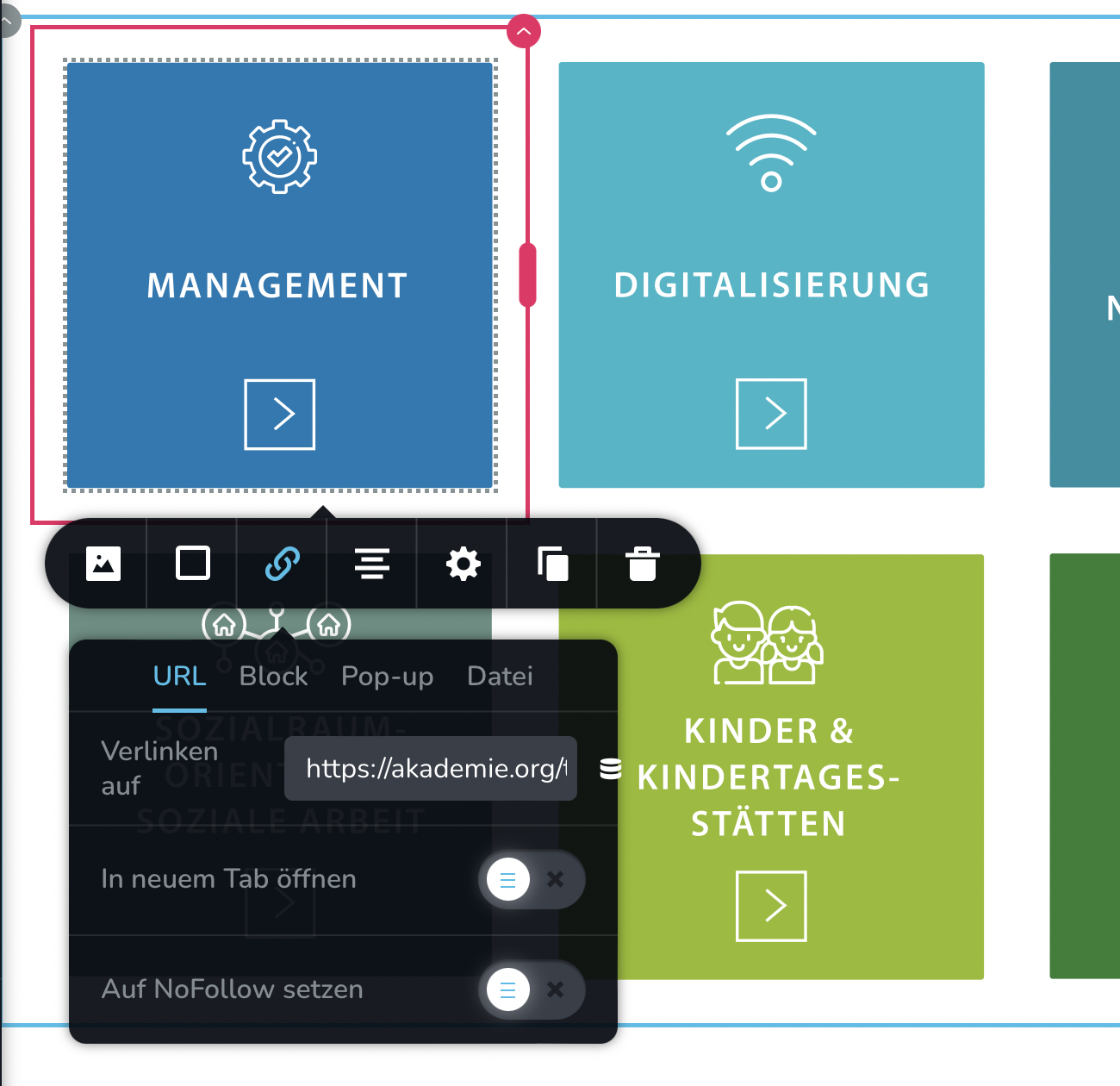
Hi Ariel,
can all images have a hover effect and hold links to the corresponding sub pages?
hover sample

Url for each image
 0
0 -

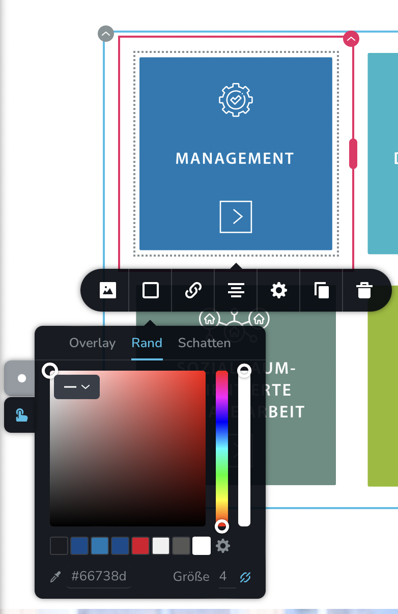
Hi Sandra,
To add the hover effect to a column, click on the top right corner of the column - select gear icon - Styling - under the Advanced tab add the following custom CSS. https://jmp.sh/Z81FlX4a Please have a look at this page for an example. https://digital-works.brizy.site/hover
element {
  transition: all .2s ease-in-out;
  transform: scale(1, 1);
}

element:hover {
  /* Add hover properties */
  transform: scale(0.95, 0.95);
  cursor: pointer;
  z-index: 1;
}
You can add the URL for each column in the URL field as you have shown above.
0 -
The Gallery element is another that need enhancements.
Well... Only rest await...
1 -
Hi Adson,
Have you looked at the updated Brizy Gallery element? Please have a look at these tutorials
- Quickly Upload Multiple Images for Gallery Element with Brizy
- Get full control over Your Gallery Layouts: Grid, Masonry, Justified & Big Image
Do you have specifics about the enhancements you are looking at in the gallery element?
0 -
If I try to use the gallery grid like in this example https://support.brizy.io/hc/en-us/community/posts/15189595749009/comments/12463247924882
how can I give each image in the gallery:
- the same hover effect like in my example shown? The hover in my example is achieved by setting
- add an individual link/URL to each image?Thanks
0 -
Hi Sandra,
I am sorry; I am not able to fully comprehend the design you are attempting to achieve.
- How do you propose to use the gallery element to implement a design like this? Are you thinking about creating images for each specific topic?
- The screenshot you have provided above is for the border color. In the design below, border color does not change on hover. How do you plan to use border color to implement this design?
Border colors are set individually for each image in the gallery. It cannot be set centrally.
 0
0
Please sign in to leave a comment.
Comments
13 comments