Hamburger menu - page titles get cut out

Hi Brizy team,
I hope everyone is doing well.
I am using an hamburger menu on this website (for tablet and mobile).
On tablet there's no issue since the screen is wider. But on mobile, pages with longer titles get cut out. I can't change the name of the pages since this is for a client.
But what I need is to make the titles that don't fit on one line, simply break the words into 2 lines. I already reduced the font size but that's not the ideal solution since there are so many different screen sizes, I can't control that. But how do I make it so the title splits into 2 lines instead of hidding a part of the word or sentence?
Please see below:
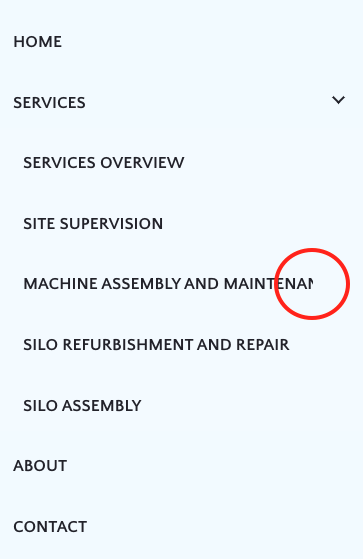
I am on WordPress and using Brizy Pro.
Thank you,
Sofia
-

Hi Sofia,
This looks like a bug. When using a long navigational label for your menu, one part of the text gets cut off. I will report this and we will work on developing a fix.
In your project, please consider adding a mega menu to 'Services'. You will need to create a new 'Services' menu and move all the pages listed currently as a sub menu to services to the new menu. You can look at this tutorial for the procedure to create a mega menu https://youtu.be/qY7xjLbyr2I?si=Y00yn99ekKiCzkMZ&t=252
Another work around would be to setup a hamburger menu using the popup builder. If you would like to explore this option, please let us know. We will give you further instructions.
0 -
Hi KC! Thank you for your reply :) Yeah, I thought it was a glitch because I'm pretty sure I've done this before. But I also use popups instead of menus quite often, so I'll do that on this site for the moment. Have a great day, Sofia
0
Please sign in to leave a comment.
Comments
2 comments