Mobile navigation menu - Cart not showing

Hi Brizy Team,
I've previously created websites using Brizy (Pro WP), and there's always been one issue that I find challenging: the responsive navigation menu.
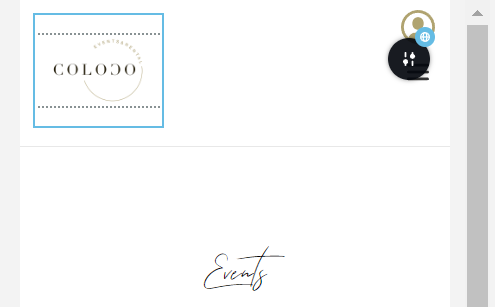
I'm currently working on the website: www.colocoagency.be. As you can see, there's a shopping cart icon on the desktop version, but it disappears on the mobile version. The profile icon is positioned just above the menu in the edit mode, but in reality, it's all the way at the top-right corner.

Even though the columns remain in place, I can't reduce the white space at the bottom. The header is too large and takes up too much space when scrolling down.
Could you please guide me on how to improve this and how to make the shopping cart visible on mobile?
In case you'd like to get access to the website, I created a temporary login so you guys can have a look. I sent the credentials to: communitysupport@brizy.io.
On a different note, why is the scroll speed slower on the main page compared to the other pages? Is there a way for me to modify this?
Thank you in advance!
-

Hi Yonik,
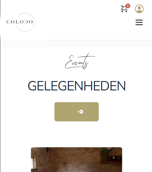
I have done some work on your mobile header design. It looks like this now.

Please have a look at this screen recording for the changes I have made. https://jmp.sh/gpcdznhZ
0 -
Hi George,
Thank you for having a look at it and I do understand why you changed it like that, but usually the nav menu is not in the middle but at the right side. Preferably, I'd like to have the cart and profile icon in the upper right corner and then the hamburger underneath it, just like in the attached picture.
I think design wise/ usability wise, it's better? Or perhaps to get the profile in the menu when opening it, and just the cart next to the hamburger menu? However, since I can only "switch" the columns, I can't find a way to get it that way. Would it be possible to get it like any of the above suggestions?
Kind regards,Yonik
0 -
Hi Yonik,
It is possible to implement the above design. Please have a look at this page on a mobile https://brizytest.online/gallery/ You can follow the procedure in this screen recording. https://jmp.sh/0J4F6KUv
0 -
Hi George,
Thank you for the screen recording; that was very helpful.
One thing I would still like to figure out is how to make the spacing a lot less, but I can't play with the margins, as the block of the menu will override the cart and profile icons, making them not clickable anymore.
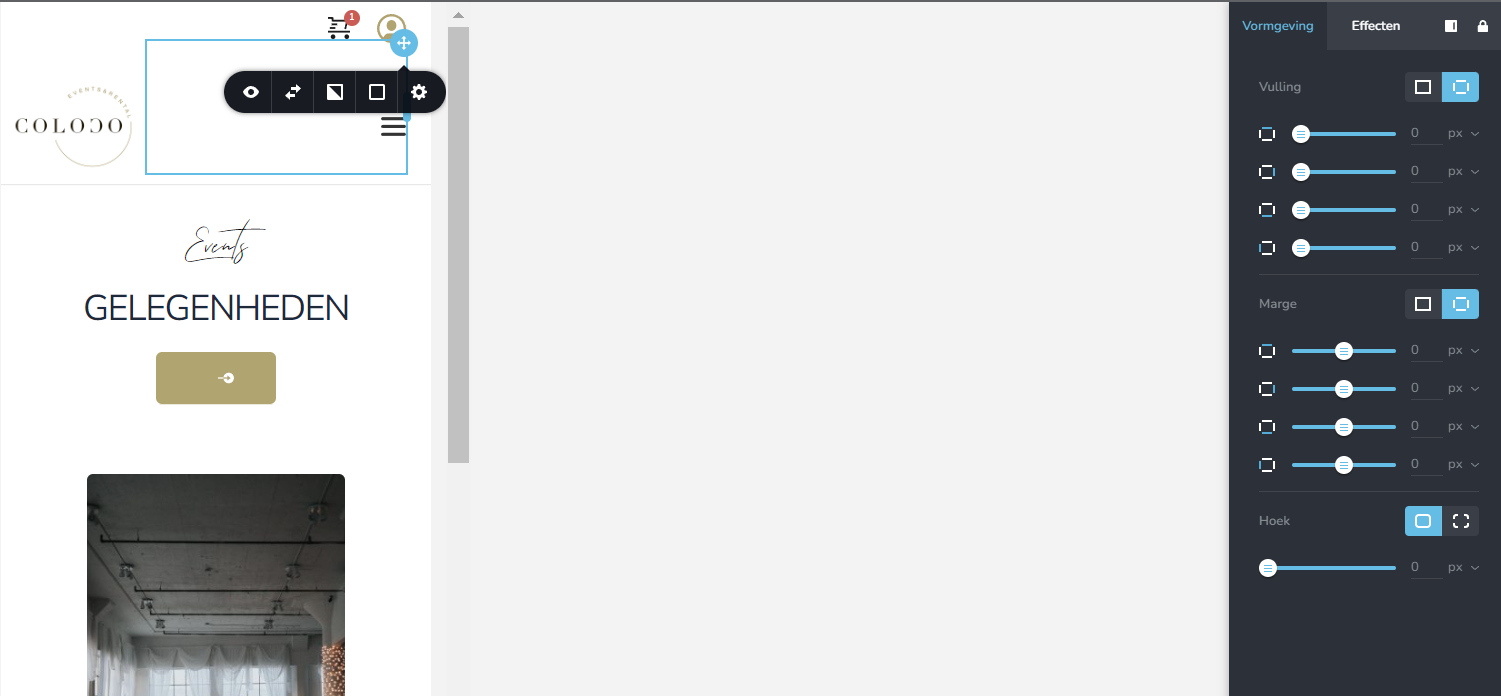
So now on mobile, there's more white space than I would like. What would be a way to change this, please?
Kind regards,
Yonik
0 -
Hi Yonik,
I have made some changes to your mobile header design to keep the elements closer to each other. Please check if all the icons are clickable.
0 -
Hi George,
Thank you so much for your help! The icons are clickable and it looks good now.
You may close this ticket :)
0
Please sign in to leave a comment.
Comments
6 comments