Tablet view menu design

Hello Brizy team,
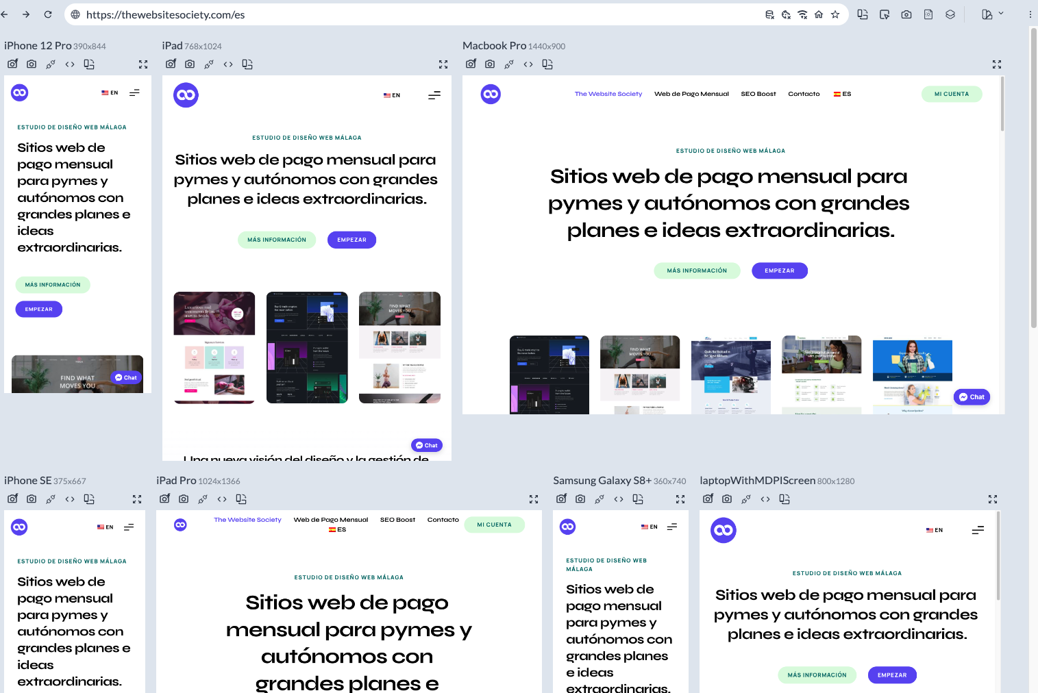
I am testing my website on different screen sizes and I note that for some (for example iPad Pro - the second below), the menu displays the way I designed it for the computer and not the tablet version. Could you help on how to "tell" Brizy that the menu should be adjusted to the "tablet" design from that specific screen size?
Can I do that per section, or does it need to be fully changed for the entire tablet view?
Sorry for the way I'm explaining it, I hope my question makes sense :)
Thank you!
-

Hi Sofia,
Thank you for reaching out to us.
To ensure that the menu displays properly on tablet view, you can try two options:
1. You can adjust the font size of the menu items to make them fit nicely on the tablet screen - https://i.imgur.com/0lMjjZR.png
2. Another option is to modify the spacing between the menu items. By adjusting the spacing, you can create a more compact layout that fits well on tablet screens - https://i.imgur.com/PXhZrqS.png
Please try this and let me know how it goes.
Best regards,
Ariel H.0 -
Hi Ariel!
Thank you very much for your quick reply.
I understand that, but it would still not ensure that it would work well for all tablets... because in reality, I actually have an hamburger icon for tablet view (not a regular menu). But on that specific device (iPad Pro) it is displaying the computer version of my design (which is not hamburger) instead of the tablet view that I designed in Brizy (which would be an hamburger). So I think it's a question of adjusting the break points, is that right?
0 -
So for example if you look at the iPad (second on the top row), you'll see what I designed for tablet. And it should be the same for the iPad Pro (second on the row below) since those would both the "tablets" :)
0 -
Hi Sofia,
Thank you for the update.
I apologize for the inconvenience caused, currently, this is the only solution we have available. However, I would like to inform you that we have a new feature called the 'Breakpoint Manager' in development as part of our roadmap. This feature aims to address the concern you raised by allowing users to optimize their websites more effectively across different screen sizes - https://prnt.sc/WI7Gsqjjyggw.
If you have any further questions, please let us know.
Kind regards,
Ariel H.0 -
Oh I thought this was already possible. Ok, perfect. Do you have a timeframe for that?
Thank you! :)
0 -
Hi Sofia,
Thank you for keeping in touch.
We regret to inform you that we have not received a specific timeframe for the completion of the Breakpoint Manager feature. However, if there are any updates or new information regarding this, we will promptly reach out to you.
Best regards,
Ariel H0 -

Please is there any update on this issue. I am testing my website on different screen sizes and I'm really not impressed. It isn't responsive on several screens despite looking responsive in brizy tablet and mobile modes. Especially for the tablet, keeps irregular showing desktop views on some tablets.
0 -
Hi,
Thank you for reaching out to us.
I regret to inform you that this feature is currently in progress. Initially, it was planned to be released towards the end of last year, but due to unforeseen circumstances, the project has been postponed to 2024 - https://prnt.sc/WI7Gsqjjyggw
I apologize for any inconvenience this may cause. If you have any other questions or concerns, please feel free to let me know.
Best regards,
Ariel H.0
Please sign in to leave a comment.
Comments
8 comments